Angular Material 7 - Progress Bar
The <mat-progress-bar>, an Angular Directive, is used to show a progress bar with material styling.
In this chapter, we will showcase the configuration required to draw a deterministic as well as indeterministic progress bar using Angular Material.
Create Angular Application
Follow the following steps to update the Angular application we created in Angular 6 - Project Setup chapter −
| Step |
Description |
| 1 |
Create a project with a name materialApp as explained in the Angular 6 - Project Setup chapter. |
| 2 |
Modify app.module.ts, app.component.ts, app.component.css and app.component.html as explained below. Keep rest of the files unchanged. |
| 3 |
Compile and run the application to verify the result of the implemented logic. |
Following is the content of the modified module descriptor app.module.ts.
import { BrowserModule } from '@angular/platform-browser';
import { NgModule } from '@angular/core';
import { AppComponent } from './app.component';
import {BrowserAnimationsModule} from '@angular/platform-browser/animations';
import {MatProgressBarModule, MatRadioModule, MatSliderModule} from '@angular/material'
import {FormsModule, ReactiveFormsModule} from '@angular/forms';
@NgModule({
   declarations: [
      AppComponent
   ],
   imports: [
      BrowserModule,
      BrowserAnimationsModule,
      MatProgressBarModule, MatRadioModule, MatSliderModule,
      FormsModule,
      ReactiveFormsModule
   ],
   providers: [],
   bootstrap: [AppComponent]
})
export class AppModule { }
Following is the content of the modified ts file app.component.css.
.tp-section {
   display: flex;
   align-content: center;
   align-items: center;
   height: 60px;
}
.tp-margin {
   margin: 0 10px;
}
Following is the content of the modified HTML host file app.component.html.
<section class = "tp-section">
   <label class = "tp-margin">Color:</label>
   <mat-radio-group [(ngModel)] = "color">
      <mat-radio-button class = "tp-margin" value = "primary">
         Primary
      </mat-radio-button>
      <mat-radio-button class = "tp-margin" value = "accent">
         Accent
      </mat-radio-button>
      <mat-radio-button class = "tp-margin" value = "warn">
         Warn
      </mat-radio-button>
   </mat-radio-group>
</section>
<section class = "tp-section">
   <label class = "tp-margin">Mode:</label>
   <mat-radio-group [(ngModel)] = "mode">
      <mat-radio-button class = "tp-margin" value = "determinate">
         Determinate
      </mat-radio-button>
      <mat-radio-button class = "tp-margin" value = "indeterminate">
         Indeterminate
      </mat-radio-button>
      <mat-radio-button class = "tp-margin" value = "buffer">
         Buffer
      </mat-radio-button>
      <mat-radio-button class = "tp-margin" value = "query">
         Query
      </mat-radio-button>
   </mat-radio-group>
</section>
<section class = "tp-section" *ngIf = "mode === 'determinate' || mode === 'buffer'">
   <label class = "tp-margin">Progress:</label>
   <mat-slider class = "tp-margin" [(ngModel)] = "value"></mat-slider>
</section>
<section class = "tp-section" *ngIf = "mode === 'buffer'">
   <label class = "tp-margin">Buffer:</label>
   <mat-slider class = "tp-margin" [(ngModel)] = "bufferValue"></mat-slider>
</section>
<section class = "tp-section">
   <label class = "tp-margin">Mode: {{mode}}</label>
   <mat-progress-bar
      class = "tp-margin"
      [color] = "color"
      [mode] = "mode"
      [value] = "value"
      [bufferValue] = "bufferValue"
      >
   </mat-progress-bar>
</section>
Following is the content of the modified ts file app.component.ts.
import { Component } from '@angular/core';
@Component({
   selector: 'app-root',
   templateUrl: './app.component.html',
   styleUrls: ['./app.component.css']
})
export class AppComponent {
   title = 'materialApp';
   color = 'primary';
   mode = 'determinate';
   value = 50;
   bufferValue = 75;
}
Result
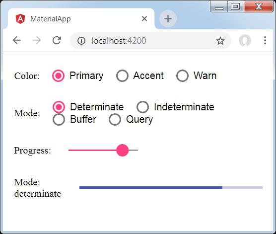
Verify the result.

Details
- Here, we've created progress bar using mat-progress-bar.


