Kibana - Create Dashboard
In our previous chapters, we have seen how to create visualization in the form of vertical bar, horizontal bar, pie chart etc. In this chapter, let us learn how to combine them together in the form of Dashboard. A dashboard is collection of your visualizations created, so that you can take a look at it all together at a time.
Getting Started with Dashboard
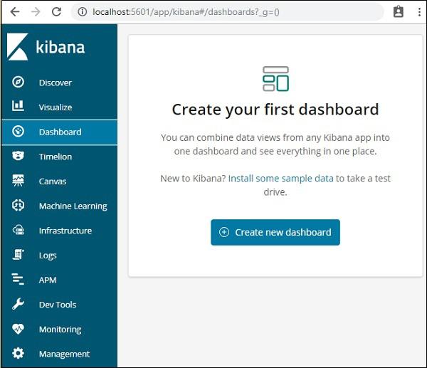
To create Dashboard in Kibana, click on the Dashboard option available as shown below −

Now, click on Create new dashboard button as shown above. It will take us to the screen as shown below −

Observe that we do not have any dashboard created so far. There are options at the top where we can Save, Cancel, Add, Options, Share, Auto-refresh and also change the time to get the data on our dashboard. We will create a new dashboard, by clicking on the Add button shown above.
Add Visualization to Dashboard
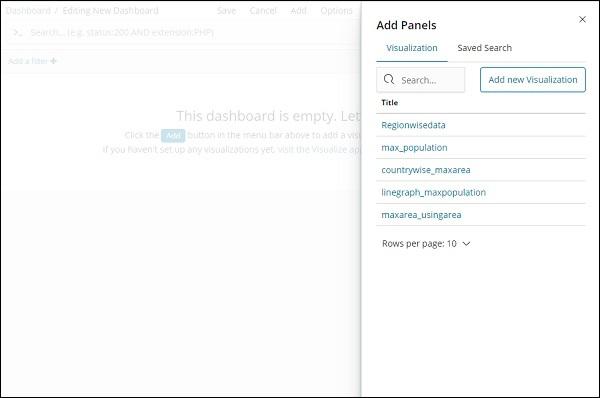
When we click the Add button (top left corner), it displays us the visualization we created as shown below −

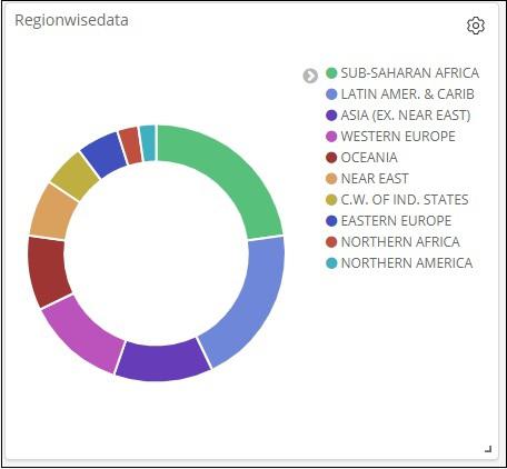
Select the visualization you want to add to your dashboard. We will select the first three visualizations as shown below −

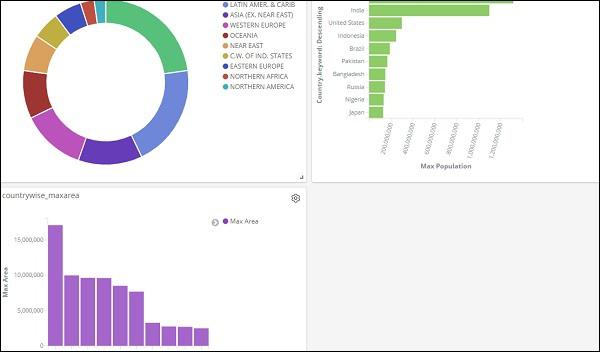
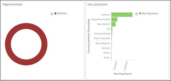
This is how it is seen on the screen together −

Thus, as a user you are able to get the overall details about the data we have uploaded – country wise with fields country-name, regionname, area and population.
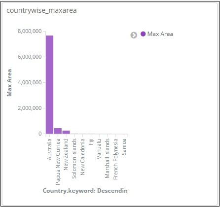
So now we know all the regions available, the max population country wise in descending order, the max area etc.
This is just the sample data visualization we uploaded, but in real world it becomes very easy to track the details of your business like for example you have a website which gets millions of hits monthly or daily, you want to keep a track on the sales done every day, hour, minute, seconds and if you have your ELK stack in place Kibana can show you your sales visualization right in front of your eyes every hour, minute, seconds as you want to see. It displays the real time data as it is happening in the real world.
Kibana, on the whole, plays a very important role in extracting the accurate details about your business transaction day wise, hourly or every minute, so the company knows how the progress is going on.
Save Dashboard
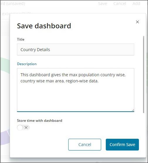
You can save your dashboard by using the save button at the top.

There is a title and description where you can enter the name of the dashboard and a short description which tells what the dashboard does. Now, click on Confirm Save to save the dashboard.
Changing Time Range for Dashboard
At present you can see the data shown is of Last 15 minutes. Please note this is a static data without any time field so the data displayed will not change. When you have the data connected to real time system changing the time, will also show the data reflecting.
By default, you will see Last 15 minutes as shown below −

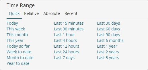
Click on the Last 15 minutes and it will display you the time range which you can select as per your choice.
Observe that there are Quick, Relative, Absolute and Recent options. The following screenshot shows the details for Quick option −

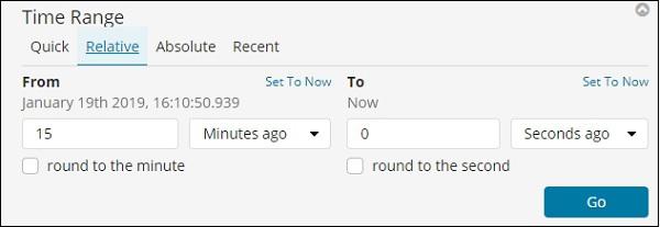
Now, click on Relative to see the option available −

Here you can specify the From and To date in minutes , hours, seconds, months, years ago.
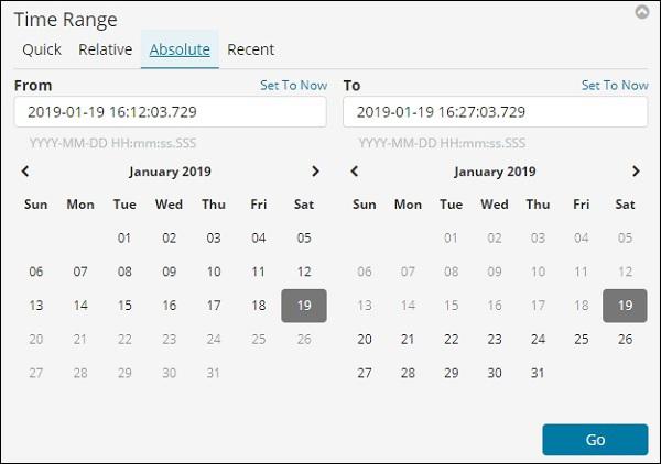
The Absolute option has the following details −

You can see the calendar option and can select a date range.
The recent option will give back the Last 15 minutes option and also other option which you have selected recently. Choosing the time range will update the data coming within that time range.
Using Search and Filter in Dashboard
We can also use search and filter on the dashboard. In search suppose if we want to get the details of a particular region, we can add a search as shown below −

In the above search, we have used the field Region and want to display the details of region:OCEANIA.
We get following results −

Looking at the above data we can say that in OCEANIA region, Australia has the max population and Area.

Similarly, we can add a filter as shown below −


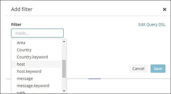
Next, click on Add a filter button and it will display the details of the field available in your index as shown below −

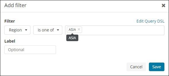
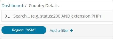
Choose the field you want to filter on. I will use Region field to get the details of ASIA region as shown below −
Save the filter and you should see the filter as follows −

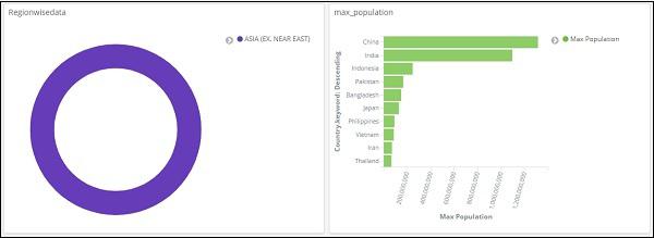
The data will now be shown as per the filter added −

You can also add more filters as shown below −

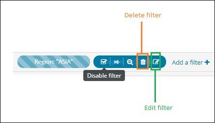
You can disable the filter by clicking on the disable checkbox as shown below.

You can activate the filter by clicking on the same checkbox to activate it. Observe that there is delete button to delete the filter. Edit button to edit the filter or change the filter options.
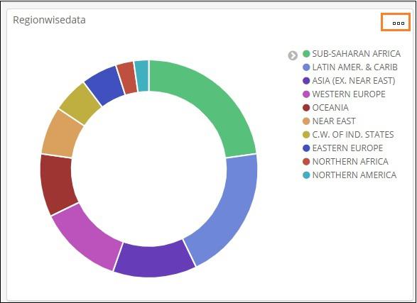
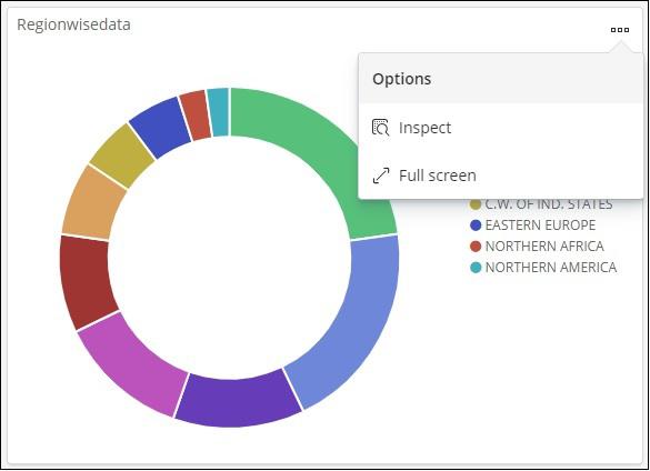
For the visualization displayed, you will notice three dots as shown below −

Click on it and it will display options as shown below −

Inspect and Fullscreen
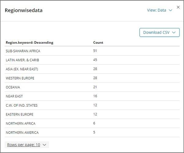
Click on Inspect and it gives the details of the region in tabular format as shown below −

There is an option to download the visualization in CSV format in-case you want to see it in excel sheet.
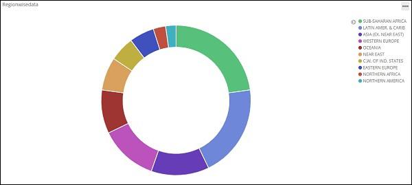
The next option fullscreen will get the visualization in a fullscreenmode as shown below −

You can use the same button to exit the fullscreen mode.
Sharing Dashboard
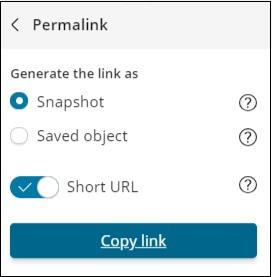
We can share the dashboard using the share button. Onclick of share button, you will get display as follows −

You can also use embed code to show the dashboard on your site or use permalinks which will be a link to share with others.

The url will be as follows −
http://localhost:5601/goto/519c1a088d5d0f8703937d754923b84b


