DC.js - Pie Chart
A pie chart is a circular statistical graph. It is divided into slices to show a numerical proportion. This chapter explains how to draw a pie chart using DC.js in detail.
Pie Chart Methods
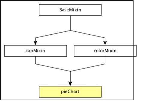
Before moving on to draw a pie chart, we should understand the dc.pieChart class and its methods. The dc.pieChart uses mixins to get the basic functionality of drawing a chart. The mixins used by dc.pieChart are as follows −
- baseMixin
- capMixin
- colorMixin
The complete class diagram of a dc.pieChart is as follows −

The dc.pieChart gets all the methods of the above specified mixins as well as has its own methods to specifically draw the pie chart. They are as follows −
- cx( [cx])
- drawPaths( [path])
- emptyTitle( [title])
- externalLabels( [label])
- innerRadius( [innerRadius])
- minAngleForLabel( [minAngleForLabel])
- radius( [radius])
- slicesCap( [cap])
Let us discuss each of these in detail.
cx( [cx])
It is used to get or set the center x coordinate position, which is defined below −
chart.cx = function (cx) {
   if (!arguments.length) {
      return (_cx ||  _chart.width() / 2);
   }
};
Similarly, you can perform the y-coordinate position.
drawPaths( [path])
This method is used to draw paths for a pie chart and is defined below −
chart.drawPaths = function (path) {
   if (arguments.length === 0) {
      return path;
   }
};
emptyTitle( [title])
This method is used to set the title when there is no data. It is defined below −
chart.emptyTitle = function (title) {
   if (arguments.length === 0) {
      return title;
   }
};
externalLabels( [label])
It is used to position slice labels offset from the outer edge of the chart. It is defined below −
chart.externalLabels = function (label) {
   if (arguments.length === 0) {
      return label;
   }
};
innerRadius( [innerRadius])
This method is used to get or set the inner radius of the pie chart. If the inner radius is greater than 0px, then the pie chart will be rendered as a doughnut chart. It is defined below −
_chart.innerRadius = function (innerRadius) {
   if (!arguments.length) {
      return _innerRadius;
   }
};
minAngleForLabel( [minAngleForLabel])
This method is used to get or set the minimal slice angle for label rendering. It is defined below −
 _chart.minAngleForLabel = function (minAngleForLabel) {
   if (!arguments.length) {
      return _minAngleForLabel;
   }
   _minAngleForLabel = minAngleForLabel;
   return _chart;
};
radius( [radius])
This method is used to get or set the outer radius. If the radius is not specified, then it will take half of the minimum chart width and height. It is defined below −
_chart.radius = function (radius) {
   if (!arguments.length) {
      return _givenRadius;
   }
   _givenRadius = radius;
   return _chart;
};
slicesCap( [cap])
Gets or sets the maximum number of slices the pie chart will generate. The top slices are determined by a value from high to low. Other slices exceeding the cap will be rolled up into one single ‘Others’ slice.
Draw a Pie Chart
Let us create a pie chart in DC. In this pie chart example, let us take a dataset named people.csv file. The sample data file is as follows −
id,name,gender,DOB,MaritalStatus,CreditCardType
1,Damaris,Female,1973-02-18,false,visa-electron
2,Barbe,Female,1969-04-10,true,americanexpress
3,Belia,Female,1960-04-16,false,maestro
4,Leoline,Female,1995-01-19,true,bankcard
5,Valentine,Female,1992-04-16,false,
6,Rosanne,Female,1985-01-05,true,bankcard
7,Shalna,Female,1956-11-01,false,jcb
8,Mordy,Male,1990-03-27,true,china-unionpay

....................
....................
....................
The above sample contains many records. You can download the file by clicking the following link and save it to the DC location.
people.csv
Now, let us adhere to the following steps to draw a pie chart in DC.
Step 1: Include a Script
Let us add D3, DC and Crossfilter using the following code −
<script src = "js/d3.js"></script>
<script src = "js/crossfilter.js"></script>
<script src = "js/dc.js"></script>
Step 2: Define a Variable
Create an object of type, dc.pieChart as shown below −
var pieChart = dc.pieChart('#pie');
Here, the Pie id is mapped with a pie.
Step 3: Read the Data
Read your data (say, from people.csv) using the d3.csv() function. It is defined as follows −
d3.csv("data/people.csv", function(errors, people) {
   console.log(people);
}
Here, if the data file is not available in the specified location, then the d3.csv() function returns an error.
Step 4: Define the Crossfilter
Define a variable for Crossfilter and assign the data to Crossfilter. It is defined below −
var mycrossfilter = crossfilter(people);
Step 5: Create a Dimension
Create a dimension for gender using the function below −
var genderDimension = mycrossfilter.dimension(function(data) {
   return data.gender;
});
Here, the Gender of the people is used for dimension.
Step 6: reduceCount()
Create a Crossfilter group by applying the group() and the reduceCount() function on the above created gender dimension - groupDimension.
var genderGroup = genderDimension.group().reduceCount();
Step 7: Generate Pie
Generate the pie using the function below −
pieChart
   .width(800)
   .height(300)
   .dimension(genderDimension)
   .group(genderGroup)
   .on('renderlet', function(chart) {
      chart.selectAll('rect').on('click', function(d) {
         console.log('click!', d);
      });
   });

dc.renderAll();
Here,
Width of the pie chart is set to 800.
Height of the pie chart is set to 300.
Dimension of the pie chart is set to genderDimension using the dimension() method.
Group of the pie chart is set to genderGroup using the group() method.
Added a click event to log the data using the DC.js built-in event, renderlet(). The renderlet is invoked, whenever the chart is rendered or drawn.
Step 8: Working Example
Create a new html file, pie.html and include all the above steps as shown below −
<html>
   <head>
      <title>DC.js Pie Chart Sample</title>
      <link rel = "stylesheet" type = "text/css" href = "css/bootstrap.min.css">
      <link rel = "stylesheet" type = "text/css" href = "css/dc.css"/>

      <script src = "js/d3.js"></script>
      <script src = "js/crossfilter.js"></script>
      <script src = "js/dc.js"></script>
   </head>

   <body>
      <div>
         <div id = "pie"></div>
      </div>

      <script language = "javascript">
         var pieChart = dc.pieChart('#pie');

         d3.csv("data/people.csv", function(errors, people) {
            console.log(people);
            var mycrossfilter = crossfilter(people);

            // gender dimension
            var genderDimension = mycrossfilter.dimension(function(data) {
               return data.gender;
            });
            var genderGroup = genderDimension.group().reduceCount();

            pieChart
               .width(800)
               .height(300)
               .dimension(genderDimension)
               .group(genderGroup)
               .on('renderlet', function(chart) {
                  chart.selectAll('rect').on('click', function(d) {
                     console.log('click!', d);
                  });
               });

            dc.renderAll();
         });
      </script>
   </body>
</html>
Now, request the browser and we will see the following response.


