Ionic - Lists
Lists are one of the most popular elements of any web or mobile application. They are usually used for displaying various information. They can be combined with other HTML elements to create different menus, tabs or to break the monotony of pure text files. Ionic framework offers different list types to make their usage easy.
Creating Ionic List
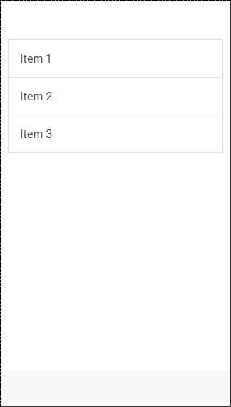
Every list is created with two elements. When you want to create a basic list your <ul> tag needs to have the list class assigned, and your <li> tag will use the item class. Another interesting thing is that you do not even need to use <ul>, <ol> and <li> tags for your lists. You can use any other elements, but the important thing is to add list and item classes appropriately.
<div class = "list">
   <div class = "item">Item 1</div>
   <div class = "item">Item 2</div>
   <div class = "item">Item 3</div>
</div>
The above code will produce the following screen −

Inset List
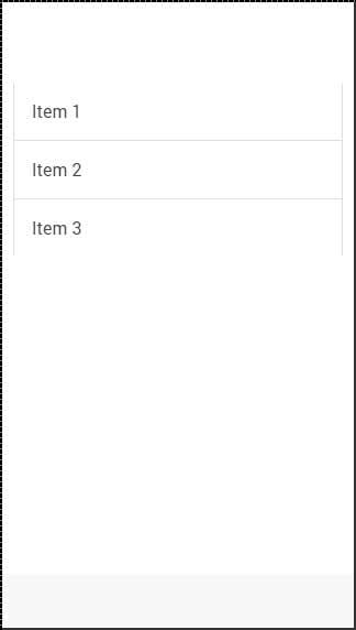
When you need a list to fill your own container, you can add the list-insets after your list class. This will add some margin to it and it will adjust the list size to your container.
<div class = "list list-inset">
   <div class = "item">Item 1</div>
   <div class = "item">Item 2</div>
   <div class = "item">Item 3</div>
</div>
The above code will produce the following screen −

Item Dividers
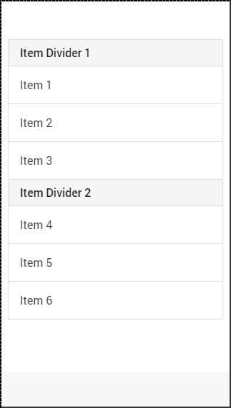
Dividers are used for organizing some elements into logical groups. Ionic gives us item-divider class for this. Again, like with all the other Ionic elements, we just need to add the item-divider class after the item class. Item dividers are useful as a list header, since they have stronger styling than the other list items by default.
<div class = "list">
   <div class = "item item-divider">Item Divider 1</div>
   <div class = "item">Item 1</div>
   <div class = "item">Item 2</div>
   <div class = "item">Item 3</div>

   <div class = "item item-divider">Item Divider 2</div>
   <div class = "item">Item 4</div>
   <div class = "item">Item 5</div>
   <div class = "item">Item 6</div>
</div>
The above code will produce the following screen −

Adding Icons
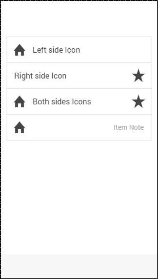
We already showed you how to add icons to your buttons. When adding icons to the list items, you need to choose what side you want to place them. There are item-icon-left and item-icon-right classes for this. You can also combine those two classes, if you want to have your Icons on both the sides. Finally, there is the item-note class to add a text note to your item.
<div class = "list">
   <div class = "item item-icon-left">
      <i class = "icon ion-home"></i>
      Left side Icon
   </div>

   <div class = "item item-icon-right">
      <i class = "icon ion-star"></i>
      Right side Icon
   </div>

   <div class = "item item-icon-left item-icon-right">
      <i class = "icon ion-home"></i>
      <i class = "icon ion-star"></i>
      Both sides Icons
   </div>

   <div class = "item item-icon-left">
      <i class = "icon ion-home"></i>
      <span class = "text-note">Text note</span>
   </div>
</div>
The above code will produce the following screen −
Adding Avatars and Thumbnails
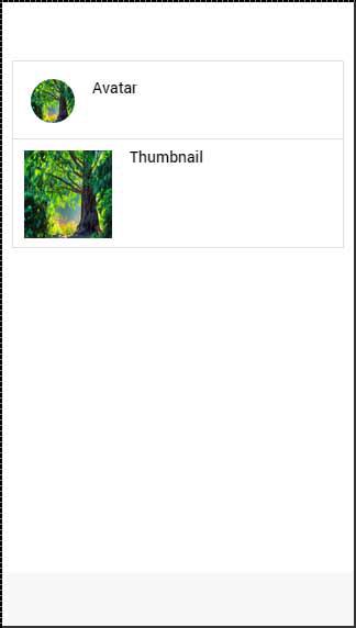
Avatars and thumbnails are similar. The main difference is that avatars are smaller than thumbnails. These thumbnails are covering most of the full height of the list item, while avatars are medium sized circle images. The classes that are used are item-avatar and item-thumbnail. You can also choose which side you want to place your avatars and thumbnails as shown in the thumbnail code example below.
<div class = "list">
   <div class = "item item-avatar">
      <img src = "my-image.png">
      <h3>Avatar</h3>
   </div>

   <div class = "item item-thumbnail-left">
      <img src = "my-image.png">
      <h3>Thumbnail</h3>
   </div>
</div>
The above code will produce the following screen −
