Plotly - FigureWidget Class
Plotly 3.0.0 introduces a new Jupyter widget class: plotly.graph_objs.FigureWidget. It has the same call signature as our existing Figure, and it is made specifically for Jupyter Notebook and JupyterLab environments.
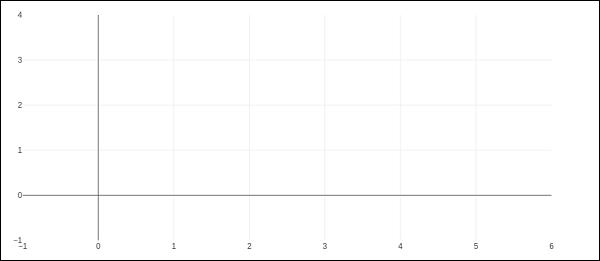
The go.FigureWiget() function returns an empty FigureWidget object with default x and y axes.
f = go.FigureWidget()
iplot(f)
Given below is the output of the code −

Most important feature of FigureWidget is the resulting Plotly figure and it is dynamically updatable as we go on adding data and other layout attributes to it.
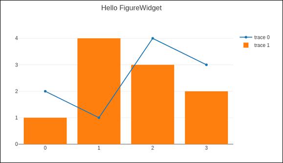
For example, add following graph traces one by one and see the original empty figure dynamically updated. That means we don’t have to call iplot() function again and again as the plot is refreshed automatically. Final appearance of the FigureWidget is as shown below −
f.add_scatter(y = [2, 1, 4, 3]);
f.add_bar(y = [1, 4, 3, 2]);
f.layout.title = 'Hello FigureWidget'

This widget is capable of event listeners for hovering, clicking, and selecting points and zooming into regions.
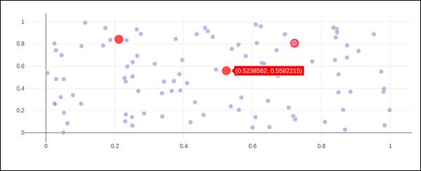
In following example, the FigureWidget is programmed to respond to click event on plot area. The widget itself contains a simple scatter plot with markers. The mouse click location is marked with different color and size.
x = np.random.rand(100)
y = np.random.rand(100)
f = go.FigureWidget([go.Scatter(x=x, y=y, mode='markers')])

scatter = f.data[0]
colors = ['#a3a7e4'] * 100

scatter.marker.color = colors
scatter.marker.size = [10] * 100
f.layout.hovermode = 'closest'
def update_point(trace, points, selector):

c = list(scatter.marker.color)
s = list(scatter.marker.size)
for i in points.point_inds:

c[i] = 'red'
s[i] = 20

scatter.marker.color = c
scatter.marker.size = s
scatter.on_click(update_point)
f
Run above code in Jupyter notebook. A scatter plot is displayed. Click on a location in the area which will be markd with red colour.

Plotly’s FigureWidget object can also make use of Ipython’s own widgets. Here, we use interact control as defined in ipwidgets module. We first construct a FigureWidget and add an empty scatter plot.
from ipywidgets import interact
fig = go.FigureWidget()
scatt = fig.add_scatter()
fig
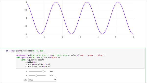
We now define an update function that inputs the frequency and phase and sets the x and y properties of the scatter trace defined above. The @interact decorator from ipywidgets module is used to create a simple set of widgets to control the parameters of a plot. The update function is decorated with @interact decorator from the ipywidgets package. The decorator parameters are used to specify the ranges of parameters that we want to sweep over.
xs = np.linspace(0, 6, 100)
@interact(a = (1.0, 4.0, 0.01), b = (0, 10.0, 0.01), color = ['red', 'green', 'blue'])
def update(a = 3.6, b = 4.3, color = 'blue'):
with fig.batch_update():
scatt.x = xs
scatt.y = np.sin(a*xs-b)
scatt.line.color = color
Empty FigureWidget is now populated in blue colour with sine curve a and b as 3.6 and 4.3 respectively. Below the current notebook cell, you will get a group of sliders for selecting values of a and b. There is also a dropdown to select the trace color. These parameters are defined in @interact decorator.
