Mobile Testing - UI
Suppose we are using a mobile application, and interestingly, you experience the following situation −
- Button alignment is missing.
- Text is getting trimmed.
- Calendar control is getting cut.
Indeed this is an unpleasant experience for any of the users. To make sure that we provide excellent experience to our users, Mobile UI Testing is highly recommended.
The first area to explore in your test plan is the user interface. It is your job as the tester to confirm that your application meets certain expectations, such as −
- Overall color scheme/theme of the device
- Style and color of icons
- Progress indicators when pages are loading
- Menus and how they are invoked and the typical items they contain
- Overall responsiveness of applications on this device
Let’s discuss more on the basics of Mobile UI Testing.
Screen Orientation / Resolution
Web content needs to look and feel great across a wide variety of devices and network conditions. It's generally a good idea to test your webpage under the commonly used screen resolutions so that you can be sure that your page is usable.
If you have a multi-column layout, you may also want to check that your columns align correctly and are still viewable when your visitor has a lower resolution. It is also important to know the standard screen resolutions −
- 640 × 480
- 800 × 600
- 1024 × 768
- 1280 × 800
- 1366 × 768
- 1400 × 900
- 1680 × 1050
Available Tools
There are quite a few tools available in the market to make mobile UI testing smoother and simpler. For example −
- Google chrome extension
- Screenfly
- Browser Stack
Let’s understand a little more about these tools and their usefulness.
Google chrome extension
It’s a free feature available with Google chrome web browser. We have given here a step-by-step explanation of how to test mobile web with Google Chrome Extension −
Step 1 − Open the website under testing in “Google Chrome Web browser”.
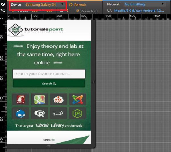
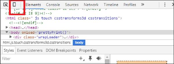
Step 2 − Press F12. It will open the Developer tool window, as shown in the following screenshot.

Step 3 − Click the mobile device like icon. Refer the following screenshot.
Step 4 − Select the mobile device with which you want to test the website. You can choose the different available devices in order to do the UI verification.

Screenfly
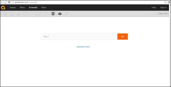
Screenfly is a free and easy-to-use tool. To use this, you just need to type in Quirktools in your web browser. You will see the following screen.

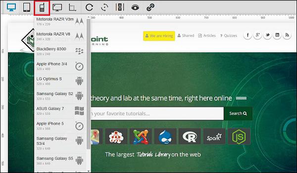
Enter the website under test and click Go. Select the mobile device in which you want to view the website.

BrowserStack
It’s another great tool for performing mobile UI testing. It provides wonderful results. Although it is a paid tool, you can avail a free trail by registering on BrowserStack with a valid email address.
Touch Screens
Multi-Touch vs. Single Touch Screens
If your device and application support multi-touch features, like the pinch-to-zoom effect on iPhone, then make sure to include lots of test cases involving touching the screen in more than one place simultaneously, especially while typing on the soft keyboard.
Long Touch vs. Short Touch
While there is no concept of a double-click on touch screen devices (although there could be, if specifically implemented in your application), some devices, like Android smartphones, distinguish between long touches and short touches. Pressing and holding an item will bring up a context menu in the middle of the screen, while short-clicking the same item will automatically perform the first action in that context menu.
Button Size and Position
Ensure that buttons and icons are large enough and far enough from the edges of the screen to be easily clicked by a large fingertip.
Soft & Hard Keys
Soft Keyboards
Often, there are various special cases and corner cases that are important to the end-users.
Does the soft keyboard automatically appear if the user's main action is to enter some text?
Does the first layer of the soft keyboard include shortcut "@" and ".com" keys if the highlighted field is for entering email addresses?
Can the soft keyboard be dismissed and re-displayed easily?
Can the soft and hard keyboards be used interchangeably (if the device has both)?
Hard Keys
Make sure to include a lot of testing around the use of the device's available hard keys such as Start, Home, Menu, and Back. These should all interact with your application similarly to how they interact with the device's native applications.
Trackballs, Track wheels & Touchpads
If your device doesn't have a touch screen, it is even more important to verify that the screen navigation is as painless as possible for the user. In these cases, the user may rely on a trackball, track wheel, or touchpad to move from object to object.


