Matplotlib - Quick Guide
Matplotlib - Introduction
Matplotlib is one of the most popular Python packages used for data visualization. It is a cross-platform library for making 2D plots from data in arrays. Matplotlib is written in Python and makes use of NumPy, the numerical mathematics extension of Python. It provides an object-oriented API that helps in embedding plots in applications using Python GUI toolkits such as PyQt, WxPythonotTkinter. It can be used in Python and IPython shells, Jupyter notebook and web application servers also.
Matplotlib has a procedural interface named the Pylab, which is designed to resemble MATLAB, a proprietary programming language developed by MathWorks. Matplotlib along with NumPy can be considered as the open source equivalent of MATLAB.
Matplotlib was originally written by John D. Hunter in 2003. The current stable version is 2.2.0 released in January 2018.
Matplotlib - Environment Setup
Matplotlib and its dependency packages are available in the form of wheel packages on the standard Python package repositories and can be installed on Windows, Linux as well as MacOS systems using the pip package manager.
pip3 install matplotlib
Incase Python 2.7 or 3.4 versions are not installed for all users, the Microsoft Visual C++ 2008 (64 bit or 32 bit forPython 2.7) or Microsoft Visual C++ 2010 (64 bit or 32 bit for Python 3.4) redistributable packages need to be installed.
If you are using Python 2.7 on a Mac, execute the following command −
xcode-select –install
Upon execution of the above command, the subprocess32 - a dependency, may be compiled.
On extremely old versions of Linux and Python 2.7, you may need to install the master version of subprocess32.
Matplotlib requires a large number of dependencies −
- Python (>= 2.7 or >= 3.4)
- NumPy
- setuptools
- dateutil
- pyparsing
- libpng
- pytz
- FreeType
- cycler
- six
Optionally, you can also install a number of packages to enable better user interface toolkits.
- tk
- PyQt4
- PyQt5
- pygtk
- wxpython
- pycairo
- Tornado
For better support of animation output format and image file formats, LaTeX, etc., you can install the following −
- _mpeg/avconv
- ImageMagick
- Pillow (>=2.0)
- LaTeX and GhostScript (for rendering text with LaTeX).
- LaTeX and GhostScript (for rendering text with LaTeX).
Matplotlib - Anaconda distribution
Anaconda is a free and open source distribution of the Python and R programming languages for large-scale data processing, predictive analytics, and scientific computing. The distribution makes package management and deployment simple and easy. Matplotlib and lots of other useful (data) science tools form part of the distribution. Package versions are managed by the package management system Conda. The advantage of Anaconda is that you have access to over 720 packages that can easily be installed with Anaconda's Conda, a package, dependency, and environment manager.
Anaconda distribution is available for installation at https://www.anaconda.com/download/. For installation on Windows, 32 and 64 bit binaries are available −
https://repo.continuum.io/archive/Anaconda3-5.1.0-Windows-x86.exe
https://repo.continuum.io/archive/Anaconda3-5.1.0-Windows-x86_64.exe
Installation is a fairly straightforward wizard based process. You can choose between adding Anaconda in PATH variable and registering Anaconda as your default Python.
For installation on Linux, download installers for 32 bit and 64 bit installers from the downloads page −
https://repo.continuum.io/archive/Anaconda3-5.1.0-Linux-x86.sh
https://repo.continuum.io/archive/Anaconda3-5.1.0-Linux-x86_64.sh
Now, run the following command from the Linux terminal −
$ bash Anaconda3-5.0.1-Linux-x86_64.sh
Canopy and ActiveState are the most sought after choices for Windows, macOS and common Linux platforms. The Windows users can find an option in WinPython.
Matplotlib - Jupyter Notebook
Jupyter is a loose acronym meaning Julia, Python, and R. These programming languages were the first target languages of the Jupyter application, but nowadays, the notebook technology also supports many other languages.
In 2001, Fernando Pérez started developing Ipython. IPython is a command shell for interactive computing in multiple programming languages, originally developed for the Python.
Consider the following features provided by IPython −
Interactive shells (terminal and Qt-based).
A browser-based notebook with support for code, text, mathematical expressions, inline plots and other media.
Support for interactive data visualization and use of GUI toolkits.
Flexible, embeddable interpreters to load into one's own projects.
In 2014, Fernando Pérez announced a spin-off project from IPython called Project Jupyter. IPython will continue to exist as a Python shell and a kernel for Jupyter, while the notebook and other language-agnostic parts of IPython will move under the Jupyter name. Jupyter added support for Julia, R, Haskell and Ruby.
To start the Jupyter notebook, open Anaconda navigator (a desktop graphical user interface included in Anaconda that allows you to launch applications and easily manage Conda packages, environments and channels without the need to use command line commands).

Navigator displays the installed components in the distribution.

Launch Jupyter Notebook from the Navigator −

You will see the application opening in the web browser on the following address − http://localhost:8888.

You probably want to start by making a new notebook. You can easily do this by clicking on the "New button" in the "Files tab". You see that you have the option to make a regular text file, a folder, and a terminal. Lastly, you will also see the option to make a Python 3 notebook.

Matplotlib - Pyplot API
A new untitled notebook with the .ipynbextension (stands for the IPython notebook) is displayed in the new tab of the browser.

matplotlib.pyplot is a collection of command style functions that make Matplotlib work like MATLAB. Each Pyplot function makes some change to a figure. For example, a function creates a figure, a plotting area in a figure, plots some lines in a plotting area, decorates the plot with labels, etc.
Types of Plots
| Sr.No |
Function & Description |
| 1 |
Bar
Make a bar plot.
|
| 2 |
Barh
Make a horizontal bar plot.
|
| 3 |
Boxplot
Make a box and whisker plot.
|
| 4 |
Hist
Plot a histogram.
|
| 5 |
hist2d
Make a 2D histogram plot.
|
| 6 |
Pie
Plot a pie chart.
|
| 7 |
Plot
Plot lines and/or markers to the Axes.
|
| 8 |
Polar
Make a polar plot..
|
| 9 |
Scatter
Make a scatter plot of x vs y.
|
| 10 |
Stackplot
Draws a stacked area plot.
|
| 11 |
Stem
Create a stem plot.
|
| 12 |
Step
Make a step plot.
|
| 13 |
Quiver
Plot a 2-D field of arrows.
|
Image Functions
| Sr.No |
Function & Description |
| 1 |
Imread
Read an image from a file into an array.
|
| 2 |
Imsave
Save an array as in image file.
|
| 3 |
Imshow
Display an image on the axes.
|
Axis Functions
| Sr.No |
Function & Description |
| 1 |
Axes
Add axes to the figure.
|
| 2 |
Text
Add text to the axes.
|
| 3 |
Title
Set a title of the current axes.
|
| 4 |
Xlabel
Set the x axis label of the current axis.
|
| 5 |
Xlim
Get or set the x limits of the current axes.
|
| 6 |
Xscale
.
|
| 7 |
Xticks
Get or set the x-limits of the current tick locations and labels.
|
| 8 |
Ylabel
Set the y axis label of the current axis.
|
| 9 |
Ylim
Get or set the y-limits of the current axes.
|
| 10 |
Yscale
Set the scaling of the y-axis.
|
| 11 |
Yticks
Get or set the y-limits of the current tick locations and labels.
|
Figure Functions
| Sr.No |
Function & Description |
| 1 |
Figtext
Add text to figure.
|
| 2 |
Figure
Creates a new figure.
|
| 3 |
Show
Display a figure.
|
| 4 |
Savefig
Save the current figure.
|
| 5 |
Close
Close a figure window.
|
Matplotlib - Simple Plot
In this chapter, we will learn how to create a simple plot with Matplotlib.
We shall now display a simple line plot of angle in radians vs. its sine value in Matplotlib. To begin with, the Pyplot module from Matplotlib package is imported, with an alias plt as a matter of convention.
import matplotlib.pyplot as plt
Next we need an array of numbers to plot. Various array functions are defined in the NumPy library which is imported with the np alias.
import numpy as np
We now obtain the ndarray object of angles between 0 and 2π using the arange() function from the NumPy library.
x = np.arange(0, math.pi*2, 0.05)
The ndarray object serves as values on x axis of the graph. The corresponding sine values of angles in x to be displayed on y axis are obtained by the following statement −
y = np.sin(x)
The values from two arrays are plotted using the plot() function.
plt.plot(x,y)
You can set the plot title, and labels for x and y axes.
You can set the plot title, and labels for x and y axes.
plt.xlabel("angle")
plt.ylabel("sine")
plt.title('sine wave')
The Plot viewer window is invoked by the show() function −
plt.show()
The complete program is as follows −
from matplotlib import pyplot as plt
import numpy as np
import math #needed for definition of pi
x = np.arange(0, math.pi*2, 0.05)
y = np.sin(x)
plt.plot(x,y)
plt.xlabel("angle")
plt.ylabel("sine")
plt.title('sine wave')
plt.show()
When the above line of code is executed, the following graph is displayed −

Now, use the Jupyter notebook with Matplotlib.
Launch the Jupyter notebook from Anaconda navigator or command line as described earlier. In the input cell, enter import statements for Pyplot and NumPy −
from matplotlib import pyplot as plt
import numpy as np
To display plot outputs inside the notebook itself (and not in the separate viewer), enter the following magic statement −
%matplotlib inline
Obtain x as the ndarray object containing angles in radians between 0 to 2π, and y as sine value of each angle −
import math
x = np.arange(0, math.pi*2, 0.05)
y = np.sin(x)
Set labels for x and y axes as well as the plot title −
plt.xlabel("angle")
plt.ylabel("sine")
plt.title('sine wave')
Finally execute the plot() function to generate the sine wave display in the notebook (no need to run the show() function) −
plt.plot(x,y)
After the execution of the final line of code, the following output is displayed −

Matplotlib - PyLab module
PyLab is a procedural interface to the Matplotlib object-oriented plotting library. Matplotlib is the whole package; matplotlib.pyplot is a module in Matplotlib; and PyLab is a module that gets installed alongside Matplotlib.
PyLab is a convenience module that bulk imports matplotlib.pyplot (for plotting) and NumPy (for Mathematics and working with arrays) in a single name space. Although many examples use PyLab, it is no longer recommended.
Basic Plotting
Plotting curves is done with the plot command. It takes a pair of same-length arrays (or sequences) −
from numpy import *
from pylab import *
x = linspace(-3, 3, 30)
y = x**2
plot(x, y)
show()
The above line of code generates the following output −

To plot symbols rather than lines, provide an additional string argument.
| symbols |
- , –, -., , . , , , o , ^ , v , < , > , s , + , x , D , d , 1 , 2 , 3 , 4 , h , H , p , | , _ |
| colors |
b, g, r, c, m, y, k, w |
Now, consider executing the following code −
from pylab import *
x = linspace(-3, 3, 30)
y = x**2
plot(x, y, 'r.')
show()
It plots the red dots as shown below −

Plots can be overlaid. Just use the multiple plot commands. Use clf() to clear the plot.
from pylab import *
plot(x, sin(x))
plot(x, cos(x), 'r-')
plot(x, -sin(x), 'g--')
show()
The above line of code generates the following output −

Matplotlib - Object-oriented Interface
While it is easy to quickly generate plots with the matplotlib.pyplot module, the use of object-oriented approach is recommended as it gives more control and customization of your plots. Most of the functions are also available in the
matplotlib.axes.Axes class.
The main idea behind using the more formal object-oriented method is to create figure objects and then just call methods or attributes off of that object. This approach helps better in dealing with a canvas that has multiple plots on it.
In object-oriented interface, Pyplot is used only for a few functions such as figure creation, and the user explicitly creates and keeps track of the figure and axes objects. At this level, the user uses Pyplot to create figures, and through those figures, one or more axes objects can be created. These axes objects are then used for most plotting actions.
To begin with, we create a figure instance which provides an empty canvas.
fig = plt.figure()
Now add axes to figure. The add_axes() method requires a list object of 4 elements corresponding to left, bottom, width and height of the figure. Each number must be between 0 and 1 −
ax=fig.add_axes([0,0,1,1])
Set labels for x and y axis as well as title −
ax.set_title("sine wave")
ax.set_xlabel('angle')
ax.set_ylabel('sine')
Invoke the plot() method of the axes object.
ax.plot(x,y)
If you are using Jupyter notebook, the %matplotlib inline directive has to be issued; the otherwistshow() function of pyplot module displays the plot.
Consider executing the following code −
from matplotlib import pyplot as plt
import numpy as np
import math
x = np.arange(0, math.pi*2, 0.05)
y = np.sin(x)
fig = plt.figure()
ax = fig.add_axes([0,0,1,1])
ax.plot(x,y)
ax.set_title("sine wave")
ax.set_xlabel('angle')
ax.set_ylabel('sine')
plt.show()
Output
The above line of code generates the following output −

The same code when run in Jupyter notebook shows the output as shown below −

Matplotlib - Figure Class
The matplotlib.figure module contains the Figure class. It is a top-level container for all plot elements. The Figure object is instantiated by calling the figure() function from the pyplot module −
fig = plt.figure()
The following table shows the additional parameters −
| Figsize |
(width,height) tuple in inches |
| Dpi |
Dots per inches |
| Facecolor |
Figure patch facecolor |
| Edgecolor |
Figure patch edge color |
| Linewidth |
Edge line width |
Matplotlib - Axes Class
Axes object is the region of the image with the data space. A given figure can contain many Axes, but a given Axes object can only be in one Figure. The Axes contains two (or three in the case of 3D) Axis objects. The Axes class and its member functions are the primary entry point to working with the OO interface.
Axes object is added to figure by calling the add_axes() method. It returns the axes object and adds an axes at position rect [left, bottom, width, height] where all quantities are in fractions of figure width and height.
Parameter
Following is the parameter for the Axes class −
ax=fig.add_axes([0,0,1,1])
The following member functions of axes class add different elements to plot −
Legend
The legend() method of axes class adds a legend to the plot figure. It takes three parameters −
ax.legend(handles, labels, loc)
Where labels is a sequence of strings and handles a sequence of Line2D or Patch instances. loc can be a string or an integer specifying the legend location.
| Location string |
Location code |
| Best |
0 |
| upper right |
1 |
| upper left |
2 |
| lower left |
3 |
| lower right |
4 |
| Right |
5 |
| Center left |
6 |
| Center right |
7 |
| lower center |
8 |
| upper center |
9 |
| Center |
10 |
axes.plot()
This is the basic method of axes class that plots values of one array versus another as lines or markers. The plot() method can have an optional format string argument to specify color, style and size of line and marker.
Color codes
| Character |
Color |
| ‘b’ |
Blue |
| ‘g’ |
Green |
| ‘r’ |
Red |
| ‘b’ |
Blue |
| ‘c’ |
Cyan |
| ‘m’ |
Magenta |
| ‘y’ |
Yellow |
| ‘k’ |
Black |
| ‘b’ |
Blue |
| ‘w’ |
White |
Marker codes
| Character |
Description |
| ‘.’ |
Point marker |
| ‘o’ |
Circle marker |
| ‘x’ |
X marker |
| ‘D’ |
Diamond marker |
| ‘H’ |
Hexagon marker |
| ‘s’ |
Square marker |
| ‘+’ |
Plus marker |
Line styles
| Character |
Description |
| ‘-‘ |
Solid line |
| ‘—‘ |
Dashed line |
| ‘-.’ |
Dash-dot line |
| ‘:’ |
Dotted line |
| ‘H’ |
Hexagon marker |
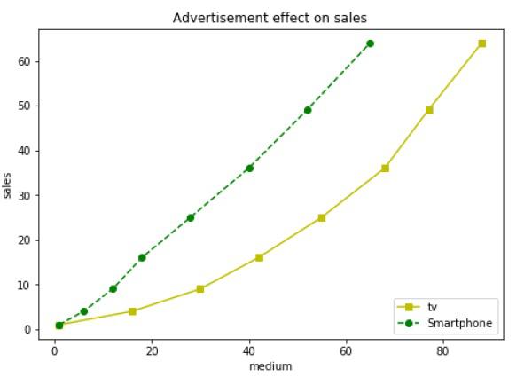
Following example shows the advertisement expenses and sales figures of TV and smartphone in the form of line plots. Line representing TV is a solid line with yellow colour and square markers whereas smartphone line is a dashed line with green colour and circle marker.
import matplotlib.pyplot as plt
y = [1, 4, 9, 16, 25,36,49, 64]
x1 = [1, 16, 30, 42,55, 68, 77,88]
x2 = [1,6,12,18,28, 40, 52, 65]
fig = plt.figure()
ax = fig.add_axes([0,0,1,1])
l1 = ax.plot(x1,y,'ys-') # solid line with yellow colour and square marker
l2 = ax.plot(x2,y,'go--') # dash line with green colour and circle marker
ax.legend(labels = ('tv', 'Smartphone'), loc = 'lower right') # legend placed at lower right
ax.set_title("Advertisement effect on sales")
ax.set_xlabel('medium')
ax.set_ylabel('sales')
plt.show()
When the above line of code is executed, it produces the following plot −

Matplotlib - Multiplots
In this chapter, we will learn how to create multiple subplots on same canvas.
The subplot() function returns the axes object at a given grid position. The Call signature of this function is −
plt.subplot(subplot(nrows, ncols, index)
In the current figure, the function creates and returns an Axes object, at position index of a grid of nrows by ncolsaxes. Indexes go from 1 to nrows * ncols, incrementing in row-major order.Ifnrows, ncols and index are all less than 10. The indexes can also be given as single, concatenated, threedigitnumber.
For example, subplot(2, 3, 3) and subplot(233) both create an Axes at the top right corner of the current figure, occupying half of the figure height and a third of the figure width.
Creating a subplot will delete any pre-existing subplot that overlaps with it beyond sharing a boundary.
import matplotlib.pyplot as plt
# plot a line, implicitly creating a subplot(111)
plt.plot([1,2,3])
# now create a subplot which represents the top plot of a grid with 2 rows and 1 column.
#Since this subplot will overlap the first, the plot (and its axes) previously
created, will be removed
plt.subplot(211)
plt.plot(range(12))
plt.subplot(212, facecolor='y') # creates 2nd subplot with yellow background
plt.plot(range(12))
The above line of code generates the following output −

The add_subplot() function of the figure class will not overwrite the existing plot −
import matplotlib.pyplot as plt
fig = plt.figure()
ax1 = fig.add_subplot(111)
ax1.plot([1,2,3])
ax2 = fig.add_subplot(221, facecolor='y')
ax2.plot([1,2,3])
When the above line of code is executed, it generates the following output −

You can add an insert plot in the same figure by adding another axes object in the same figure canvas.
import matplotlib.pyplot as plt
import numpy as np
import math
x = np.arange(0, math.pi*2, 0.05)
fig=plt.figure()
axes1 = fig.add_axes([0.1, 0.1, 0.8, 0.8]) # main axes
axes2 = fig.add_axes([0.55, 0.55, 0.3, 0.3]) # inset axes
y = np.sin(x)
axes1.plot(x, y, 'b')
axes2.plot(x,np.cos(x),'r')
axes1.set_title('sine')
axes2.set_title("cosine")
plt.show()
Upon execution of the above line of code, the following output is generated −

Matplotlib - Subplots() Function
Matplotlib’spyplot API has a convenience function called subplots() which acts as a utility wrapper and helps in creating common layouts of subplots, including the enclosing figure object, in a single call.
Plt.subplots(nrows, ncols)
The two integer arguments to this function specify the number of rows and columns of the subplot grid. The function returns a figure object and a tuple containing axes objects equal to nrows*ncols. Each axes object is accessible by its index. Here we create a subplot of 2 rows by 2 columns and display 4 different plots in each subplot.
import matplotlib.pyplot as plt
fig,a =  plt.subplots(2,2)
import numpy as np
x = np.arange(1,5)
a[0][0].plot(x,x*x)
a[0][0].set_title('square')
a[0][1].plot(x,np.sqrt(x))
a[0][1].set_title('square root')
a[1][0].plot(x,np.exp(x))
a[1][0].set_title('exp')
a[1][1].plot(x,np.log10(x))
a[1][1].set_title('log')
plt.show()
The above line of code generates the following output −

Matplotlib - Subplot2grid() Function
This function gives more flexibility in creating an axes object at a specific location of the grid. It also allows the axes object to be spanned across multiple rows or columns.
Plt.subplot2grid(shape, location, rowspan, colspan)
In the following example, a 3X3 grid of the figure object is filled with axes objects of varying sizes in row and column spans, each showing a different plot.
import matplotlib.pyplot as plt
a1 = plt.subplot2grid((3,3),(0,0),colspan = 2)
a2 = plt.subplot2grid((3,3),(0,2), rowspan = 3)
a3 = plt.subplot2grid((3,3),(1,0),rowspan = 2, colspan = 2)
import numpy as np
x = np.arange(1,10)
a2.plot(x, x*x)
a2.set_title('square')
a1.plot(x, np.exp(x))
a1.set_title('exp')
a3.plot(x, np.log(x))
a3.set_title('log')
plt.tight_layout()
plt.show()
Upon execution of the above line code, the following output is generated −

Matplotlib - Grids
The grid() function of axes object sets visibility of grid inside the figure to on or off. You can also display major / minor (or both) ticks of the grid. Additionally color, linestyle and linewidth properties can be set in the grid() function.
import matplotlib.pyplot as plt
import numpy as np
fig, axes = plt.subplots(1,3, figsize = (12,4))
x = np.arange(1,11)
axes[0].plot(x, x**3, 'g',lw=2)
axes[0].grid(True)
axes[0].set_title('default grid')
axes[1].plot(x, np.exp(x), 'r')
axes[1].grid(color='b', ls = '-.', lw = 0.25)
axes[1].set_title('custom grid')
axes[2].plot(x,x)
axes[2].set_title('no grid')
fig.tight_layout()
plt.show()

Matplotlib - Formatting Axes
Sometimes, one or a few points are much larger than the bulk of data. In such a case, the scale of an axis needs to be set as logarithmic rather than the normal scale. This is the Logarithmic scale. In Matplotlib, it is possible by setting xscale or vscale property of axes object to ‘log’.
It is also required sometimes to show some additional distance between axis numbers and axis label. The labelpad property of either axis (x or y or both) can be set to the desired value.
Both the above features are demonstrated with the help of the following example. The subplot on the right has a logarithmic scale and one on left has its x axis having label at more distance.
import matplotlib.pyplot as plt
import numpy as np
fig, axes = plt.subplots(1, 2, figsize=(10,4))
x = np.arange(1,5)
axes[0].plot( x, np.exp(x))
axes[0].plot(x,x**2)
axes[0].set_title("Normal scale")
axes[1].plot (x, np.exp(x))
axes[1].plot(x, x**2)
axes[1].set_yscale("log")
axes[1].set_title("Logarithmic scale (y)")
axes[0].set_xlabel("x axis")
axes[0].set_ylabel("y axis")
axes[0].xaxis.labelpad = 10
axes[1].set_xlabel("x axis")
axes[1].set_ylabel("y axis")
plt.show()

Axis spines are the lines connecting axis tick marks demarcating boundaries of plot area. The axes object has spines located at top, bottom, left and right.
Each spine can be formatted by specifying color and width. Any edge can be made invisible if its color is set to none.
import matplotlib.pyplot as plt
fig = plt.figure()
ax = fig.add_axes([0,0,1,1])
ax.spines['bottom'].set_color('blue')
ax.spines['left'].set_color('red')
ax.spines['left'].set_linewidth(2)
ax.spines['right'].set_color(None)
ax.spines['top'].set_color(None)
ax.plot([1,2,3,4,5])
plt.show()

Matplotlib - Setting Limits
Matplotlib automatically arrives at the minimum and maximum values of variables to be displayed along x, y (and z axis in case of 3D plot) axes of a plot. However, it is possible to set the limits explicitly by using set_xlim() and set_ylim() functions.
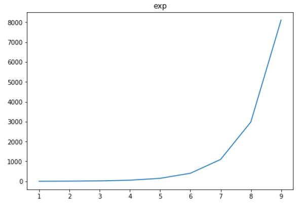
In the following plot, the autoscaled limits of x and y axes are shown −
import matplotlib.pyplot as plt
fig = plt.figure()
a1 = fig.add_axes([0,0,1,1])
import numpy as np
x = np.arange(1,10)
a1.plot(x, np.exp(x))
a1.set_title('exp')
plt.show()

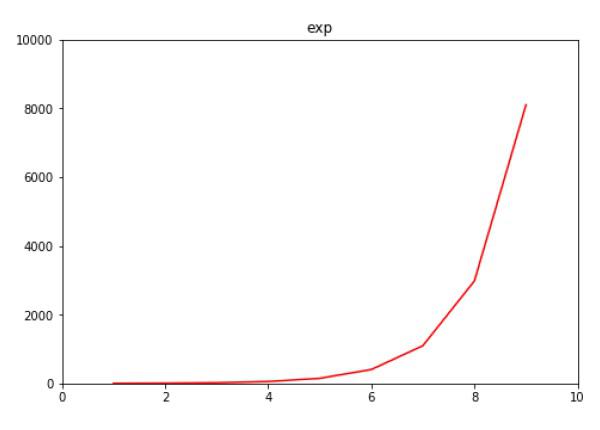
Now we format the limits on x axis to (0 to 10) and y axis (0 to 10000) −
import matplotlib.pyplot as plt
fig = plt.figure()
a1 = fig.add_axes([0,0,1,1])
import numpy as np
x = np.arange(1,10)
a1.plot(x, np.exp(x),'r')
a1.set_title('exp')
a1.set_ylim(0,10000)
a1.set_xlim(0,10)
plt.show()

Matplotlib - Setting Ticks and Tick Labels
Ticks are the markers denoting data points on axes. Matplotlib has so far - in all our previous examples - automatically taken over the task of spacing points on the axis.Matplotlib's default tick locators and formatters are designed to be generally sufficient in many common situations. Position and labels of ticks can be explicitly mentioned to suit specific requirements.
The xticks() and yticks() function takes a list object as argument. The elements in the list denote the positions on corresponding action where ticks will be displayed.
ax.set_xticks([2,4,6,8,10])
This method will mark the data points at the given positions with ticks.
Similarly, labels corresponding to tick marks can be set by set_xlabels() and set_ylabels() functions respectively.
ax.set_xlabels([‘two’, ‘four’,’six’, ‘eight’, ‘ten’])
This will display the text labels below the markers on the x axis.
Following example demonstrates the use of ticks and labels.
import matplotlib.pyplot as plt
import numpy as np
import math
x = np.arange(0, math.pi*2, 0.05)
fig = plt.figure()
ax = fig.add_axes([0.1, 0.1, 0.8, 0.8]) # main axes
y = np.sin(x)
ax.plot(x, y)
ax.set_xlabel(‘angle’)
ax.set_title('sine')
ax.set_xticks([0,2,4,6])
ax.set_xticklabels(['zero','two','four','six'])
ax.set_yticks([-1,0,1])
plt.show()

Matplotlib - Twin Axes
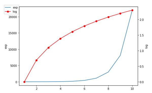
It is considered useful to have dual x or y axes in a figure. Moreso, when plotting curves with different units together. Matplotlib supports this with the twinxand twiny functions.
In the following example, the plot has dual y axes, one showing exp(x) and the other showing log(x) −
import matplotlib.pyplot as plt
import numpy as np
fig = plt.figure()
a1 = fig.add_axes([0,0,1,1])
x = np.arange(1,11)
a1.plot(x,np.exp(x))
a1.set_ylabel('exp')
a2 = a1.twinx()
a2.plot(x, np.log(x),'ro-')
a2.set_ylabel('log')
fig.legend(labels = ('exp','log'),loc='upper left')
plt.show()

Matplotlib - Bar Plot
A bar chart or bar graph is a chart or graph that presents categorical data with rectangular bars with heights or lengths proportional to the values that they represent. The bars can be plotted vertically or horizontally.
A bar graph shows comparisons among discrete categories. One axis of the chart shows the specific categories being compared, and the other axis represents a measured value.
Matplotlib API provides the bar() function that can be used in the MATLAB style use as well as object oriented API. The signature of bar() function to be used with axes object is as follows −
ax.bar(x, height, width, bottom, align)
The function makes a bar plot with the bound rectangle of size (x −width = 2; x + width=2; bottom; bottom + height).
The parameters to the function are −
| x |
sequence of scalars representing the x coordinates of the bars. align controls if x is the bar center (default) or left edge. |
| height |
scalar or sequence of scalars representing the height(s) of the bars. |
| width |
scalar or array-like, optional. the width(s) of the bars default 0.8 |
| bottom |
scalar or array-like, optional. the y coordinate(s) of the bars default None. |
| align |
{‘center’, ‘edge’}, optional, default ‘center’ |
The function returns a Matplotlib container object with all bars.
Following is a simple example of the Matplotlib bar plot. It shows the number of students enrolled for various courses offered at an institute.
import matplotlib.pyplot as plt
fig = plt.figure()
ax = fig.add_axes([0,0,1,1])
langs = ['C', 'C++', 'Java', 'Python', 'PHP']
students = [23,17,35,29,12]
ax.bar(langs,students)
plt.show()

When comparing several quantities and when changing one variable, we might want a bar chart where we have bars of one color for one quantity value.
We can plot multiple bar charts by playing with the thickness and the positions of the bars. The data variable contains three series of four values. The following script will show three bar charts of four bars. The bars will have a thickness of 0.25 units. Each bar chart will be shifted 0.25 units from the previous one. The data object is a multidict containing number of students passed in three branches of an engineering college over the last four years.
import numpy as np
import matplotlib.pyplot as plt
data = [[30, 25, 50, 20],
[40, 23, 51, 17],
[35, 22, 45, 19]]
X = np.arange(4)
fig = plt.figure()
ax = fig.add_axes([0,0,1,1])
ax.bar(X + 0.00, data[0], color = 'b', width = 0.25)
ax.bar(X + 0.25, data[1], color = 'g', width = 0.25)
ax.bar(X + 0.50, data[2], color = 'r', width = 0.25)

The stacked bar chart stacks bars that represent different groups on top of each other. The height of the resulting bar shows the combined result of the groups.
The optional bottom parameter of the pyplot.bar() function allows you to specify a starting value for a bar. Instead of running from zero to a value, it will go from the bottom to the value. The first call to pyplot.bar() plots the blue bars. The second call to pyplot.bar() plots the red bars, with the bottom of the blue bars being at the top of the red bars.
import numpy as np
import matplotlib.pyplot as plt
N = 5
menMeans = (20, 35, 30, 35, 27)
womenMeans = (25, 32, 34, 20, 25)
ind = np.arange(N) # the x locations for the groups
width = 0.35
fig = plt.figure()
ax = fig.add_axes([0,0,1,1])
ax.bar(ind, menMeans, width, color='r')
ax.bar(ind, womenMeans, width,bottom=menMeans, color='b')
ax.set_ylabel('Scores')
ax.set_title('Scores by group and gender')
ax.set_xticks(ind, ('G1', 'G2', 'G3', 'G4', 'G5'))
ax.set_yticks(np.arange(0, 81, 10))
ax.legend(labels=['Men', 'Women'])
plt.show()

Matplotlib - Histogram
A histogram is an accurate representation of the distribution of numerical data. It is an estimate of the probability distribution of a continuous variable. It is a kind of bar graph.
To construct a histogram, follow these steps −
- Bin the range of values.
- Divide the entire range of values into a series of intervals.
- Count how many values fall into each interval.
The bins are usually specified as consecutive, non-overlapping intervals of a variable.
The matplotlib.pyplot.hist() function plots a histogram. It computes and draws the histogram of x.
Parameters
The following table lists down the parameters for a histogram −
| x |
array or sequence of arrays |
| bins |
integer or sequence or ‘auto’, optional |
| optional parameters |
| range |
The lower and upper range of the bins. |
| density |
If True, the first element of the return tuple will be the counts normalized to form a probability density |
| cumulative |
If True, then a histogram is computed where each bin gives the counts in that bin plus all bins for smaller values. |
| histtype |
The type of histogram to draw. Default is ‘bar’
- ‘bar’ is a traditional bar-type histogram. If multiple data are given the bars are arranged side by side.
- ‘barstacked’ is a bar-type histogram where multiple data are stacked on top of each other.
- ‘step’ generates a lineplot that is by default unfilled.
- ‘stepfilled’ generates a lineplot that is by default filled.
|
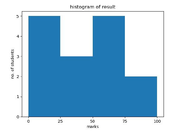
Following example plots a histogram of marks obtained by students in a class. Four bins, 0-25, 26-50, 51-75, and 76-100 are defined. The Histogram shows number of students falling in this range.
from matplotlib import pyplot as plt
import numpy as np
fig,ax = plt.subplots(1,1)
a = np.array([22,87,5,43,56,73,55,54,11,20,51,5,79,31,27])
ax.hist(a, bins = [0,25,50,75,100])
ax.set_title("histogram of result")
ax.set_xticks([0,25,50,75,100])
ax.set_xlabel('marks')
ax.set_ylabel('no. of students')
plt.show()
The plot appears as shown below −

Matplotlib - Pie Chart
A Pie Chart can only display one series of data. Pie charts show the size of items (called wedge) in one data series, proportional to the sum of the items. The data points in a pie chart are shown as a percentage of the whole pie.
Matplotlib API has a pie() function that generates a pie diagram representing data in an array. The fractional area of each wedge is given by x/sum(x). If sum(x)< 1, then the values of x give the fractional area directly and the array will not be normalized. Theresulting pie will have an empty wedge of size 1 - sum(x).
The pie chart looks best if the figure and axes are square, or the Axes aspect is equal.
Parameters
Following table lists down the parameters foe a pie chart −
| x |
array-like. The wedge sizes. |
| labels |
list. A sequence of strings providing the labels for each wedge. |
| Colors |
A sequence of matplotlibcolorargs through which the pie chart will cycle. If None, will use the colors in the currently active cycle. |
| Autopct |
string, used to label the wedges with their numeric value. The label will be placed inside the wedge. The format string will be fmt%pct. |
Following code uses the pie() function to display the pie chart of the list of students enrolled for various computer language courses. The proportionate percentage is displayed inside the respective wedge with the help of autopct parameter which is set to %1.2f%.
from matplotlib import pyplot as plt
import numpy as np
fig = plt.figure()
ax = fig.add_axes([0,0,1,1])
ax.axis('equal')
langs = ['C', 'C++', 'Java', 'Python', 'PHP']
students = [23,17,35,29,12]
ax.pie(students, labels = langs,autopct='%1.2f%%')
plt.show()

Matplotlib - Scatter Plot
Scatter plots are used to plot data points on horizontal and vertical axis in the attempt to show how much one variable is affected by another. Each row in the data table is represented by a marker the position depends on its values in the columns set on the X and Y axes. A third variable can be set to correspond to the color or size of the markers, thus adding yet another dimension to the plot.
The script below plots a scatter diagram of grades range vs grades of boys and girls in two different colors.
import matplotlib.pyplot as plt
girls_grades = [89, 90, 70, 89, 100, 80, 90, 100, 80, 34]
boys_grades = [30, 29, 49, 48, 100, 48, 38, 45, 20, 30]
grades_range = [10, 20, 30, 40, 50, 60, 70, 80, 90, 100]
fig=plt.figure()
ax=fig.add_axes([0,0,1,1])
ax.scatter(grades_range, girls_grades, color='r')
ax.scatter(grades_range, boys_grades, color='b')
ax.set_xlabel('Grades Range')
ax.set_ylabel('Grades Scored')
ax.set_title('scatter plot')
plt.show()

Matplotlib - Contour Plot
Contour plots (sometimes called Level Plots) are a way to show a three-dimensional surface on a two-dimensional plane. It graphs two predictor variables X Y on the y-axis and a response variable Z as contours. These contours are sometimes called the z-slices or the iso-response values.
A contour plot is appropriate if you want to see how alue Z changes as a function of two inputs X and Y, such that Z = f(X,Y). A contour line or isoline of a function of two variables is a curve along which the function has a constant value.
The independent variables x and y are usually restricted to a regular grid called meshgrid. The numpy.meshgrid creates a rectangular grid out of an array of x values and an array of y values.
Matplotlib API contains contour() and contourf() functions that draw contour lines and filled contours, respectively. Both functions need three parameters x,y and z.
import numpy as np
import matplotlib.pyplot as plt
xlist = np.linspace(-3.0, 3.0, 100)
ylist = np.linspace(-3.0, 3.0, 100)
X, Y = np.meshgrid(xlist, ylist)
Z = np.sqrt(X**2 + Y**2)
fig,ax=plt.subplots(1,1)
cp = ax.contourf(X, Y, Z)
fig.colorbar(cp) # Add a colorbar to a plot
ax.set_title('Filled Contours Plot')
#ax.set_xlabel('x (cm)')
ax.set_ylabel('y (cm)')
plt.show()

Matplotlib - Quiver Plot
A quiver plot displays the velocity vectors as arrows with components (u,v) at the points (x,y).
quiver(x,y,u,v)
The above command plots vectors as arrows at the coordinates specified in each corresponding pair of elements in x and y.
Parameters
The following table lists down the different parameters for the Quiver plot −
| x |
1D or 2D array, sequence. The x coordinates of the arrow locations |
| y |
1D or 2D array, sequence. The y coordinates of the arrow locations |
| u |
1D or 2D array, sequence. The x components of the arrow vectors |
| v |
1D or 2D array, sequence. The y components of the arrow vectors |
| c |
1D or 2D array, sequence. The arrow colors |
The following code draws a simple quiver plot −
import matplotlib.pyplot as plt
import numpy as np
x,y = np.meshgrid(np.arange(-2, 2, .2), np.arange(-2, 2, .25))
z = x*np.exp(-x**2 - y**2)
v, u = np.gradient(z, .2, .2)
fig, ax = plt.subplots()
q = ax.quiver(x,y,u,v)
plt.show()

Matplotlib - Box Plot
A box plot which is also known as a whisker plot displays a summary of a set of data containing the minimum, first quartile, median, third quartile, and maximum. In a box plot, we draw a box from the first quartile to the third quartile. A vertical line goes through the box at the median. The whiskers go from each quartile to the minimum or maximum.

Let us create the data for the boxplots. We use the numpy.random.normal() function to create the fake data. It takes three arguments, mean and standard deviation of the normal distribution, and the number of values desired.
np.random.seed(10)
collectn_1 = np.random.normal(100, 10, 200)
collectn_2 = np.random.normal(80, 30, 200)
collectn_3 = np.random.normal(90, 20, 200)
collectn_4 = np.random.normal(70, 25, 200)
The list of arrays that we created above is the only required input for creating the boxplot. Using the data_to_plot line of code, we can create the boxplot with the following code −
fig = plt.figure()
# Create an axes instance
ax = fig.add_axes([0,0,1,1])
# Create the boxplot
bp = ax.boxplot(data_to_plot)
plt.show()
The above line of code will generate the following output −

Matplotlib - Violin Plot
Violin plots are similar to box plots, except that they also show the probability density of the data at different values. These plots include a marker for the median of the data and a box indicating the interquartile range, as in the standard box plots. Overlaid on this box plot is a kernel density estimation. Like box plots, violin plots are used to represent comparison of a variable distribution (or sample distribution) across different "categories".
A violin plot is more informative than a plain box plot. In fact while a box plot only shows summary statistics such as mean/median and interquartile ranges, the violin plot shows the full distribution of the data.
import matplotlib.pyplot as plt

np.random.seed(10)
collectn_1 = np.random.normal(100, 10, 200)
collectn_2 = np.random.normal(80, 30, 200)
collectn_3 = np.random.normal(90, 20, 200)
collectn_4 = np.random.normal(70, 25, 200)

## combine these different collections into a list
data_to_plot = [collectn_1, collectn_2, collectn_3, collectn_4]

# Create a figure instance
fig = plt.figure()

# Create an axes instance
ax = fig.add_axes([0,0,1,1])

# Create the boxplot
bp = ax.violinplot(data_to_plot)
plt.show()

Matplotlib - Three-dimensional Plotting
Even though Matplotlib was initially designed with only two-dimensional plotting in mind, some three-dimensional plotting utilities were built on top of Matplotlib's two-dimensional display in later versions, to provide a set of tools for three-dimensional data visualization. Three-dimensional plots are enabled by importing the mplot3d toolkit, included with the Matplotlib package.
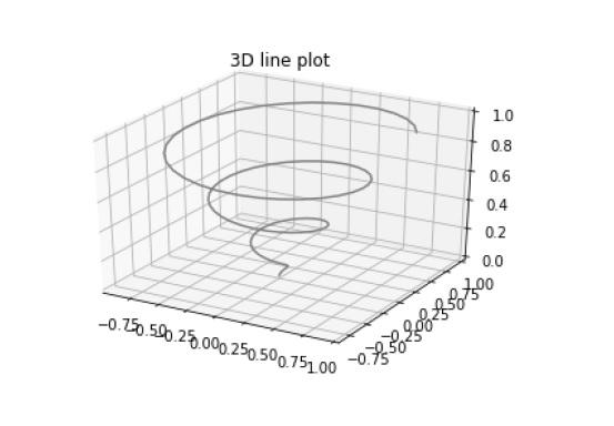
A three-dimensional axes can be created by passing the keyword projection='3d' to any of the normal axes creation routines.
from mpl_toolkits import mplot3d
import numpy as np
import matplotlib.pyplot as plt
fig = plt.figure()
ax = plt.axes(projection='3d')
z = np.linspace(0, 1, 100)
x = z * np.sin(20 * z)
y = z * np.cos(20 * z)
ax.plot3D(x, y, z, 'gray')
ax.set_title('3D line plot')
plt.show()
We can now plot a variety of three-dimensional plot types. The most basic three-dimensional plot is a 3D line plot created from sets of (x, y, z) triples. This can be created using the ax.plot3D function.

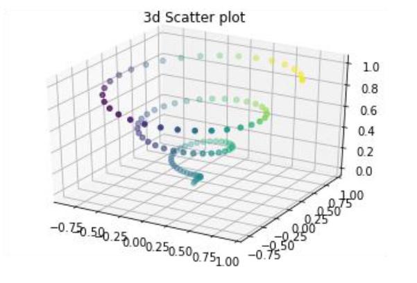
3D scatter plot is generated by using the ax.scatter3D function.
from mpl_toolkits import mplot3d
import numpy as np
import matplotlib.pyplot as plt
fig = plt.figure()
ax = plt.axes(projection='3d')
z = np.linspace(0, 1, 100)
x = z * np.sin(20 * z)
y = z * np.cos(20 * z)
c = x + y
ax.scatter(x, y, z, c=c)
ax.set_title('3d Scatter plot')
plt.show()

Matplotlib - 3D Contour Plot
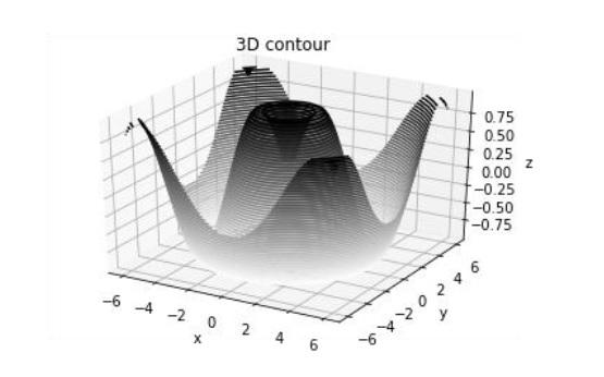
The ax.contour3D() function creates three-dimensional contour plot. It requires all the input data to be in the form of two-dimensional regular grids, with the Z-data evaluated at each point. Here, we will show a three-dimensional contour diagram of a three-dimensional sinusoidal function.
from mpl_toolkits import mplot3d
import numpy as np
import matplotlib.pyplot as plt
def f(x, y):
   return np.sin(np.sqrt(x ** 2 + y ** 2))

x = np.linspace(-6, 6, 30)
y = np.linspace(-6, 6, 30)

X, Y = np.meshgrid(x, y)
Z = f(X, Y)

fig = plt.figure()
ax = plt.axes(projection='3d')
ax.contour3D(X, Y, Z, 50, cmap='binary')
ax.set_xlabel('x')
ax.set_ylabel('y')
ax.set_zlabel('z')
ax.set_title('3D contour')
plt.show()

Matplotlib - 3D Wireframe plot
Wireframe plot takes a grid of values and projects it onto the specified three-dimensional surface, and can make the resulting three-dimensional forms quite easy to visualize. The plot_wireframe() function is used for the purpose −
from mpl_toolkits import mplot3d
import numpy as np
import matplotlib.pyplot as plt
def f(x, y):
   return np.sin(np.sqrt(x ** 2 + y ** 2))

x = np.linspace(-6, 6, 30)
y = np.linspace(-6, 6, 30)

X, Y = np.meshgrid(x, y)
Z = f(X, Y)

fig = plt.figure()
ax = plt.axes(projection='3d')
ax.plot_wireframe(X, Y, Z, color='black')
ax.set_title('wireframe')
plt.show()
The above line of code will generate the following output −

Matplotlib - 3D Surface plot
Surface plot shows a functional relationship between a designated dependent variable (Y), and two independent variables (X and Z). The plot is a companion plot to the contour plot. A surface plot is like a wireframe plot, but each face of the wireframe is a filled polygon. This can aid perception of the topology of the surface being visualized. The plot_surface() function x,y and z as arguments.
from mpl_toolkits import mplot3d
import numpy as np
import matplotlib.pyplot as plt
x = np.outer(np.linspace(-2, 2, 30), np.ones(30))
y = x.copy().T # transpose
z = np.cos(x ** 2 + y ** 2)

fig = plt.figure()
ax = plt.axes(projection='3d')

ax.plot_surface(x, y, z,cmap='viridis', edgecolor='none')
ax.set_title('Surface plot')
plt.show()
The above line of code will generate the following output −

Matplotlib - Working With Text
Matplotlib has extensive text support, including support for mathematical expressions, TrueType support for raster and vector outputs, newline separated text with arbitrary rotations, and unicode support. Matplotlib includes its own matplotlib.font_manager which implements a cross platform, W3C compliant font finding algorithm.
The user has a great deal of control over text properties (font size, font weight, text location and color, etc.). Matplotlib implements a large number of TeX math symbols and commands.
The following list of commands are used to create text in the Pyplot interface −
| text |
Add text at an arbitrary location of the Axes. |
| annotate |
Add an annotation, with an optional arrow, at an arbitrary location of theAxes. |
| xlabel |
Add a label to the Axes’s x-axis. |
| ylabel |
Add a label to the Axes’s y-axis. |
| title |
Add a title to the Axes. |
| figtext |
Add text at an arbitrary location of the Figure. |
| suptitle |
Add a title to the Figure. |
All of these functions create and return a matplotlib.text.Text() instance.
Following scripts demonstrate the use of some of the above functions −
import matplotlib.pyplot as plt
fig = plt.figure()

ax = fig.add_axes([0,0,1,1])

ax.set_title('axes title')
ax.set_xlabel('xlabel')
ax.set_ylabel('ylabel')
ax.text(3, 8, 'boxed italics text in data coords', style='italic',
bbox = {'facecolor': 'red'})
ax.text(2, 6, r'an equation: $E = mc^2$', fontsize = 15)
ax.text(4, 0.05, 'colored text in axes coords',
verticalalignment = 'bottom', color = 'green', fontsize = 15)
ax.plot([2], [1], 'o')
ax.annotate('annotate', xy = (2, 1), xytext = (3, 4),
arrowprops = dict(facecolor = 'black', shrink = 0.05))
ax.axis([0, 10, 0, 10])
plt.show()
The above line of code will generate the following output −

Matplotlib - Mathematical Expressions
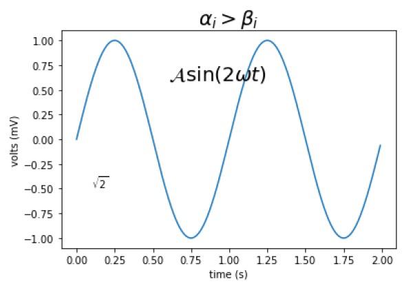
You can use a subset TeXmarkup in any Matplotlib text string by placing it inside a pair of dollar signs ($).
# math text
plt.title(r'$\alpha > \beta$')
To make subscripts and superscripts, use the '_' and '^' symbols −
r'$\alpha_i> \beta_i$'

import numpy as np
import matplotlib.pyplot as plt
t = np.arange(0.0, 2.0, 0.01)
s = np.sin(2*np.pi*t)

plt.plot(t,s)
plt.title(r'$\alpha_i> \beta_i$', fontsize=20)

plt.text(0.6, 0.6, r'$\mathcal{A}\mathrm{sin}(2 \omega t)$', fontsize = 20)
plt.text(0.1, -0.5, r'$\sqrt{2}$', fontsize=10)
plt.xlabel('time (s)')
plt.ylabel('volts (mV)')
plt.show()
The above line of code will generate the following output −

Matplotlib - Working with Images
The image module in Matplotlib package provides functionalities required for loading, rescaling and displaying image.
Loading image data is supported by the Pillow library. Natively, Matplotlib only supports PNG images. The commands shown below fall back on Pillow if the native read fails.
The image used in this example is a PNG file, but keep that Pillow requirement in mind for your own data. The imread() function is used to read image data in an ndarray object of float32 dtype.
import matplotlib.pyplot as plt
import matplotlib.image as mpimg
import numpy as np
img = mpimg.imread('mtplogo.png')
Assuming that following image named as mtplogo.png is present in the current working directory.

Any array containing image data can be saved to a disk file by executing the imsave() function. Here a vertically flipped version of the original png file is saved by giving origin parameter as lower.
plt.imsave("logo.png", img, cmap = 'gray', origin = 'lower')
The new image appears as below if opened in any image viewer.

To draw the image on Matplotlib viewer, execute the imshow() function.
imgplot = plt.imshow(img)
Matplotlib - Transforms
The matplotlib package is built on top of a transformation framework to easily move between coordinate systems. Four coordinate systems can be used. The systems are described in brief in the table given below −
| Coordinate |
Transformation Object |
Description |
| Data |
ax.transData |
The user land data coordinate system. controlled by the xlim and ylim |
| Axes |
ax.transAxes |
The coordinate system of the Axes. (0,0) is bottom left and (1,1) is top right of the axes. |
| Figure |
fig.transFigure |
The coordinate system of the Figure. (0,0) is bottom left and (1,1) is top right of the figure
|
| display |
None |
This is the pixel coordinate system of the display. (0,0) is the bottom left and (width, height) is the top right of display in pixels.
Alternatively, the(matplotlib.transforms.IdentityTransform()) may be used instead of None.
|
Consider the following example −
axes.text(x,y,"my label")
The text is placed at the theoretical position of a data point (x,y). Thus we would speak of "data coords".
Using other transformation objects, placement can be controlled. For example, if the above test is to be placed in the centre of axes coordinate system, execute the following line of code −
axes.text(0.5, 0.5, "middle of graph", transform=axes.transAxes)
These transformations can be used for any kind of Matplotlib objects. The default transformation for ax.text is ax.transData and the default transformation for fig.text is fig.transFigure.
The axes coordinate system is extremely useful when placing text in your axes. You might often want a text bubble in a fixed location; for example, on the upper left of the axes pane and have that location remain fixed when you pan or zoom.


