Excel Power View - Quick Guide
Excel Power View - Overview
Power View enables interactive data exploration, visualization, and presentation that encourages intuitive ad-hoc reporting. Large data sets can be analyzed on the fly using versatile visualizations in Power View. The data visualizations are dynamic, thus facilitating ease of presentation of the data with a single Power View report.
Power View is based on the Data Model in your workbook. Either you can start with a Data Model that is already available in Power Pivot or you can create a Data Model from Power View itself. In this tutorial, we assume that you are aware of the Data Model concepts in Power Pivot. Otherwise, we suggest you to go through the Excel Power Pivot tutorial first.
Creating Power View
To create a Power View, first you need to make sure that the Power View add-in is enabled in your Excel. You can then create a Power View sheet that contains Power View, which can hold several different data visualizations based on your Data Model. You will learn how to create a Power View sheet and Power View in the chapter - Creating a Power View.
Understanding Power View Sheet
The Power View sheet has several components such as Power View canvas, Filters area, Power View Fields list, Power View Layout areas and Power View tabs on the Ribbon. You will learn about these components in the chapter – Understanding Power View Sheet.
Power View Visualizations
The core of the Power View is in its various types of data visualizations that will enable you to portray the data, visualize, and explore, all in a dynamic mode. You can handle large data sets spanning several thousands of data on the fly switching from one visualization to another, drilling up and drilling down the data displaying the essence of the data.
The different Power View visualizations that you can have are the following −
- Table
- Matrix
- Card
- Charts
- Line Chart
- Bar Chart
- Column Chart
- Scatter Chart
- Bubble Chart
- Map
You will learn about these visualizations in different chapters in this tutorial. You will also learn about combination of visualizations on a Power View and their interactive nature.
Visualization with Multiples
Another domain of Power View is its facility to visualize the Chart visualizations in Multiples. You can have a grid of Charts in Power View with the same axis. You can have Horizontal Multiples or Vertical Multiples. You will learn Multiples in Power View with different types of charts in the chapter - Visualization with Multiples.
Visualization with Tiles
When you have large data to display at a time, browsing up and down could take time. Power View makes this task very easy for you with Tiles. Tiles are containers on a navigation strip that is based on a field in your data. Clicking on a Tile is equivalent to selecting that value of the field and your visualization is filtered accordingly. You can have data bound images such as sport images for Tiles that will give a visual cue to your navigation strip. You will learn about Tiles in the chapter – Visualization with Tiles.
Advanced Features in Power View
Whenever you have to create a visualization, you need to first create a Table and then switch visualization to the required one. This would make you create the Tables several times during data exploration and reporting. Even after you decide on what fields to portray in your visualizations, you have to repeatedly select all these fields every time. Power View provides you with an advanced feature to define a default field set that enable you to select all the fields with a single click on the table name in the Power View Fields list.
You can set table behavior, filter all the visualizations together with the VIEW tab in filters, change the sort order of a field, filter visualizations with Slicers, add data labels and add a title to the Power View. You will learn about these and more in the chapter – Advanced Features in Power View.
Power View and Data Model
We said Power View is based on the Data Model. You can either work on the Data Model that is already present, as is the case in all the previous chapters, or create one from the Power View sheet. You will learn about adding data tables to Data Model, creating relationships between tables and modifying Data Model from Power View sheet in the chapter – Power View and Data Model.
Hierarchies in Power View
If you data has nested fields you can define a hierarchy so that you can treat all the nested fields as one field. You can have a defined hierarchy in the Data Model that you can visualize from Power View or you can create a hierarchy in Power View and use it for visualization. You can drill p and drill down the hierarchy in Matrix, Bar Chart, Column Chart and Pie Chart visualizations. You can filter hierarchy in Pie Chart with Column Chart. You will learn all these in the chapter – Hierarchies in Power View.
Key Performance Indicators (KPIs) in Power View
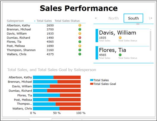
Key Performance Indicators (KPIs) enable you to track the progress against the set goals. You can create KPIs in the Data Model from Power View. You can then create appealing Power View visualizations that depict the KPIs and produce aesthetic reports. You can also edit the KPIs from Power View as it is possible that the KPIs might have to be modified as the time progresses. You will learn about KPIs in the chapter - Key Performance Indicators (KPIs) in Power View.
The chapter also has a brief introduction on KPIs, KPI parameters and how to identify KPIs. But, note that this is not exhaustive as KPIs depend on the field you have chosen to track the progress – for e.g. business performance, sales, HR, etc
Formatting a Power View Report
The Power View visualizations as you learn throughout the tutorial are ready to present any time, as they are all appealing and presentable. Because of the dynamic nature of the visualizations, it is easy to display the required results on the sport without much effort or time. As everything is visual, there will not be any need to preview the results. Hence, in Power View reporting is not the final step and can be at any point of time with your Power View and visualizations.
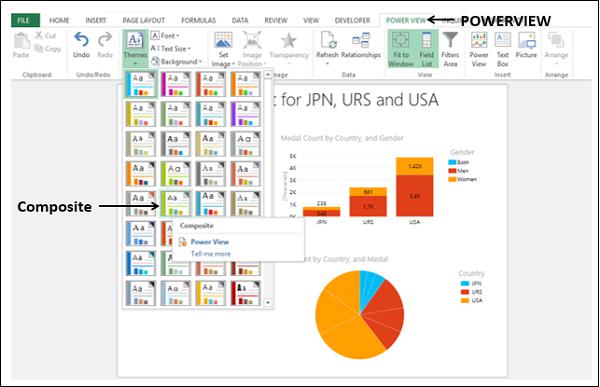
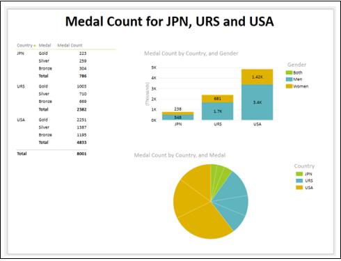
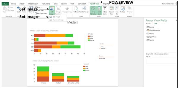
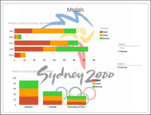
In the chapter – Formatting a Power View Report, you will learn some more features that can change the look and feel of your already appealing Power View reports. These include changing Theme, setting background image, changing background colors, font and text size, formatting numbers and changing number aggregates.
Sharing Your Work
You can share your work with the concerned as the Power View sheets in your Excel workbook itself on server / cloud by giving appropriate permissions to read /edit. As Power View is also available on SharePoint, you can share your Power View reports as SharePoint reports. You can print Power View sheets, but as they are static, it would not make much sense to print them because of their innate powerful features of interactivity and dynamic nature. You can publish Power View sheets to Power BI.
Data Acknowledgements
The data that is used to the maximum extent is the Olympics results data for the years 1900 – 2014. The data table has around 35,000 rows of data that could reveal the power features of the optimistic Data Model and Power View visualizations.
Sincere thanks to all those involved in providing this data onsite −
Last but not the least Microsoft Office Support that gave the idea of choosing Olympics data to render the power of Power View Visualizations.
Excel Power View - Creation
Power View is like a canvas on which you can have any number of visualizations based on your Data Model. You need to start with creating a Power View sheet and then add fields from the data tables to Power View to visualize and explore data.
Before you start your data exploration with Power View, make sure that the Power View add-in enabled and available on the Ribbon.
Click the INSERT tab on the Ribbon. Power View should be visible on the Ribbon in the Reports group.

Enabling Power View Add-in
If you do not find Power View on the Ribbon, you need to enable the Power View add-in.
Click the File tab on the Ribbon.
Click Options.
Click Add-Ins in the Excel Options dialog box.
Click the drop-down arrow in the Manage box.
Select COM Add-ins from the dropdown list and click Go.

The COM Add-ins dialog box appears. Check the box Power View and click OK.

Power View will be visible on the Ribbon.
Creating a Power View Sheet
You can create a Power View from the data tables in the Data Model.
Suppose you have the following Data Model in your workbook.

To create a Power View sheet, do the following −
- Click the INSERT tab on the Ribbon in Excel window.
- Click Power View in the Reports group.
Opening Power View message box appears with a horizontally scrolling green status bar. This might take a little while.

The Power View sheet is created as a worksheet in your Excel workbook. It contains an empty Power View area, Filters area and the Power View Fields list displaying the tables in the Data Model. Power View appears as a tab on the Ribbon in the Power View sheet.

You will understand these different parts of the Power View sheet in the next chapter.
Creating a Power View
In this section, you will understand how to create a Power View in the Power View sheet.
Suppose you want to display the medals that each country has won.
Select the fields Country and Medal from the Results table. These two fields appear under FIELDS in the Areas. Power View will be displayed as a Table with the two selected fields as columns.

As you can see, Power View is displaying which medals each country has won.
- Click the Title of the Power View sheet.
- Type Medals.

Excel Power View - Sheet
In the previous chapter, you have created a Power View sheet and a Power View on the Power View sheet. Note that you can create multiple Power Views on a Power View sheet. They are called Visualizations. You will learn about the various different visualizations that you can create on a Power View sheet in the subsequent chapters. Before you learn about the different visualizations, you need to understand the various parts of the Power View sheet.
Power View Sheet Layout
The Power View sheet layout looks as follows −

You can find the following different parts on the Power View sheet.
- Power View Area.
- Power View Visualizations.
- Power View Title.
- Power View Fields List.
- Filters.
Power View Area
Power View area is like a canvas on which you can create multiple different visualizations based on the data in the Data Model. You can have multiple visualizations in the Power View area and work on them either collectively or separately. To create a new visualization, you need to click on an empty part of the Power View area, and select the fields that you want to display in the visualization.
Power View Visualizations
The variety of visualizations that Power View provides is the strength of Power View. You can have any number of visualizations on the Power View area and each with different size and different layout. For example, you can have a Table visualization, a Chart visualization and a Map visualization on a single Power View. The fields that are displayed in the visualizations can be individually chosen.
The sizes of the visualizations can be different.
To resize a visualization, do the following −
Click on the symbol  in the top right corner, or
Click on the symbol  in the bottom right corner and pull the arrow that appears
Pop out and Pop in
You can make a visualization to occupy the entire Power View area with the Pop out button  that appears on the top right corner of the visualization.


The Table visualization reverts to the original size.
Power View Fields List
The Power View Fields list displays all the tables in the Data Model and the corresponding fields. By selecting the fields, you can display the required data in a visualization. Note that you can choose different fields for the different visualizations on a Power View sheet. This makes Power View a versatile and collective tool to visualize the different aspects of the data in the Data Model.
While the selected fields in the Power View Fields list determine what data is to be displayed in a visualization, the areas below the Fields list determine how the data is to be displayed. For example, you might choose to display the fields - Country, Sport, Gender, and Medal Count in the visualization. While placing these fields in the Areas, you can opt to display Gender as a Legend. You will learn the different types of Areas and the way they can change the layout of a visualization in the subsequent chapters.
Title
The Title in a Power View sheet is for the entire sheet. Therefore, while giving a Title, see to that it meets the objective of the entire Power View report.
Filters
The Filters area allows you to filter the fields for specific data that is to be displayed. You can choose to apply a filter to the entire View, i.e. all the visualizations or only the selected visualization.
Click Table visualization.

As you can observe, the Filters area has two tabs – VIEW and TABLE.
If you click the tab TABLE and apply the filters to fields, only the data in the selected TABLE visualization will be filtered.
If you click on the tab VIEW and apply the filters to fields, the data in all the visualizations in the Power View sheet will be filtered.
If the visualization is other than Table, say Matrix, then the tabs in the Filters area will be VIEW and MATRIX.
You will learn about Filters in detail in the chapter - Combination of Power View Visualizations.
Power View Tabs on the Ribbon
Power View has three tabs on the Ribbon − Power View, Design, and Layout.
When you create a Power View Sheet, the tab – POWER VIEW is added to the Ribbon.

When you create a Power View (visualization) such as Table visualization and click it, the tab – DESIGN is added to the Ribbon.

When you switch visualization to a Chart or Map, the tab – LAYOUT is added to the Ribbon.

Excel Power View - Visualizations
Power View is an interactive data exploration and visualization tool in Excel. Power View supports various visualizations such as Tables, Matrices, Cards, Charts such as Bar, Column, Scatter, Line, Pie and Bubble Charts and Maps. You can also create sets of multiple charts (charts with same axis) in Power View.
In this chapter, you will understand each Power View visualization briefly. You will understand the details in the subsequent chapters.
Table Visualization
For every visualization that you want to create on a Power View sheet, you have to start by creating a Table first. You can then quickly switch among the visualizations to find the one that best suits your data.
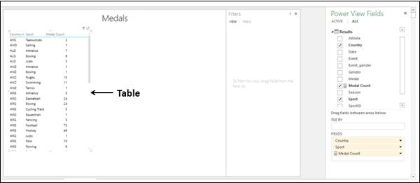
The Table looks like any other data table with columns representing fields and rows representing data values. You can select and deselect fields in the Power View Fields list to choose the fields that are to be displayed in the Table.

Switch Visualization
Once you create a Table visualization that is default, you can convert it into any other visualization as follows −

There are several visualization options in the Switch Visualization group on the Ribbon. You can choose any of these options.
Matrix Visualization
Matrix Visualization is similar to a Table Visualization as it also contains rows and columns of data. However, a matrix has some additional features such as displaying the data without repeating values, displaying totals and subtotals by columns and/or rows, drill down/drill up a hierarchy, etc.

Card Visualization
In a card visualization, you will have a series of snapshots that display the data from each row in the table, laid out like an index card.

Chart Visualizations
In Power View, you have a number of Chart options: Bar, Column, Line, Scatter, Bubble, and Pie.

Map Visualization
If your data has fields pertaining to geography, you can use Maps in Power View to display the values. Maps in Power View use Bing map tiles and hence you need to make sure that you are online when you are displaying a Map visualization.

You can use Pie Charts for data points in a Map Visualization.

Excel Power View - Table Visualization
In Power View, for every visualization you want to create, you start by creating a Table, which is the default and then convert the Table to other visualizations easily.
The Table looks like any other data table with columns representing fields and rows representing data values. You can select and deselect fields in the Power View Fields list to choose the fields that are to be displayed in the Table. The fields can be from the same data table or from different related data tables.
Creating a Table
To create a Table in Power View, do the following −
- Click on the Power View area.
- Click on the table – Results in the Power View Fields list.
- Select the fields Country, Sport, and Medal.
A Table will be displayed on Power View with selected fields as columns, containing the actual values.

Understanding Table Visualization
You can see that the selected fields appear in the FIELDS area under the Power View Fields list. The columns are formatted according to their data type, as defined in the data model that the report is based on.
The order of the fields in the FIELDS area represents the order of the columns in the Table. You can change the order by dragging the fields in the FIELDS area. You can sort the Table by any column by clicking on the column name. The sort order can be ascending or descending by values.
You can filter the data in the Table by choosing the filtering options in the Filters area, under the Table tab. You can add fields to the Table by dragging the field either to the Table in Power View or to the FIELDS area. If you drag a field to the Power View area and not to the Table, a new Table is displayed.
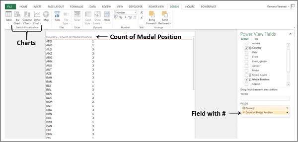
Adding a Field to Table as Count
Suppose you want to display the Medal Count as a column. You can do it by adding the field Medal to the Table as Count.
- Click the arrow next to the field, Medal, in the Power View Fields list.
- Select Add to Table as Count from the dropdown list.

A new column Count of Medal will be added to the Table, displaying the Medal Count values.

Adding a Count Field to Table
As your data has more than 34000 rows, adding the field Medal as Count to the Table is not an efficient approach, as Power View has to do the calculation whenever you change the layout of the Table.
The more effective way is to add a calculated field to the Medals data table in the Data Model.
- Click on the PowerPivot tab on the Ribbon.
- Click on Manage in the Data Model group. The tables in the Data Model will be displayed.
- Click on the Results tab.
- In the Results table, in the calculation area, in the cell below the Medal column, type the following DAX formula
Medal Count:=COUNTA([Medal])

You can see that the medal count formula appears in the formula bar and to the left of the formula bar, the column name Medal is displayed.
In the Power View sheet, you will get a Power View message that the Data Model is changed and if you click OK, the changes will be reflected in your Power View. Click OK.

In the Power View Fields list, you can observe the following −
A new field Medal Count is added in the Results table.
A calculator icon appears adjacent to the field Medal Count, indicating that it is a calculated field.
Select the fields – Country, Sport, and Medal Count.
Your Power View Table displays the medal count country wise and sport wise.

Filtering Table in Power View
You can filter the values displayed in the Table by defining the filter criteria.
- Click the TABLE tab in the Filters area.
- Click Medal Count.
- Click the icon Advanced filter mode to the right of Medal Count.


The Table will display only those records with Medal Count >= 100.

Excel Power View - Matrix Visualization
Matrix visualization is similar to a Table visualization in that it also contains rows and columns of data. However, a Matrix has additional features such as hierarchy, not repeating values, etc.
As you have learnt in the previous chapters, you need to start with a Table and then convert it to Matrix.
Choose the fields – Country, Sport, and Medal Count. A Table representing these fields appears in Power View.

Switching to Matrix Visualization
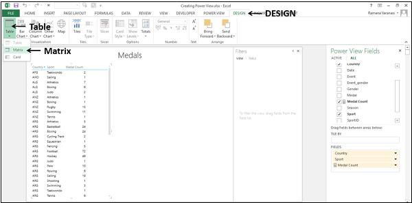
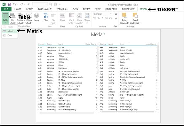
Convert the Table to Matrix as follows −
- Click on the Table.
- Click the DESIGN tab.
- Click Table in the Switch Visualization group.
- Select Matrix from the dropdown list.

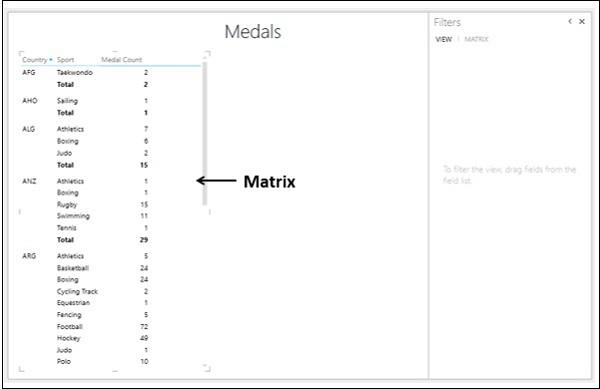
The Table is converted to Matrix.

Advantages of Matrix Visualization
A Matrix has the following advantages −
- It can display the data without repeating values.
- It can display totals and subtotals by columns and/or rows.
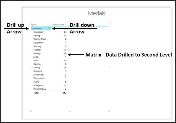
- If it contains a hierarchy, you can drill down/drill up.
- It can be collapsed and expanded by rows and/or columns.
Combination of Table and Matrix Visualizations
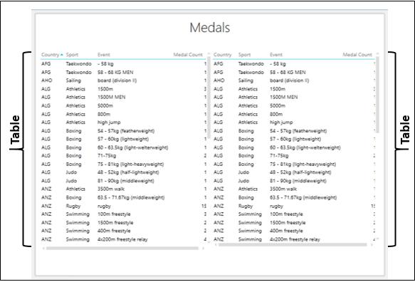
You can see the differences between the Table and Matrix visualizations by having them side by side on the Power View sheet, displaying the same data.
Follow the steps given below −
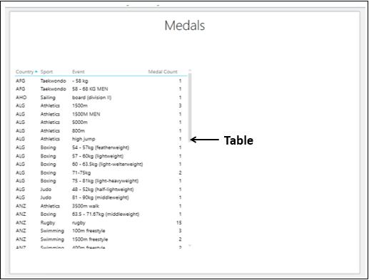
Create a Table with the fields – Country, Sport, Event, and Medal Count.

In the Table, the values of country repeated for several sport values and the values of sport are repeated for several event values.
Create another Table on the right side of the first Table as follows −
Click on the Power View sheet in the space to the right of the Table.
Select the fields – Country, Sport, Event, and Medal Count.
Another Table representing these fields appears in Power View, to the right of the earlier Table.

Click the Table on the right.
Click the DESIGN tab on the Ribbon.
Click Table in the Switch Visualization group.
Select Matrix from the dropdown list.

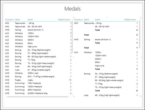
The Table on the right in Power View is converted to Matrix.

As you can observe, the Matrix displays each country and sport only once, without repeating values as is the case in Table.
Filtering Matrix in Power View
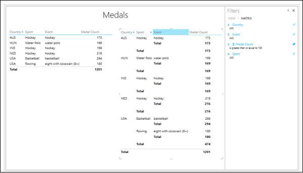
You can explore the data to find the countries and the corresponding sports and events with medal count of more than 150.
Click on the Table.
In the Filters area, click the TABLE tab.
Set the filtering criteria for Medal Count as - is greater than or equal to 150.
Click Apply filter
Click Matrix.
In the Filters area, click the MATRIX tab.
Set the filtering criteria for Medal Count as - is greater than or equal to 150.
Click Apply filter.

In Matrix, data is displayed without repeating the values, whereas in Table data is displayed with repeated values.
Totals
To understand the capability of Matrix in displaying Subtotals and Totals, do the following −
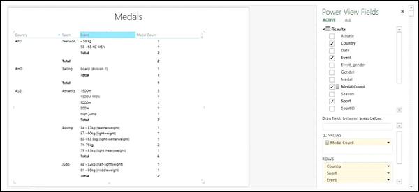
Add the fields Country, Sport, Event and Medal Count to Matrix.

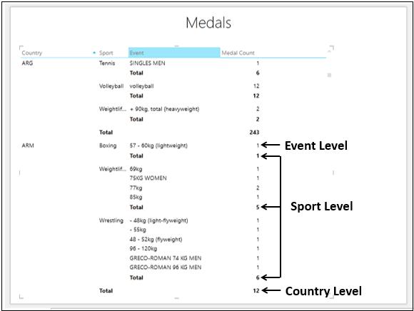
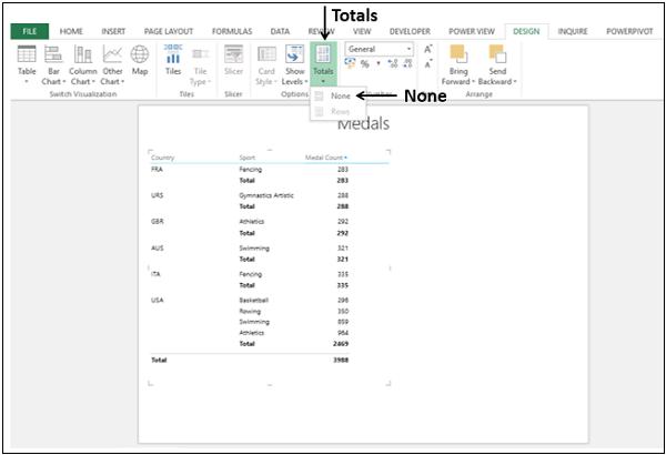
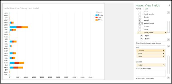
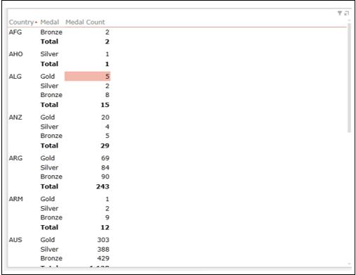
As you can see, the fields – Country, Sport, and Event define the hierarchy and are nested in that order. Matrix also displays Subtotals at each of these Levels as shown below.

The Subtotals and Total are given as follows −
Medal Count is at the Event Level.
Subtotal at the Sport Level – Sum of the Medal Count values of all Events in that Sport won by the Country that is one Level up.
Subtotal at the Country Level – Sum of the Subtotals at Sport Level.
At the bottom of the Matrix, the Total row is displayed that sums up all the Medal Count values.
Look at a variation of the same Matrix −
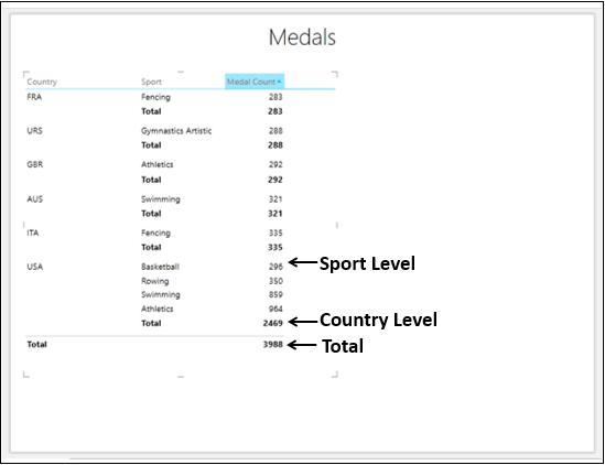
- Add the fields Country, Sport, and Medal Count to Matrix.
- Filter the Matrix to display only values with Medal Count more than 250.

The Medal Count values are displayed as follows −
At Sport Level − Total Medal Count of all the Medal Counts at Event Levels in the Sport.
At Country Level − Subtotal of all the Medal Count values at Sport Levels in the Country.
Total Row − Total of all the Subtotals of all the Countries.
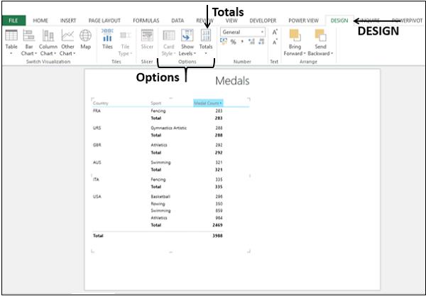
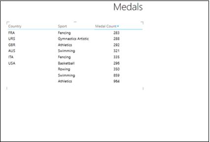
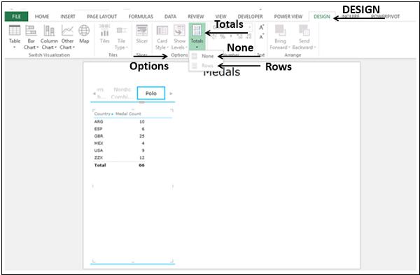
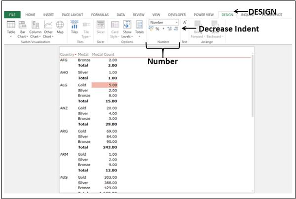
If you do not want to display the Subtotals and Total rows in Matrix, do the following −
Click on the Matrix.
Click the DESIGN tab.


Totals will not be displayed.

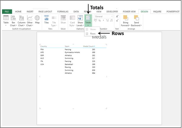
To display the Subtotals and total again, do the following
- Click on the Matrix.
- Click the DESIGN tab.
- Click Totals in the Options group.
- Select Rows from the dropdown list.

The Rows with Subtotals and Total will be displayed. As you can see, this is the default mode in Matrix.
Excel Power View - Card Visualization
In a Card visualization, you will have a series of snapshots that display the data from each row in the table, laid out like an index card.
Consider the Data Model, where we have added the table SportPics.

You need to start with a Table and then convert it to Card.
Choose the fields − Country, Sport, SportImage and Medal Count. The Table representing these fields appears in Power View.
Filter the Table to display data with Medal Count more than 275.

The values in the column SportImage are images. It is possible to add images to your Power View visualizations. The images are data bound, i.e. a sport image is linked to the corresponding sport. You will learn more about images in subsequent chapters.
Switching to Card Visualization
Convert the Table to a Card as follows −
- Click on the Table.
- Click the DESIGN tab.
- Click Table in the Switch Visualization group.
- Select Card from the dropdown list.

The Table is converted to Card visualization.

Card Style
You have two Card Styles for Card visualization.
The Card Style that you have in the previous section is Card, is the default style.
To convert the Card Style to Callout do the following −
- Click on the Card.
- Click the Design tab on the Ribbon.
- Click Card Style in the Options group.

Select Callout from the dropdown list.

The Card Style changes from Card to Callout.

In the Callout Card Style, all the text is displayed in large font. You can change the Card Style back to Card as follows −
- Click on Card Style.
- Select Card from the dropdown list.

Excel Power View - Chart Visualizations
In Power View, you have a number of Chart options. The Charts in Power View are interactive. Further, the Charts are interactive in a presentation setting also, which would enable you to highlight the analysis results interactively.
In this chapter, you will have an overview of the Chart visualizations. You will learn them in detail in the subsequent chapters.
Types of Chart Visualizations
In Power View, you have the following types of Chart visualizations −
- Line
- Bar
- Column
- Scatter
- Bubble
- Pie
Line, Bar and Column Charts
You can use Line, Bar and Column charts for comparing data points in one or more data series.
Line Chart
In a Line Chart, categories are along the horizontal axis and values along the vertical axis.

Bar Chart
In a Bar Chart, categories are along the vertical axis and values along the horizontal axis.

Column Chart
In a Column Chart, categories are along the horizontal axis and values along the vertical axis.

Scatter and Bubble Charts
You can use Scatter Charts and Bubble Charts to display many related data in one Chart. In Scatter Charts and Bubble Charts, the x-axis displays one numeric field and the y-axis displays another. In Bubble Charts, a third numeric field controls the size of the data points.
Scatter Chart − A scatter chart is shown below −

Bubble Chart − A bubble chart is shown below −

Pie Charts
In a Pie Chart, the numeric field can be shown by the Pie slice size, and categories by colors.
In Power View, Pie Charts can be simple or sophisticated. In a sophisticated Pie Chart, you can have the following additional features −
- Drill down when you double-click a Pie slice.
- Show sub-slices within the larger Pie slices.
Pie Chart − A Pie chart is shown below −

Interactive Nature of Chart Visualizations
The Charts in Power View are interactive. If you click on a value in one Chart −
- That value in that Chart is highlighted.
- That value in all the other Charts in Power View is also highlighted.
- All the Tables, Matrices and Tiles in Power View are filtered to that value.

You will learn more about this and other additional interactive features such as Play Axis, Colors, and Tiles in subsequent chapters.
Excel Power View - Line Chart Visualization
Line Charts are used for comparing data points in one or more data series. Line Charts distribute category data evenly along the horizontal (category) axis, and all numerical value data along the vertical (value) axis.
As you are aware from the previous chapters, you need to start with a Table and then convert it to Line Chart.
Select the fields – Country and Medal Count. By default, Table will be displayed.

Switching to Line Chart Visualization
Convert the Table to Line Chart as follows −
Select Line from the dropdown list.

The Table is converted to Line Chart.

The category data is displayed along the horizontal axis and numerical value data along the vertical axis.
Exploring Data with Line Chart Visualization
The categories are distributed evenly along the x-axis and all the categories (countries in this case) are not visible in the display. To view the categories that are not in the display, do the following −
- Click and hold on the Line or the Category (x-axis) axis.
- Drag to left or right.
The categories to the left or right will be displayed and Line Chart will be displayed accordingly.

The Status Bar shows you the position of the current display as compared to the complete category range. You can drag the Status Bar to the left or right to display the categories that are on the left or right side of the current display.
You might want to know the data values of a data point on the Line Chart.
Place the cursor on the data point on the Line Chart. The values corresponding to that data point will be displayed at that point.

Excel Power View - Bar Chart Visualization
Bar Charts are used for comparing data points in one or more data series. In a Bar Chart, categories are organized along the vertical axis and values along the horizontal axis.
As you know from the previous chapters, you need to start with a Table and then convert it to Bar Chart visualization.
Select the fields – Country and Medal Count. By default, Table will be displayed.

Types of Bar Chart Visualization
In Power View, there are three types of Bar Chart visualization −
- Stacked Bar.
- 100% Stacked Bar.
- Clustered Bar.
Switching to Bar Chart Visualization
Convert the Table to Bar Chart as follows −
- Click on the Table.
- Click the DESIGN tab.
- Click Bar Chart in the Switch Visualization group.
- Select Stacked Bar from the dropdown list.

The Table is converted to Bar Chart.

You can see that Y-axis values are sorted by the category values in ascending order.
Exploring Data with Bar Chart Visualization
You can explore data with Bar Chart in several ways. You will understand the various methods that you can use for data visualization and exploration with Bar Chart in this section and the subsequent sections.
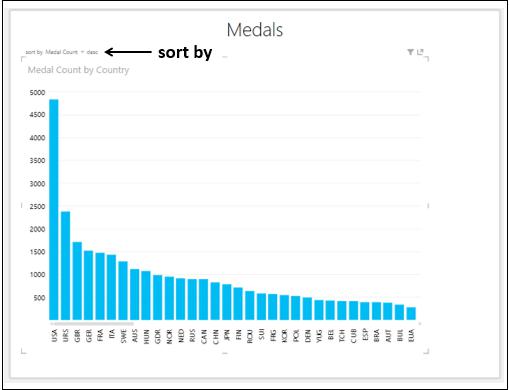
You can sort the Y-axis values in Bar Chart by the Medal Count as follows −
Take the cursor to above the Bar Chart. On the top left corner, you will find – sort by Country asc. This means the sorting is by Country and in ascending order.


Combination of Bar Chart and Table Visualizations
You can view the interactive features of Bar Chart visualizations by placing a Table on the same Power View.
Create a Table with the fields, Country and Medal Count.
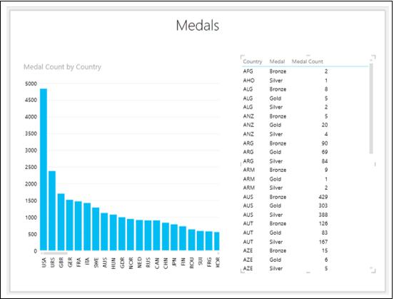
Adjust the sizes and positions of Bar Chart and Table to appear as below.

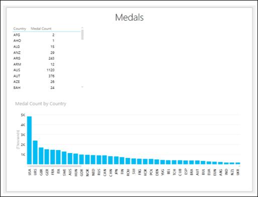
From the Bar Chart, you can see that USA has the highest Medal Count.
Click on the Bar for USA. That Bar will be highlighted and other Bars will be inactive. The Table is filtered to show the values only for the selected Bar.

The highest Medal Count is of USA with 4833 as displayed in the Table.
To find the top three Medal Counts, proceed as follows −
Click on the Bar with Category USA. Only that Bar will be highlighted.
With Ctrl key pressed, click on Bars with Categories URS and GBR that are in second and third places. The Bars for USA, URS and GBR will be highlighted.
The Table also shows values for these three Categories only.

From the Bar Chart, you can also observe that the values for NED, RUS and CAN are almost equal.
The Table also shows values for these three Categories only.

Adding a Legend
You can observe more powerful features of Bar Chart by adding a Legend.
- Click on the Bar Chart.
- Drag the field Medal to LEGEND area.
- Click on the Table.
- Drag the field Medal to FIELDS area.

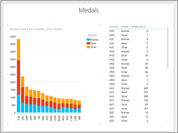
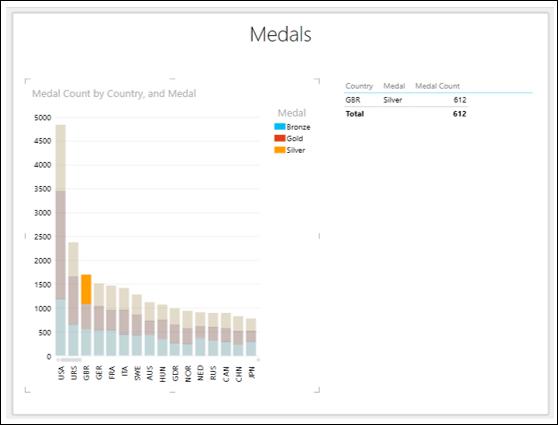
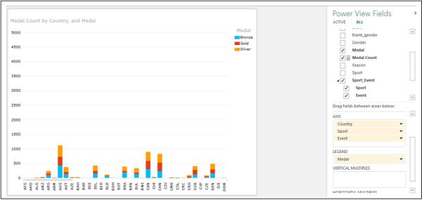
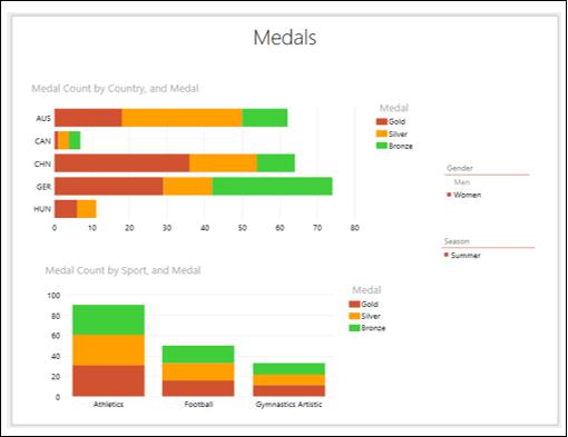
As you can see, this is a full-fledged Stacked Bar Chart visualization, showing the Medal Count by Medal type for each Country.
Click on the orange color portion of the Bar for GER.

You can observe the following −
Only the orange color portion of the Bar for GER on which you clicked will be highlighted.
The other two portions of the Bar for GER will become inactive.
All other Bars will become inactive .
The Table will be filtered to show only the values of highlighted region.
Note − You cannot make multiple selections in this case.
100% Stacked Bar Chart
You can convert the Stacked Bar Chart to 100% Stacked Bar Chart as follows −
Click on the Stacked Bar Chart.
Click the DESIGN tab on the Ribbon.
Click on Bar Chart.
Select 100% Stacked Bar from the dropdown list.

Your Stacked Bar Chart will be converted to 100% Stacked Bar Chart as shown below.

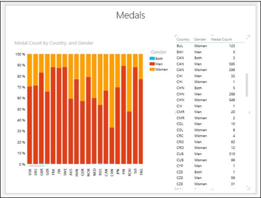
From the Chart, you can visualize the Gold, Silver and Bronze ratios of the total Medal Count for each country.
You can also visualize the ratio of the Medals won by Men and Women for each country.
Remove the field Medal and add the field Gender to both Bar Chart and Table.

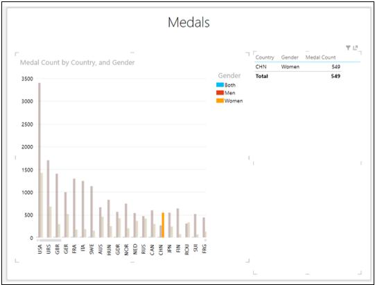
Observe that for CHN, the Medal Count for Women is more than that for Men as against other countries.
Scroll down the Table to view the values for CHN.

In country CHN, the Medal Count for Men is 268 and that for Women is 549.
Clustered Bar Chart
You can convert the 100% Stacked Bar Chart to Clustered Bar Chart as follows −
Click on the 100% Stacked Bar Chart.
Click the DESIGN tab on the Ribbon.
Click on Bar Chart.
Select Clustered Bar from the dropdown list.

The 100% Stacked Bar chart will be converted to Clustered Bar chart.

Click on the Green Bar for CHN.

You will observe the following −
- Only the selected bar will be highlighted.
- Other Bars will become inactive.
- The Table shows only the corresponding values.
Column Chart Visualization
Column Charts are used for showing data changes over a period of time or for illustrating comparison among items. In Column Charts, categories are along the horizontal axis and values along the vertical axis.
You have learnt in the previous chapters, you need to start with a Table and then convert it to Column Chart visualization.
Select the fields – Country and Medal Count. By default, Table will be displayed.

Types of Column Chart Visualization
In Power View, there are three types of Column Chart visualization −
- Stacked Column.
- 100% Stacked Column.
- Clustered Column.
Switching to Column Chart Visualization
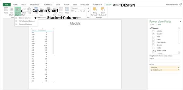
Convert the Table to Column Chart as follows −
- Click on the Table.
- Click the DESIGN tab.
- Click Column Chart in the Switch Visualization group.
- Select Stacked Column from the dropdown list.

The Table will be converted to Column Chart. The X-axis values are sorted by the category values in ascending order.

Exploring Data with Column Chart Visualization
You can explore data with Column Chart in several ways. You will understand the various methods that you can use for data visualization and exploration with Column Chart in this section and the subsequent sections.
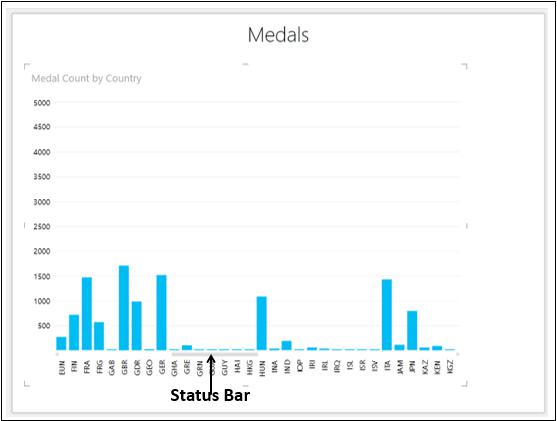
In the Column Chart, the categories are distributed evenly along the x-axis and not all the categories (countries in this case) are visible in the display. To view the categories that are not in the display, do the following −

The Status Bar shows you the position of the current display as compared to the complete category range. You can drag the Status Bar also to the left or right to display the categories that are on the left or right side of the current display.
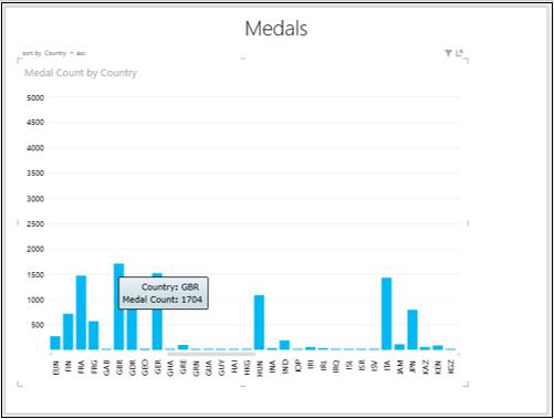
You might want to know the data values of a Column on the Column Chart.
Place the cursor on the Column on the Column Chart. The values corresponding to that Column will be displayed at that Column.

Sorting in Column Chart
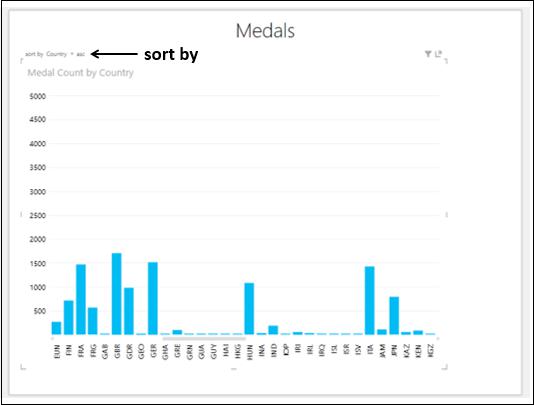
You can sort the X-axis values in Column Chart by the Medal Count as follows −
On the top left corner, you will see – sort by Country asc. This means the sorting is by Country and in ascending order.


Combination of Column Chart and Table Visualizations
You can view the interactive features of Column Chart visualization by placing a Table on the same Power View.

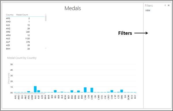
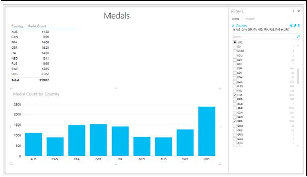
Click on the Filters area. As you have not yet selected any fields for filtering, the Filters area will be empty.

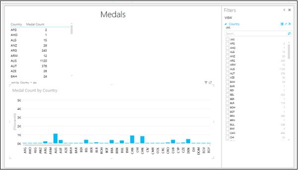
Drag the field Country from Power View Fields list to the Filters area.

Check the boxes for the countries that you want display the results. Both Table and Column Chart are filtered to show only the filtered data.

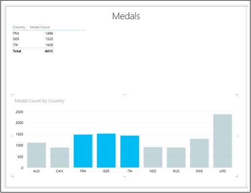
Click on the Columns for FRA, GER and ITA with the Ctrl key pressed. These Columns will be highlighted and others will become inactive. The Table is also filtered to show the values only for the highlighted Columns.

Adding a Legend
You will understand some powerful features of a Column Chart by adding a Legend.
Arrange the Column Chart and Table to be side by side.

- Click on the Column Chart.
- Drag the field Medal to LEGEND area.
- Click on the Table.
- Drag the field Medal to FIELDS area.

The illustration give above is the full-fledged Stacked Column Chart visualization, showing the Medal Count by Medal type for each Country.
Click on the top portion of the Column for GBR.

You will observe the following −
Only the orange color portion of the Column for GBR on which you clicked will be highlighted.
The other two portions of the Column for GBR will become inactive.
All other Columns will become inactive.
The Table will be filtered to show only the values of highlighted region.
Note − You cannot make multiple selections in this case.
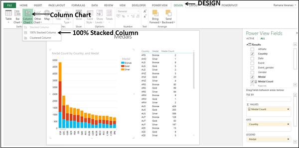
100% Stacked Column Chart
You can convert the Stacked Column Chart to 100% Stacked Column Chart as follows −
- Click on the Stacked Column Chart.
- Click the DESIGN tab on the Ribbon.
- Click Column Chart.
- Select 100% Stacked Column from the dropdown list.

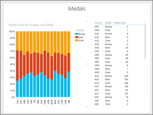
The Stacked Column Chart will be converted to 100% Stacked Column Chart.

From the Chart, you can visualize the Gold, Silver and Bronze ratios of the total Medal Count for each Country.
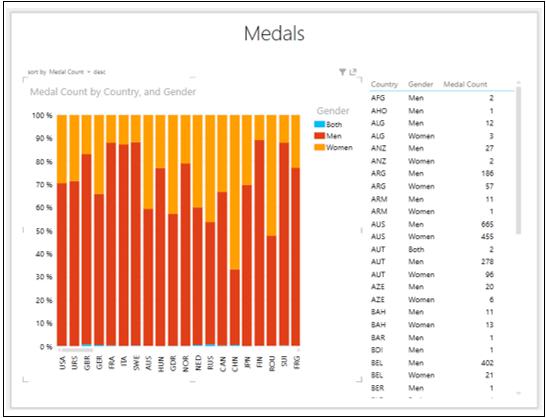
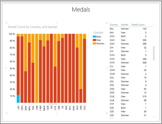
You can also visualize the ratio of the Medals won by Men and Women for each Country. Remove the field Medal and add the field Gender to both Column Chart and Table.

For CHN, the Medal Count of Women is more than that of Men as against other countries. Scroll down the Table to view the values for CHN.

In country CHN, the Medal Count of Men is 268 and that of Women is 549.
Click on the X-axis and drag to view the other countries.

You can find other countries, where women outperformed men.
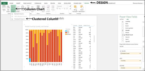
Clustered Column Chart
You can convert the 100% Stacked Column Chart to Clustered Column Chart as follows −
- Click on the 100% Stacked Column Chart.
- Click the DESIGN tab on the Ribbon.
- Click Column Chart.
- Select Clustered Column from the dropdown list.

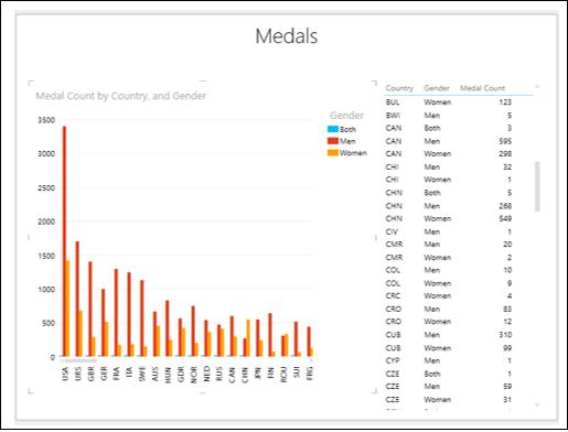
The 100% Stacked Column chart will be converted to Clustered Column chart.

Click on the orange Column for CHN.

You will observe the following −
Combining Bar Chart Visualization
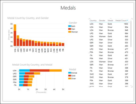
To understand the interactive features of Power View Chart visualizations more in depth, place the following visualizations on a Power View sheet −
- Table with the fields – Country, Medal, Gender and Medal Count.
- Stacked Column Chart with fields – Country, Gender and Medal Count.
- Stacked Bar Chart with fields – Country, Medal and Medal Count.
- Sort all the three visualizations by Medal Count in descending order.

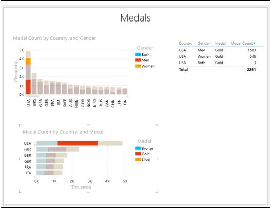
Click on the Gold part of USA on the Stacked Bar Chart.

You will observe the following −
Stacked Bar Chart – Only the selected portion is highlighted.
Stacked Column Chart – Data related to selected portion of the Stacked Bar Chart is highlighted.
Table – Data is filtered to display only the values pertaining to both the Charts.
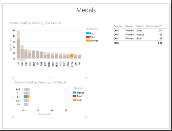
Next, do the following −
- Click on the top portion for CHN on the Stacked Column Chart.
- Drag the y-axis on the Stacked Bar Chart to view CHN.

You will observe the following −
Stacked Column Chart – Only the selected portion is highlighted.
Stacked Bar Chart – Data related to selected portion of the Stacked Column Chart is highlighted.
Table – Data is filtered to display only the values pertaining to both the Charts.
Scatter and Bubble Chart Visualization
You can use Scatter Charts and Bubble Charts to display many related data in one Chart. In both these charts, the X-axis displays one numeric field and the y-axis displays another, making it easy to see the relationship between the two values for all the items in the chart. In Bubble charts, a third numeric field controls the size of the data points.
As you are aware from the previous chapters, you need to start with a Table and then convert it to Scatter Chart visualization.
Select the fields – Sport, Medal Count and Event. By default, Table will be displayed.
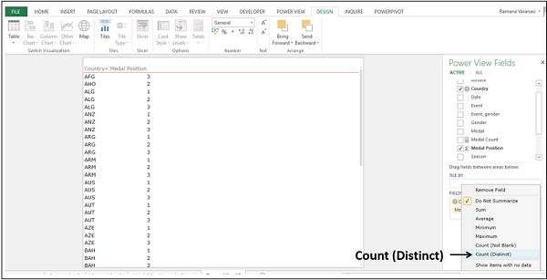
Click the arrow next to Event in the Power View Fields list.
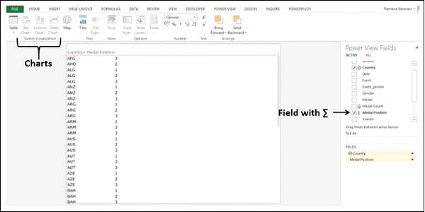
Click Count (Distinct).

The field Event changes to the numeric field Count of Event.

There is one category field Sport, and two numeric fields, Medal Count and Count of Event.
Switching to Scatter Chart Visualization
Convert the Table to Scatter Chart as follows −
- Click on the Table.
- Click the DESIGN tab.
- Click Other Chart in the Switch Visualization group.
- Select Scatter from the dropdown list.

The Table will be converted to Scatter Chart.

You will observe the following −
The data points are displayed as circles of same size, showing how the Count of Event and Medal Count values are related for each sport.
Medal Count is displayed on X-Axis and Count of Event on Y-Axis.
Medal Count is placed under area - ∑ X VALUE in the Power View Fields pane.
Count of Event is placed under area - ∑ Y VALUE in the Power View Fields pane.
Sport is placed under area - DETAILS in the Power View Fields pane.
Adding Data Labels to Scatter Chart
Add Data Labels to the data points in the Scatter Chart as follows −
- Click on the LAYOUT tab on the Ribbon.
- Click on Data Labels in the Labels group.
- Select Right from the drop down list.

Data Labels appear for the data points.

You will observe the following −
Data Labels appear to the right of the data points, as you have chosen Right.
The sport wrestling has less number of medals in more number of events as compared to the sport, rowing that has more number of medals in less number of events.
Converting to Bubble Chart Visualization
You can convert the Scatter Chart visualization to Bubble Chart visualization by adding a third numeric field that controls the size of the data points.
Drag Country to ∑ Size area. The Scatter chart will be converted to Bubble Chart.

- Drag Medal Count to ∑ Size area.
- Drag Country to ∑ X VALUE area.
The Count of Country will be displayed on X-Axis and Count of Event on Y-Axis. Size of each Bubble shows Medal Count. The Data Labels show the Sport.

Exploring Data with Bubble Chart Visualization
You can explore data with Bubble Chart in several ways. You will understand the various methods that you can use for data visualization and exploration with Bubble Chart in this section and the subsequent sections.
Place the cursor on a Bubble. The values of that data point will be displayed next to the Bubble.

Click on the Bubble. Only that particular Bubble will be highlighted. All the other Bubbles will be inactive.

Visualization with Colors
You can explore the data by adding color to a category, so that the bubbles are colored according to the category values −
Drag the field Gender to COLOR area in the Power View Fields pane. The Bubbles will be colored by the values of Gender. Gender appears in the Legend.

Click on the value – Women in the Legend.

You will observe the following −
In the Legend, the selected value – Women is highlighted.
In the Chart, all the Bubbles with value – Women are highlighted and all the other Bubbles will get greyed.
From the highlighted Bubbles, you can find that for the Sports – Athletics and Swimming, Women got highest number of Medals. You can find the values of these data points by placing the cursor on them.
Filtering in Bubble Chart
To filter the data in Bubble Chart, proceed as follows −
- Drag Sport to ∑ X VALUE area.
- Drag Event to ∑ Y VALUE area.
- Drag Medal Count to ∑ SIZE area.
- Drag Country to COLOR area.

You will observe the following −
The Bubbles are colored by the values of the field – Country.
The field – Country appears in the Legend.
A warning message is displayed on the top of Chart - Too many ‘Country’ values. Not displaying all data. Filter the data or choose another field.
Filter the data as follows −
- In the Filters area, click Medal Count.
- Click Advanced Filter mode on the right side.
- Set the filter criteria to – Medal Count is greater than or equal to 250.

Click Apply filter. The data in the Bubble Chart will be filtered to display only the data points satisfying the set filter criteria.

After applying the filter, the number of values in the Legend is few and that is accepted by Power View.
Click on the value – USA in the Legend. Bubbles that correspond to the Country value – USA will be highlighted. All the other Bubbles will become inactive.

Combination of Bubble Chart and Table Visualizations
You can view the interactive features of Bubble Chart visualization by placing a Table on the same Power View.
- Create a Table with the fields – Country, Sport, and Medal Count.
- Filter the Table with the same filter criteria as that in Bubble Chart.
- Adjust the sizes and positions of Bubble Chart and Table to appear as shown below.

Click USA in the Legend.

You will observe the following −
The data points corresponding to the value selected in the Legend are highlighted. All other Bubbles are greyed out.
The table shows the values of the data points that are highlighted in the Bubble Chart.
Visualization with Play Axis
Another powerful feature that you can use in the data exploration in Bubble Chart is the Play Axis. You can visualize the data changes over a period of time using Play Axis.

The timeline spans from Year 1900 to Year 2014, for which you have data in your Data Model.
Click the Play Button.
The bubbles travel, grow, and shrink to show how the values change based on the play axis. A small vertical line appears on the timeline that moves across the timeline. The Time value, Year in this case will be displayed at the top right corner of the Chart that changes as the timeline progresses.

Click the Pause Button. You can view the data at that point of time. The Time value, Year, at that point of time will be displayed at the top right corner of the Chart.
Click and drag the vertical line to the left or right, to a point of time of your interest. You can view the data at that point of time.
You can adjust the timeline by filtering the Year field values in the Filters area. This would be useful if you want to focus on a particular time range or if the timeline is too wide.
Suppose you want to visualize the data changes during the period 2004 – 2014.

You will have a more detailed view of the data that is in the restricted window of the timeline. You can pause at any point to study the data in more detail.
You can also view the history in the trail that a bubble has followed over time.
Click on the Bubble that represents the sport- Swimming. Only that Bubble will be highlighted and all other Bubbles will be inactive.

Click the Play Button.

You can see the trail that the bubble have followed over time.
Click on the Bubble that represents the sport- Shooting. Only that Bubble will be highlighted and all other Bubbles will become inactive.

Click the Play button.

You can the trail that the bubble has followed over time.
Excel Power View - Pie Chart Visualization
Pie charts in Power View can be simple or sophisticated. You will learn about these two types of Power View visualizations and data exploration and visualization with Pie Charts in this chapter.
As you know, you need to start with a Table and then convert it to Pie Chart visualization.
Select the fields – Country and Medal Count. By default, Table will be displayed.
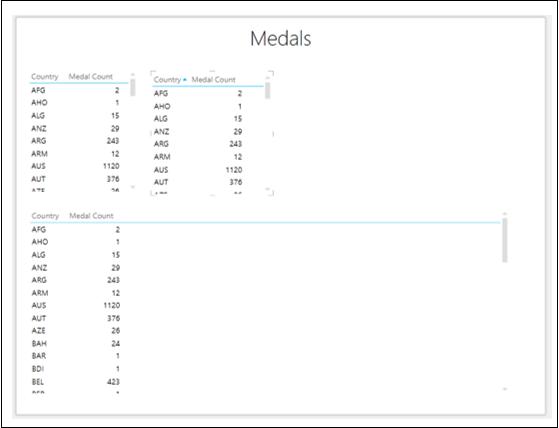
Add two more Tables to Power View with the same fields.
Adjust the size of the visualizations to appear as below.

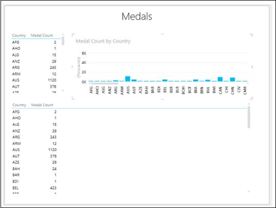
- Click on the Table to the top right side of the Power View.
- Click the DESIGN tab on the Ribbon.
- Click Column Chart in the Switch Visualization group.
- Click Stacked Column. The Table will be converted to Column Chart.
- Adjust the size of Column Chart to display more number of Country values.

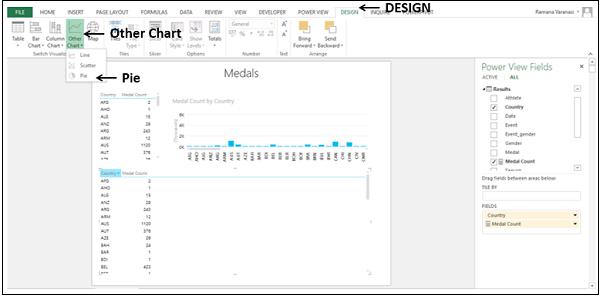
Switching to Pie Chart Visualization
Convert the Table at the lower portion of Power View to Pie Chart as follows −

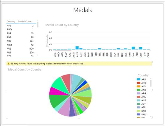
The Table visualization will be converted to Pie Chart visualization. A warning message appears at the top of the Chart - Too many ‘Çountry’ values. Not displaying all data. Filter the data or choose another field.

You can see that there are too many slices in the Pie chart as there are many Country values. Note that Pie Charts work well only when the number of categories is 8 or less.
You can reduce the number of categories by filtering the values as follows −
Set the filtering criteria as Medal Count is greater than or equal to 1300 in all the visualizations in Power View.

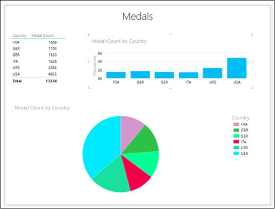
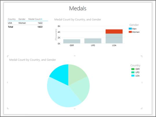
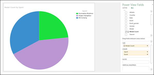
You have a Simple Pie Chart visualization, wherein the Medal Count values are shown by the Pie sizes and Country values by colors, as shown in the Legend.
Exploring Data with Simple Pie Chart Visualization
You can explore data interactively with Simple Pie Chart as follows −
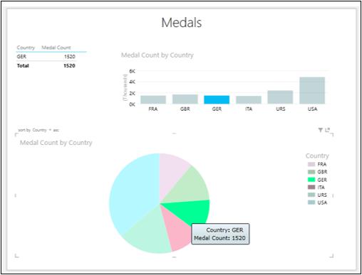
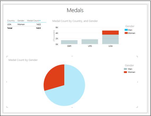
Click on a Pie slice. That slice will be highlighted and others will be inactive. The corresponding Column in the Column Chart also will be highlighted. In the Table, only the values corresponding to the highlighted Pie slice will be displayed.
Place the cursor on the highlighted Pie slice. The data values corresponding to that Pie slice will be displayed.

Sophisticated Pie Chart Visualizations
You can make your Pie Chart visualization sophisticated to add more powerful data exploration features. You have two types of Sophisticated Pie Chart visualizations −
- Pie Chart that drills down when you double-click on a Pie slice.
- Pie Chart that shows sub-slices within the larger Pie slices.
Exploring Data with Sophisticated Pie Chart Visualizations
Exploring Data with Pie Chart that drills down
Click on the Pie Chart.
Drag the field Gender to COLOR area, to below the field Country in the Power View Fields pane. This means you have two categories.
In the Table, add Gender to FIELDS.
In the Column Chart, add Gender to LEGEND area.

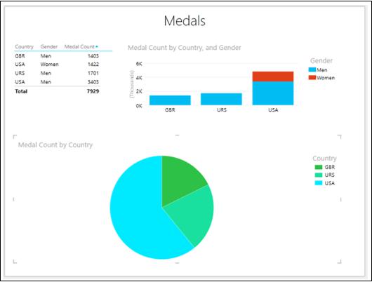
In the Pie Chart, there is a single slice with one color for each category - Country.
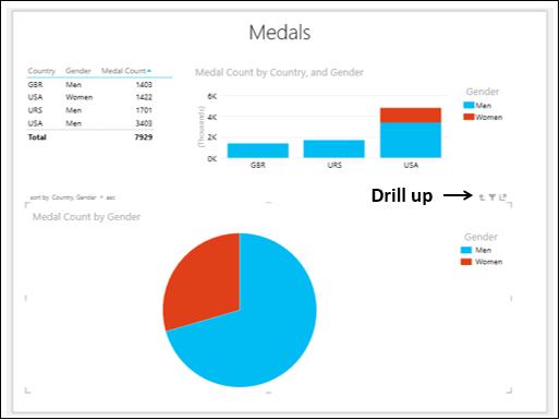
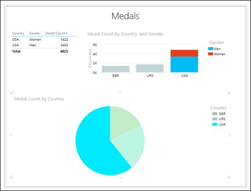
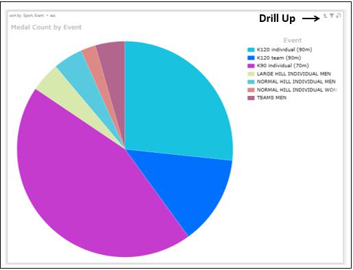
Double-click on the USA slice. The Pie Chart in your Power View will be changed to show values by Gender, which is the second category, for the selected first category (USA). The colors of the Pie Chart now show the percentages of the second field, i.e., Gender, corresponding to Country - USA. In other words, the Pie Chart was drilled down.

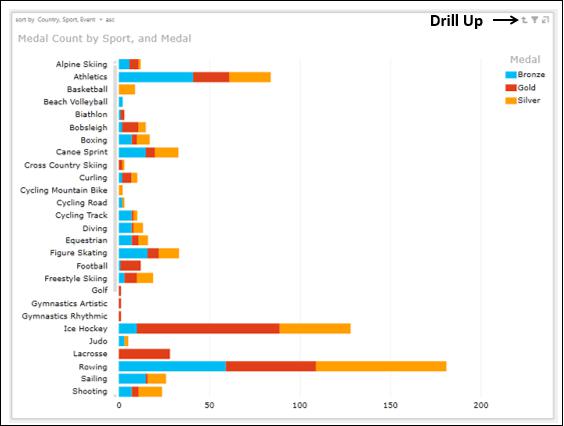
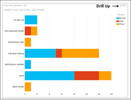
A small arrow - Drill up appears on the top right corner of the Pie Chart.
Click on a Pie slice. That Pie slice will be highlighted and the other one will become inactive.

The Table is filtered showing only the values corresponding to the highlighted Pie slice. In the Column Chart, the portion of the Column corresponding to the highlighted Pie slice is highlighted and the rest becomes inactive.
- Click the drill up arrow. The Pie Chart returns to its previous state.
- Click on the Pie slice – USA

The Pie slice is highlighted. The Table is filtered to show only those values. In the Column Chart, the Column corresponding to the Pie slice is highlighted.
Exploring Data with Pie Chart that shows sub-slices
To explore data with Pie chart that shows sub-slices, proceed as follows −

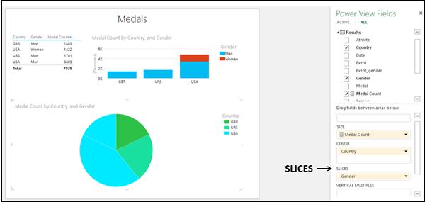
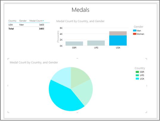
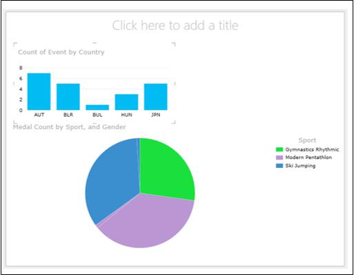
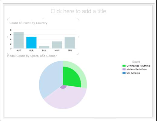
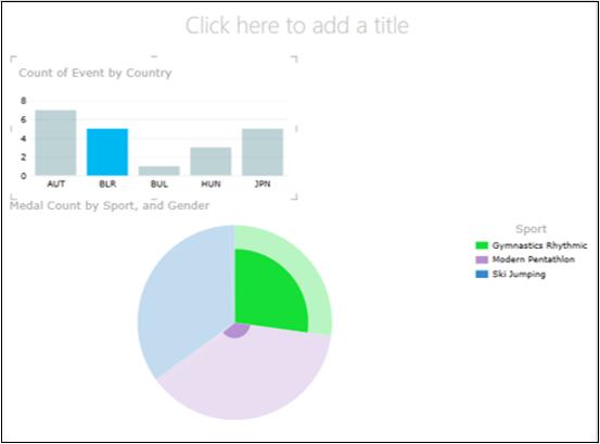
In the Pie Chart, there are two Pie slices of same color for the Country value - USA. Click on one of these Pie slices.

You will observe the following changes in Power View −
In the Pie Chart, the selected Pie slice is highlighted and other slices are grayed out.
In the Column Chart, the Column for the Country value USA highlights the Medal Count for the selected Pie slice.
The Table shows only the values corresponding to the selected Pie slice.
Click on the other Pie slice of the Country value USA. You will observe the changes as given above for this selected Pie slice.

Excel Power View - Map Visualization
You can use Maps to display your data in the context of geography. Maps in Power View use Bing map tiles, so you can zoom and pan as you would with any other Bing map. To make maps work, Power View has to send the data to Bing through a secured web connection for geocoding. Therefore, it asks you to enable content, adding locations and values places dots on the map. The larger the value, the bigger will be the dot. When you add a multi-value series, you will get Pie charts for data points on the map, with the size of the Pie Chart showing the size of the total.
Your data has a geographic field Country that can be used for Map visualization. To create a Map visualization for the Medal Count with Country values, proceed as follows −
- Click the POWERVIEW tab on the Ribbon.
- Click Power View in the Insert group.

A new Power View sheet will be created in the workbook.
Setting Data Category for Geographic Field
To set the data category for Geographic Field proceed as follows −
Select the fields – Country and Medal Count. By default, Table will be displayed.

You have a geographic field and a numeric field.
You need to set the category of the field Country for Power View to create reports dynamically.
Click the POWERPIVOT tab on the Ribbon.
Click Manage in the Data Model group. The Power Pivot window appears.
Click the Results tab. Select the Country field.
Click the Advanced tab on the Ribbon.
Click Data Category.
Select Country/Region from the dropdown list.

The Data Category of the field Country will be set as Country/Region.

Click on the Power View sheet. A small globe icon appears beside the field Country in the Results table in the Power View fields list. This indicates that the field Country contains a geographic location.

Switching to Map Visualization
Convert the Table to Map visualization as follows −

The Table visualization will be converted to Map visualization.

Power View creates a Map with a dot representing each geographic location, Country. The size of the dot is the value of the corresponding numeric field Medal Count.
In the Power View Fields pane, the geographic field Country is in the LOCATIONS area and the numeric field Medal Count is in the ∑ SIZE area
To display more information about a data point, you can do one of the following −
Step 1 − Place the cursor on a dot on the Map. A box appears displaying the geographic location name and the corresponding numeric value.

Step 2 − Click on a dot on the Map. That particular dot will be highlighted and all other dots will become inactive.

Zooming and Panning in Map
You can find the zoom in, zoom out, pan buttons on the top right corner of the Map when you hover the mouse on that area.

Pie Charts in Map Visualization
Suppose you want to add another field to the Map visualization. For example, you might want to display the medal types – Gold, Silver, and Bronze. You can do it as follows −
Drag the field Medal to the COLOR area in the Power View Fields pane. The dots will be converted to Pie Charts.

A Legend for Medal appears displaying the types of medals and respective colors. Each color in the Pie Charts represents the type of the medal as given in the Legend.
You can also observe that the size of a Pie Chart corresponds to the Medal Count and the size of each slice in the Pie Chart corresponds to the count of that medal type.
Exploring Data with Pie Charts in Map Visualization
You can filter your data and highlight a significant data point as follows −
In the Filters area, set the Medal Count to display only the values greater than or equal to 400.
Apply the filter. The Map zooms and displays only the filtered values.

Place the cursor on the Pie Chart representing Great Britain and the details of the Pie Chart will be displayed.

You can see that the gold Medal Count for Great Britain is 545. You can find the silver Medal Count and bronze Medal Count for Great Britain by placing the cursor on those slices on the Pie Chart.

Highlighting a Pie Slice in Map Visualization
You might want to highlight the gold Medal Count of all countries
Click on Gold in the Legend.

The Pie slices representing Gold in all Pie Charts are highlighted. The other Pie slices in all the other Pie Charts are inactive.
Place the cursor on any Pie Chart on the Map. The Pie slice representing gold will be highlighted. The details of the Pie slice will be displayed.

Excel Power View - Multiple Visualizations
Multiples, also called Trellis Charts are a series of Charts with identical X and Y axes. You can arrange Multiples side by side, to compare many different values easily at the same time. You can have Line Charts, Bar Charts, Column Charts, and Pie Charts as Multiples. You can arrange the Multiples either horizontally or vertically.
Multiples Visualization with Line Charts
Suppose you want to display the Medal Count by Year for each Country.
Start with a Table with fields – Year and Country.

Convert the Table to Line Chart. A Line Chart appears with Medal Count by Year.

You will observe the following −
In the Line chart, Year is on X-axis and Medal Count Values are on Y-axis.
In the Power View Fields pane, Year is in AXIS area and Medal Count is in ∑ VALUES area.
Create Multiples visualization with Line Charts as follows −
Drag the field Country to VERTICAL MULTIPLES area in the Power View Fields pane. A Line Charts appear in a grid with each Line Chart representing a Country.

Click the LAYOUT tab on the Ribbon.
Click on Grid Height in the Multiples group.
Select 3 from the dropdown list.
Click on Grid Width in the Multiples group.
Select 3 from the dropdown list.

Vertical Multiples
As you are aware, you have placed the Country field in the VERTICAL MULTIPLES area in the Power View Fields pane. Hence, the visualization that you have is the Vertical Multiples visualization. You will observe the following in the above visualization −
One Line Chart per Country (Country is placed in VERTICAL MULTIPLES area).
The grid height and grid width that you have chosen determine the number of rows and number of columns for the Multiples.
A common x-axis for all the Multiples.
A similar y-axis for each row of the Multiples.
A vertical scroll bar on the right side that can be used to drag the rows of Line Charts up and down, to make the other Line Charts visible.
Horizontal Multiples
You can have the Multiples visualization with Horizontal Multiples as follows −
Drag the field Country to HORIZONTAL MULTIPLES area in the Power View Fields pane. You will get the Horizontal Multiples visualization as shown below.

You will observe the following −
One Line Chart per Country (Country is placed in HORIZONTAL MULTIPLES area).
The grid height determines the height of the Line Charts, unlike the number of rows of Line Charts in the VERTICAL MULTIPLES. There is a single row of Line Charts with the height determined by the grid height.
The grid width determines the number of columns of Line Charts in the row.
A common x-axis for all the Multiples.
A common y-axis for all the Multiples.
A horizontal scroll bar at the bottom, below the x-axis, that can be used to drag the row of Line Charts to the left and the right, so as to make the other Line Charts visible.
Multiples Visualization with Bar Charts
You can choose Bar Charts for Multiples visualization −
- Switch visualization to Stacked Bar Chart.
- Deselect the field – Year.
- Drag the field Country to VERTICAL MULTIPLES area.
- Drag the field Medal to LEGEND area.
- Choose the Grid Height and Grid Width to get a proper display of the Bar Charts.
With Grid Height of 6 and Grid Width of 2, you will get the following −

You can have Clustered Bar Charts also for Multiples visualization. Switch to Clustered Bar Chart visualization.

Multiples Visualization with Column Charts
You can choose Column Charts for Multiples visualization.
- Switch visualization to Stacked Column Chart.
- Adjust the Grid Height and Grid Width to get a proper display of the Column Charts.
With Grid Height of 2 and Grid Width of 6, you will see the following −

You can have Clustered Column Charts also for Multiples visualization. Switch visualization to Clustered Column Chart.

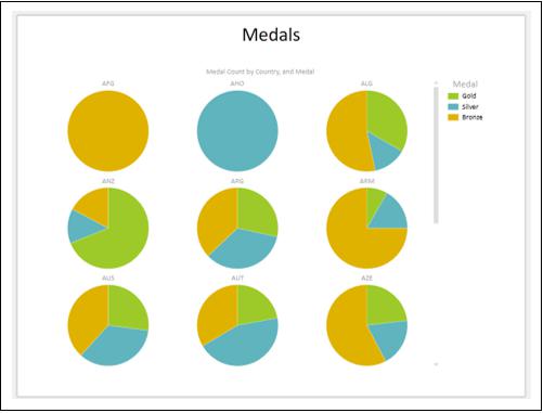
Multiples Visualization with Pie Charts
Pie Charts Multiples visualization gives you enhanced Power View data exploration and visualization options.
- Switch to Pie Chart visualization.
- Change the Grid Height to 3 and Grid Width to 3.

You will observe the following −
Medal Count is in SIZE area, Medal is in SLICES area and Country is in VERTICAL MULTIPLES area in the Power View Fields pane.
For each Country, a Pie Chart is displayed, with the Pie Slices showing the Medal Count of Medal Types, with the colors given in the Legend.
Suppose you want to highlight the Gold Medal Count for all the Countries. You can do it in a single step as follows −
Click Pie Slice representing Gold on any one of the Pie Charts. In all the Pie Charts, only the slices representing Gold will be highlighted and other slices will be grayed.

This is a fast way of exploring and comparing the count of gold medals across the countries.
Excel Power View - Tiles Visualization
In case you have lot of data to display with significant data points at varied places, you might have to scroll very often in your Power View visualizations to find the data you are looking for. This would be tedious and also might not be smooth when you are presenting the results.
You can overcome this drudgery using the Tiles feature in Power View. With Tiles, you can gain insights from your data much more quickly. Tiles act as navigation strips, with a single Tile for each possible field value. When you click on a Tile, only the data related to that field value is displayed. As it is easy to scroll the values in the navigation strip that dynamically changes the corresponding values in the visualization, Tiles become an easy to use tool for you.
You can have Tiles in a Table, Matrix, Card and Chart or Map visualization. You can have a combination of these visualizations in Power View with a single Tile Navigation Strip and get them filtered with a Tile. A Tile can be simple text or an image.
Table Visualization with Tiles
Start with a Table visualization as follows −
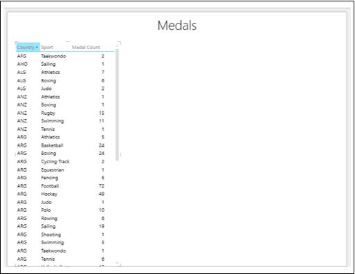
Drag the fields Country, Sport and Medal Count to Power View. A Table will be displayed by default.

You can see that as the number of rows is large, it is difficult to scroll up and down to highlight the required and / or significant values.
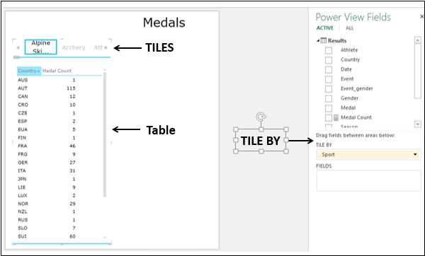
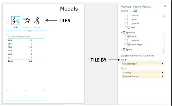
Drag the field Sport from FIELDS area to TILE BY area in the Power View Fields pane. The Tiles appear at the top of the Table as a Navigation Strip.

You will observe the following −
By default, the first Tile in the Navigation Strip is selected.
In the Table, the values are filtered to that of the Tile selected. In this case, the Sport that is selected.
There are arrow buttons at the left and right edges of the Navigation Strip to enable scrolling.
There is a scroll bar below the Navigation Strip.
Exploring Data with Table Tiles Visualization
You can select a different Tile as follows −
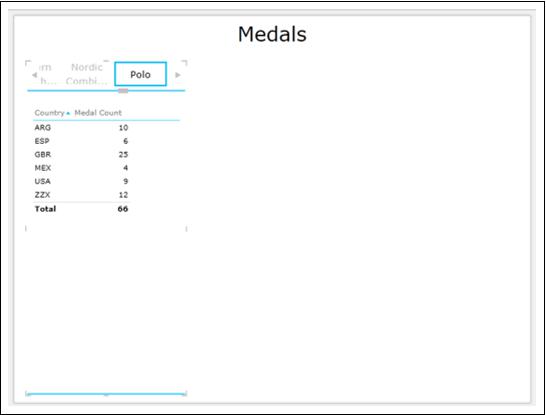
Scroll the Navigation Strip to display the Tile representing the Sport you are looking for, say, Polo.
Click the Tile – Polo. The values in the Table are filtered to those of Polo.

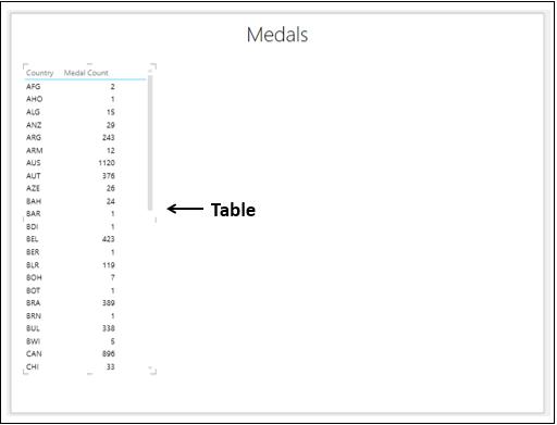
You can see that the row Total is displayed. You have an option to turn Totals on or off.
- Click on the Table.
- Click the DESIGN tab on the Ribbon.
- Click Totals in the Options group.

You can make the Tiles more appealing and meaningful by having images instead of Text.
Drag the field SportImage from SportPics table to TILE BY. You will get the Tiles as images, portraying each sport.

The images in Tiles are data bound. If you click on any image Tile, the Table will be filtered to that Sport values.
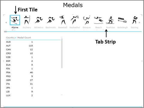
Tile Navigation Strip - Tab Strip
There are two types of Navigation Strips in Power View - Tile Flow and Tab Strip.
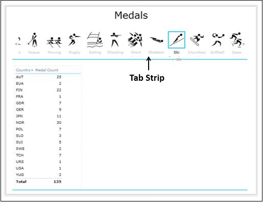
What you have created above is the Tab Strip.
- Adjust the size of the Tab Strip so that it spans the width of the Power View.
- Click on the Tile – Ski Jumping.

You will observe the following −
When you add a field to the TILE BY area, the Tab Strip is displayed by default.
Tab Strip is displayed across the top of the Power View.
The label, Sport name is displayed below every image.
By default, the first Tile in the Tab Strip is selected.
There are arrow buttons at the left and right edges of the Tab Strip to enable scrolling.
You can scroll to the left or right to display the Tiles.
The highlighted Tile moves to the left or right as you scroll the Tab Strip. It can also go out of view, while scrolling.
You can click on a Tile to select it. The Tile is highlighted at the same position as it was before.
In the Table, the values are filtered to that of the Tile selected.
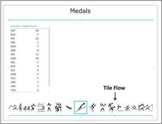
Tile Navigation Strip - Tile Flow
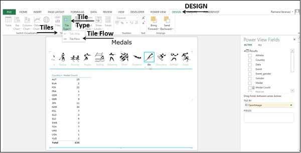
You can convert the Navigation Strip from Tab Strip to Tile Flow as follows −
Click a Tile on the Tab Strip.
Click the DESIGN tab on the Ribbon.
Click Tile Type in the Tiles group.
Select Tile Flow from the dropdown list.

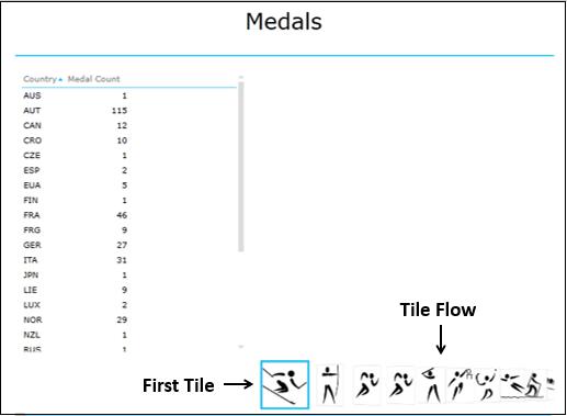
The Navigation Strip shifts to the bottom of the Power View. This is Tile Flow.

You will observe the following −
Tile Flow is displayed across the bottom of the Power View.
By default, the first Tile in the Tile Flow is selected. It will be displayed at the center of the Tile Flow.
There are no arrow buttons for scrolling.
No Labels appear.
You can scroll to the left or right by clicking on any of the Tiles to the left or right of the center Tile.
The Tiles flow to the left or right and the center Tile will always get highlighted.
You can click on a Tile to select it. The Tile gets highlighted and moves to the center of the Tile Flow.
As the selected Tile is always the center Tile, the following happens −
Selected Tile does not go out of view.
When you scroll to the left or right, the Tile that comes to the center position will get automatically selected and highlighted.
The previous selection disappears.
The Table will be automatically updated to the values corresponding to the Tile in the center of the Tile Flow.

Convert the Tile Type to Tab Strip.

Matrix Tiles Visualization
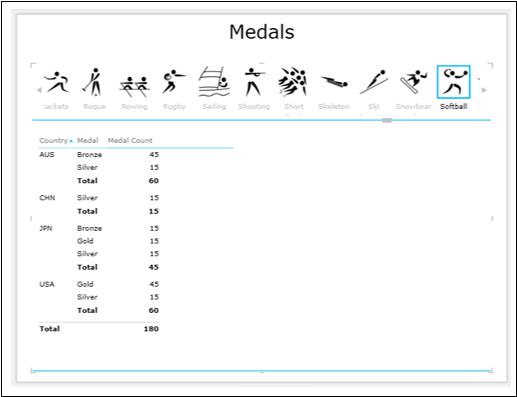
Suppose you want the Medal Count by medal type – Gold, Silver and Bronze and also the total Medal Count, by Country for a selected Sport. You can display the results in a Matrix Tiles visualization.
- Click on the Table.
- Switch visualization to Matrix.
- Add the field Medal to Matrix.
- Click the Tile – Soft Ball.
You will get the desired results as follows −

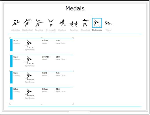
Card Tiles Visualization
You can have a Card Tiles visualization to display specific data.
Click on the Matrix.
Switch visualization to Card.
Filter the Card visualization to display data with Medal Count greater than or equal to 100
Add the field SportImage from the SportPics table to Matrix.
Click on the Tile – Swimming.

You will observe the following −
Stacked Bar Chart Tiles Visualization
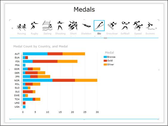
You can make your explored results more conspicuous by switching your visualization to Stacked Bar Chart Tiles visualization −
- Click on the Card visualization.
- Clear the filter.
- Remove the field SportImage from Card.
- Switch visualization to Stacked Bar Chart.
- Click on the Tile – Ski Jumping.

Map Tiles Visualization
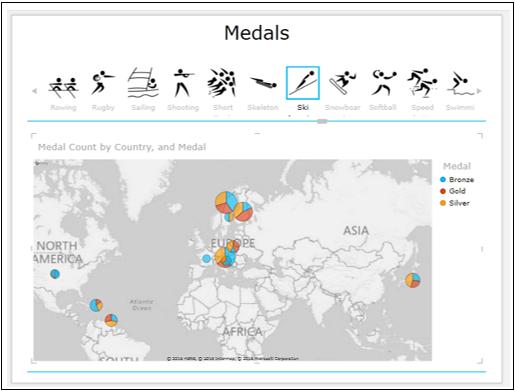
As your data contains geographic locations, you can also switch to Map Tiles visualization −
- Click on the Stacked Bar Chart.
- Switch visualization to Map.

Combination of Power View Tiles Visualizations
You can have a combination of visualizations on Power View with the same Tile Navigation Strip.
Add a Table with fields – Country, Medal and Medal Count.
Add a Table with fields – Country, Gender and Medal Count. Convert it to Stacked Bar Chart.
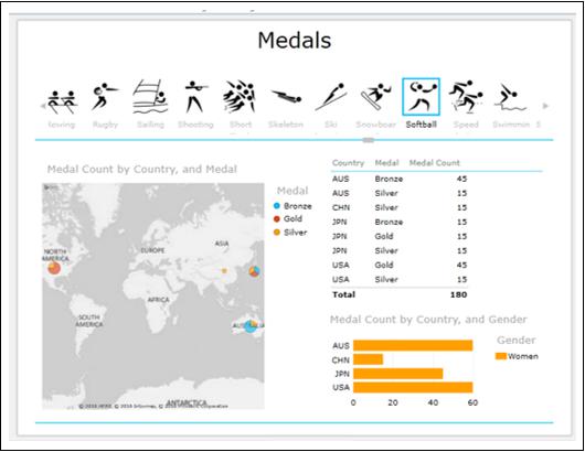
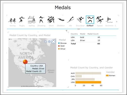
Click on the Tile – Soft Ball.
Resize Map, Table and Bar Chart for a conspicuous display.
You will get the three visualizations filtered to the Tile (Sport) – Soft Ball.

Exploring Data with Tiles Visualizations
To explore data with Tiles Visualization, proceed as follows −
- Click on the Bar USA in the Stacked Bar Chart.
- Pan and zoom Map.
- Place cursor on the Pie Chart – USA.

You will observe the following −
- The selected Bar in the Bar Chart is highlighted.
- The Table is filtered to the corresponding values.
- The Pie Chart for USA is highlighted and others are grayed out.
- The data values of the Pie Chart for USA are highlighted.
This is the power of Power View visualizations as you can display the required results on the fly during a presentation.
Excel Power View - Advanced Features
In the previous chapters you have learnt about the different possible Power View visualizations, Multiples and Tiles. The fields you select for display in the visualizations depend on what you want to explore, analyze and present. For example, in most of the visualizations that you have seen so far, we have chosen Medal to analyze Medal Count by medal type. You might want to explore, analyze and present the data gender-wise. In such a case, you need to choose the field Gender.
Further, visualization also depends on the data you are displaying. Throughout this tutorial, we have chosen Olympics data in order to visualize the power of Power View, the ease with which you can handle large data and switch over different visualizations on the fly. However, your data set might be different.
You need to choose a visualization that best suits your data. If you are not sure about the suitability, you can just play around with the visualizations to choose the right one as switching across the visualizations is quick and simple in Power View. Moreover, you can also do it in the presentation view, in order to answer any queries that can arise during a presentation.
You have also seen how you can have a combination of visualizations in a Power View and the interactive nature of the visualizations. You will learn advanced features in Power View in this chapter. These features come handy for reporting.
Creating a Default Field Set for Table
You might have to use the same field set for different visualizations in a Power View. As you are aware, to display any visualization, you need to create a Table visualization first. If the fields for the Table visualization are from the same data table, you can create a default field set for Table so that you can select the default field set with one click, instead of selecting the fields for the Table visualization repeatedly.

The Power Pivot window appears −
Click the tab – Results to display the Results data table in the Power Pivot window.
Click the Advanced tab on the Ribbon.
Click Default Field Set in the Reporting Options group. The Default Field Set dialog box appears.

Click the Fields you want to select holding down the Ctrl key in the Fields in the table box.
Click Add.

The selected fields appear in the Default fields, in order box on the right side.

Click the Move Up or Move Down buttons to order the fields in the Default fields, in order box and click OK.

Click on the Power View sheet in the Excel window. A message ‘Data Model is changed’ appears and click OK to make those changes in Power View.
Click on the data table name – Results in the Power View Fields list. Table visualization with the default field set appears in Power View

Note that you have to click only on the data table name in the Power View Fields list to select the default field set. If you click on the arrow next to data table name, it expands showing all the fields in the data table and in Power View, Table visualization does not appear.
Click in the empty space to the right of Table visualization in Power View.
Click on the data table name - Results in the Power View Fields list. Another Table visualization with the default field set appears in Power View.

As you can see, you are able to create a Table visualization with 5 fields in the desired order with a single click using the default field set. This eliminates the cumbersome selection of the 5 fields in the desired order with 5 clicks each time you want to display a
Table (or any other) visualization. However, you should be sure of which fields should be in the default field set in a data table. Hence, this feature can be used after data exploration, visualization is complete, and you are ready to produce reports. You might have to produce several reports, in which case this feature comes handy.
Setting Table Behavior
You can set the default table behavior that Power View uses to create report labels automatically for the data table. This becomes useful when you create visualizations from the same data table, perhaps for many different reports.
Suppose you have a data table – Olympics Results in the Data Model
Click on the data table Olympics Results in the Power Pivot window.
Click the Advanced tab on the Ribbon.
Click Table Behavior in the Reporting Options group. The Table Behavior dialog box appears

Select EventID under the Row Identifier box. This column should have unique values in the data table.
Check the boxes Event and EventID in the Keep Unique Rows box. These columns should have row values that are unique, and should not be aggregated when creating Power View reports.
Select Sport in the Default Label box.
Select SportImage in the Default Image box.
Click OK.

To visualize the Table behavior that you have set, select the fields as follows −
Click on Power View.
Select the fields – Sport, SportImage, Event, Year, Athlete, Country and Medal in that order. By default, Table visualization appears.

Switch visualization to Card.

The Sport field values are larger than the other field values and appear as headings for the Cards. This is because you have set Sport as the Default Label in the Table Behavior dialog box. Further, you have set SportImage as the Default Image that appears on each Card based on the Sport value.
Filtering Values in a View
Suppose you have three Power View visualizations – Matrix, Stacked Column Chart and sophisticated Pie Chart in the same Power View, each displaying different aspects of data.

You can see that all the three visualizations are displaying data for all the Country values.
Suppose you want to display data only for USA, URS and JPN. You can apply the filter criteria on the field Country in View rather than in each visualization separately.
Click in the Filters area.
Click the VIEW tab. The Filters area will be empty and no fields will be displayed, as you have not yet selected any.
Drag the field Country from Power View Fields list to Filters area. The field Country with all the values appears in the Filters area.
Check the boxes - USA, URS and JPN.

You can see that all the visualizations in the Power View were filtered at once.
Adding Title to Power View
The Title in the Power View is common to all visualizations. Hence, it should be meaningful across the visualizations. At the top of the Power View, you will see – Click here to add a title.

- Click the placeholder and type Medal Count for JPN, URS and USA.
- Click the Text tab on the Ribbon and format the Title.

Adding Data Labels in a Chart Visualization
You can add Data Labels in a Chart visualization.
Click on the Clustered Column Chart.
Click the LAYOUT tab on the Ribbon.
Click Data Labels in the Labels group.
Select Show from the dropdown list.

Data Labels appear in the Column Chart.

Interactive Data Visualization in Power View
The efficiency of Power View is in its ability to make you visualize data interactively within no time.
- Click on the Pie Chart.
- Drag Medal from COLOR area to SLICES area.
- Drag Country from Power View Fields list to COLOR area.

The Pie Chart shows Country values – JPN, URS and USA as you have applied this filter to VIEW.
Click on the Pie Slice – USA, Gold.

The Matrix is filtered to show only the values corresponding to the highlighted Pie Slice. In the Column Chart, the distribution of Gold Medals among Men and Women is highlighted for USA. Thus, efficient presentations with Power View is just a click away.
Changing the Sort Order of a Field
As you are aware, each field will have default sort order. In the visualizations that you have seen so far, the Medal field is sorted by the default order – Bronze, Gold, and Silver. This is because the text field is sorted in ascending order. However, while reporting, you might want to display the order as Gold, Silver and Bronze as it would be more appealing.
Add a field by which you can sort the Medal field in the desired order as follows −
- Create a new worksheet in your workbook.
- Create an Excel table as given below.
- Name the table as Medal_Position.


The table Medal_Position will be added to Data Model as a data table.

Create a relationship between the data tables Results and Medal Position with the field Medal.

Add the field Medal Position to Results data table as follows −
- Click on the Data View in the Power Pivot window.
- Click the Results tab.
- Click the Design tab on the Ribbon.
- Click Add.
- The Add Column on the extreme right of the data table will be highlighted.
- Type the following DAX formula in the formula bar and press Enter.
=RELATED(Medal_Position[Medal Position])

A new column will be added to the Results data table. The header of the column would be Calculated Column1.
Change the column header to Medal Position by double clicking on it.

As you can observe, the Medal Position column is filled as per the values in the Medal column and as defined in the Medal_Position data table.
Specify how Power View should sort the Medal field as follows −
Select the Medal column.
Click the Home tab on the Ribbon.
Click Sort by Column in the Sort and Filter group.
Select Sort by Column from the dropdown list.

The Sort by Column dialog box appears.
- Ensure Medal is in the Sort Column box.
- Select Medal Position in the By Column box.
- Click OK.

The visualizations will be updated automatically to the new sort order.

Filtering Visualizations with Slicers
You can filter Power View visualizations with Slicers.


The table will be converted to a Slicer.

When you click any of the options in the Slicer, the Map will immediately reflect the selection. Click Men.

Now click Women.

You can have any number of Slicers in Power View.
Click on the Map.
Deselect the field Medal.
Click Power View in any empty space.
Drag the field Medal to Power View. The table appears by default.
Click Slicer on the Ribbon. Another Slicer – Medal appears in Power View.

You can have any combination of filters with the two Slicers.
- Click on Women in the Gender Slicer.
- Click on Gold in the Medal Slicer.

You can clear a filter by clicking on the Clear Filter icon that looks like Eraser on the top right corner of the Slicer.

Creating Interactive Bar and Column Charts
You can have interactive Bar and Column Charts in a Power View.
- Create a Table with Country and Medal Count.
- Switch to Stacked Bar Chart.
- Create a Table with Sport and Medal Count.
- Switch to Stacked Column Chart.
- Add a Slicer for Gender.
- Add a Slicer for Season.
- Filter Stacked Bar Chart to display few Country values.
- Filter Stacked Column Chart to display few Sport values.
You Power View looks as follows −

- Click on Summer in Season Slicer.
- Click on Women in Gender Slicer.
- Click on Gold in the Legend.

You can select any combination of the filters and display the results immediately.
Excel Power View and Data Model
Power View is based on the Data Model in your workbook that is created and managed by Power Pivot. You can access the Data Model from the Power Pivot window. Because of the optimization that Power Pivot uses in managing the Power Pivot window, you would be able to work with large data sets on the fly. Power View visualizations and their interactive features are possible because of the Data Model.
You can also create and/or modify the Data Model from the Power View sheet in your workbook.
For those readers for whom Data Model concepts in Excel are new, suggest to refer to Excel Power Pivot tutorial for the details. In this chapter, you will learn more about Power View and Data Model.
Power View and Data Model
You have learnt that Power View is based on the Data Model that is created and managed in Power Pivot window. You have also seen the Power of interactive visualizations that are based on large data such as Olympics data that is made part of the Data Model.
When you have a Data Model in your workbook, whenever you create a Power View sheet, it automatically gets the data tables from the Data Model along with the relationships defined among them, so that you can select fields from the related data tables.
If you have Excel tables in your workbook, you can link them to the data tables in the Data Model. However, if you have large data sets such as Olympics data, the Power View is optimized by directly creating the Data Model from the data source.
Once you have the Data Model in your workbook and relationships defined among the tables, you are all set to visualize and explore data in Power View.
You can refresh the data in the Data Model to update the modifications made in the data sources from where you have created the Data Model.
Creating Data Model from Power View Sheet
You can also create the Data Model directly from the Power View sheet as follows −
Start with a new workbook that contains Salesperson data and Sales data in two worksheets.

You have two tables – Salesperson and Sales in your workbook.
Click the Sales table in the Sales worksheet.
Click the INSERT tab on the Ribbon.
Click Power View in the Reports group.

A new Power View sheet will be created in your workbook. A Table visualization appears with all the fields in the Sales table. Note that you do not have a Data Model in your workbook.

As you can observe in the Power View Fields list, both the tables that are in the workbook are displayed. However, in the Power View only the active table (Sales) fields are displayed.
In the Table in the Power View, Salesperson ID is displayed. Suppose you want to display the Salesperson name instead.
In the Power View Fields list, make the following changes −
- Deselect the field Salesperson ID in the Sales table.
- Select the field Salesperson in the Salesperson table.
As you do not have a Data Model in the workbook, no relationship exists between the two tables. No data is displayed in Power View. Excel displays messages directing you what to do.

A CREATE button will be displayed in the Power View Fields pane. Click the CREATE button.
A Create Relationship dialog box appears in the Power View Sheet itself.

Create a relationship between the two tables using the Salesperson ID field.
Without closing the Power View sheet, you have successfully created the following −
- The Data Model with the two tables, and
- The relationship between the two tables.
The field Salesperson appears in the Table in Power View along with the Sales data.

Rearrange the fields in the FIELDS area to Region, Salesperson and ∑ Order Amount in that order.
Drag the field Month to the area TILE BY.
Switch visualization to Matrix.

You can see that for each of the Regions, the Salespersons of that Region and sum of Order Amount are displayed. Subtotals are displayed for each Region. The display is month-wise as selected in the Tiles. When you select a Month in the Tiles, the data of that Month will be displayed in the Matrix.
You are able to work with the Power View visualizations as the Data Model is now created. You can check it in the Power Pivot window.

The data tables – Salesperson and Sales are created in the Data Model along with the defined relationship.
Modifying Data Model from Power View Sheet
You can also modify the Data Model in your workbook from the Power View sheet by adding data tables and creating relationships among the data tables.
- Consider the Excel table – SalesTarget in your workbook.

Click on the Power View sheet.
Click on the Matrix.
Switch visualization to Table.
Deselect the field – Month.
Click the ALL tab in the Power View Fields pane. You can see that the table SalesTarget is included.
Click the POWERPIVOT tab on the Ribbon.
Click Manage. The Power Pivot window appears displaying the Data Model.

You can add a data table to the Data Model from Power View itself.

The new field SalesTarget is added to the table, but a message saying – Relationships between tables may be needed. A CREATE button appears.

Click in the Power Pivot window.

The relationship you have created in the Power View sheet is reflected in the Data Model.

Rearrange the fields in the Fields area.

Excel Power View - Hierarchies
If your Data Model has a hierarchy, you can use it in Power View. You can also create a new hierarchy from scratch in Power View. In both the cases, you can drill up and drill down the hierarchy in Power View.
In this chapter, you will learn how to view the hierarchy and drill up and drill down the hierarchy in different Power View visualizations.
Viewing a Hierarchy from Data Model
If you have a hierarchy in Data Model, you can visualize the same in Power View. Suppose, you have the hierarchy Sport-Event defined in the Data Model as shown below.

The hierarchy will be visible as a field in the Power View Fields list and you can add it as any other field to a Power View visualization.

- Create a Table with the fields – Country, Sport-Event and Medal Count.
- Switch visualization to Matrix.

The levels in the hierarchy are nested as per the order of fields in the hierarchy.
Creating a Hierarchy in Power View
You can also create a new hierarchy from scratch in Power View.
Create a Table with the fields - Country, Sport, Event, Year, and Medal Count, in that order.
Switch visualization to Matrix.
The hierarchy is set by the order of the fields in the ROWS area. You can place the fields in any order in a hierarchy in Power View, provided it is meaningful. You can change the order by simply dragging the fields in the ROWS area.

The difference between defining the hierarchy in Data Model and defining the hierarchy in Power View is the following −
If you define a hierarchy in Data Model, it is added to Power View Fields list as a field and you can include it in any visualization in Power View by just adding that field.
On the other hand, if you define a hierarchy in Power View, it is restricted to the visualization in which you have placed the fields in the hierarchy order. It needs to be recreated in every visualization that is in the Power View.
Drilling Up and Drilling Down the Hierarchy in Matrix
Once you have a hierarchy in Power View (either from Data Model or from Power View), you can drill up and drill down in Matrix, Bar Chart, Column Chart and Pie Chart visualizations. In this section, you will understand how you can drill up and drill down the hierarchy in Matrix visualization. In the subsequent sections, you will understand how to do the same in the other mentioned visualizations.
In Matrix, you can show just one level at a time. You can drill down for details and drill up for summary.

Select Rows – Enable Drill Down One Level at a Time from the dropdown list.

The Matrix collapses to display only Level 1 data. You can also find an arrow on right side of the Level 1 data value indicating drill down.

Click on the drill down arrow to drill down. Alternatively, you can double click on the data value to drill down. That particular data value drills down by one Level.

For the data value, you have one arrow on the left indicating drill up and one arrow on the right indicating drill down.
You can double click on one data value in a Level to expand to show the data values under that in the next Level in the hierarchy. You can click on the drill up arrow to collapse to the data value.
Hierarchy in Bar Chart
In this section, you will understand how you can drill up and drill the hierarchy in a Stacked Bar Chart visualization.
Create a Table with the fields – Country, Sport-Event and Medal Count. Sport-Event is a hierarchy with fields Sport and Event that is defined in the Data Model.
Switch visualization to Stacked Bar Chart.
Ensure Country, Sport, Event are in the AXIS area.
Add the field Medal to LEGEND area.
A Stacked Bar Chart will be displayed.

The data displayed is Medal Count by Country and Medal.
Double-click a Bar, say CAN. The Stacked Bar Chart will be drilled down by one level.

The data displayed is Medal Count by Sport and Medal (This is for the Country – CAN). A small up arrow, indicating drill up appears in the top right corner of the Chart, adjacent to Filter and Pop-in.
Now, you can either drill up to Country Level or drill down to Event Level.
Double click on the Bar – Figure Skating. The Stacked Bar Chart will be drilled down by one level.

The data displayed is Medal Count by Event and Medal (This is for the Country – CAN and Sport – Figure Skating). A small up arrow, indicating drill up appears in the top right corner of the Chart, adjacent to Filter and Pop-in.
Now, you can drill up to Sport Level (You can drill up one level at a time).
Hierarchy in Column Chart
In this section, you will understand how you can drill up and drill the hierarchy in a Stacked Column Chart visualization.
Create a Table with the fields – Country, Sport-Event and Medal Count. Sport-Event is a hierarchy with fields Sport and Event that is defined in the Data Model.
Switch visualization to Stacked Column Chart.
Ensure Country, Sport, Event are in the AXIS area.
Add the field Medal to LEGEND area.
A Stacked Column Chart will be displayed.

The data displayed is Medal Count by Country and Medal.
Double-click on a Column, say CHN. A Stacked Column Chart will be drilled down by one level.

The data displayed is Medal Count by Sport and Medal (This is for the Country – CHN). A small up arrow, indicating drill up appears in the top right corner of the Chart, adjacent to Filter and Pop-in.
Now, you can either drill up to Country Level or drill down to Event Level.
Double click on the Column – Fencing. The Stacked Column Chart will be drilled down by one level.

The data displayed is Medal Count by Event and Medal (This is for the Country – CHN and Sport – Fencing). A small up arrow, indicating drill up appears in the top right corner of the Chart, adjacent to Filter and Pop-in.
Now, you can drill up to Sport Level (You can drill up one level at a time).
Hierarchy in Pie Chart
In this section, you will understand how you can drill up and drill down the hierarchy in a Pie Chart visualization.
Create a Table with the fields – Sport-Event and Medal Count. The Sport-Event is a hierarchy with fields Sport and Event that is defined in the Data Model.
Switch visualization to Pie Chart.
Ensure Sport, Event are in the COLOR area and Medal Count is in the SIZE area.
A Pie Chart will be displayed. However, as the number of Sports is many, it will not be possible to display all the Sports in the Pie Chart.
You need to filter the VIEW and not the Pie Chart because when you drill up or drill down, the filtering needs to be in place.

The data displayed is Medal Count by Sport and the Legend shows the Sport values.
Double-click on a Pie Slice, say Ski Jumping. The Pie Chart will be drilled down by one level.

You will observe the following −
The data displayed is Medal Count by Event (This is for the Sport – Ski Jumping).
Legend shows Events (for the Sport – Ski Jumping).
Pie Slices represent Events.
A small up arrow, indicating drill up appears in the top right corner of the Chart, adjacent to Filter and Pop-in.
Now, you can drill up to Sport Level.
Filtering Hierarchy in Pie Chart with Column Chart
You can combine a Pie Chat and a Column Chart in Power View to visualize the hierarchy, drill up and drill down.
- Click on the Pie Chart.
- Add Gender to SLICES area.
- Click outside the Pie Chart.
- Create a Table with the fields - Country and Event.
- Click on the field Event in the FIELDS area.
- Click on Count (Distinct) in the dropdown menu.
- Filter the VIEW with the field Country to display only 5 Countries.
- Switch visualization to Stacked Column Chart.

Click a Column in the Column Chart, say BLR.

Click another Column, say JPN.

Double click on the highlighted Pie Slice.

You have seen the following in the above given visualizations −
- How you can filter the data by Column Chart.
- How you can show a hierarchy Pie Chart with the filtered data.
- How the Pie Chart appears after drill down, where the filter is still in place.
Key Performance Indicators
A Key Performance Indicator (KPI) is a quantifiable measurement for gauging business objectives. Examples of KPIs are −
Sales department of an organization use a KPI to measure monthly gross profit against projected gross profit.
Accounting department measure monthly expenditures against revenue to evaluate costs.
Human resources department measure quarterly employee turnover.
Business professionals frequently use KPIs that are grouped together in a business scorecard to obtain a quick and accurate historical summary of business success or to identify trends.
KPIs are a form of communication involving the following activities −
Identifying the KPIs based on the organization’s objectives.
Monitoring and reporting the KPIs.
Altering the KPIs as the organization progresses and / or the organization’s goals change.
The second and third objectives given above can be achieved with Power View. A KPI includes Base Value, Target Value/ Goal and Status.
Base Value
A Base Value is defined by a calculated field that resolves to a value. The calculated field represents the current value for the item in that row of the Table or Matrix. For example, aggregate of sales, profit for a given period, etc.
Target Value
A Target Value (or Goal) is defined by a calculated field that resolves to a value, or by an absolute value. The current value is evaluated against this value. This could be one of the following
A fixed number that is the goal all the rows should achieve. E.g. Sales target for all the salespersons.
A calculated field that might have a different goal for each row. For example, Budget (calculated field), department-wise in an organization.
Status
Status is the visual indicator of the value. In Power View, you can edit the KPI, choosing which indicators to use and what values to trigger each indicator.
Identifying the KPIs
The first and the most crucial step in KPI analysis is to identify the KPIs that effectively monitor the required trends in the organization. This requires complete understanding of the objectives and requires proper communication channels between the analysts and those who are responsible for fulfilling the objectives.
There are a number of KPIs to choose from, but the success in monitoring relies on the right choice of those that are relevant to the objectives. The KPIs differ from organization to organization and from department to department. It is effective only when they lead to improvement in the performance.
You can evaluate the relevance of a KPI using the SMART criteria, i.e. the KPI should be Specific, Measurable, Attainable, Relevant and Time-bound. In other words, the KPI chosen should meet the following criteria −
The KPI reflects your Specific objective.
The KPI enables you to Measure progress towards that goal.
The goal for which the KPI is being defined is realistically Attainable.
The goal that the KPI is targeting is Relevant to the organization.
You can set a Time-frame for achieving the goal so that the KPI reveals how near the goal is as compared to the time that is left.
The defined KPIs are to be evaluated from time to time to find their relevance as the time progresses. If required, different KPIs need to be defined and monitored. The KPIs might have to be edited as the time progresses. Only then, your KPI monitoring will be relating to the current organization needs.
Defining KPIs in the Data Model
Once you identify the KPIs, you can define them in the Data Model and add them to your Power View report to show the status of the set goals. You can do any of the following −
You will learn how to define KPIs in the Data Model in this section. The other method you will learn in the next section.
Suppose you want to monitor the sales targets of the salespersons in an organization who are selling a product. The objective is to identify the best performers who are meeting the Sales Target. You can proceed to define the KPI as follows −
Base Value − Current Value of the Sales Amount for each salesperson.
Target Value / Goal − Target Value is fixed for all the salespersons so as to enable comparison between the salespersons. Assume that the Sales Target is 3500.
Status − The Status is to be displayed with a graphic to easily determine the status of the Base Value compared to the Target Value.
Define the KPI in the Data Model as follows −
- Consider the two data tables - SalesPerson and Sales.
- Create a relationship between the two data tables using the field SalesPerson ID.

To set the Base Value, you need a calculated field for Sales Amount.
- Click the Data View in the Power Pivot window.
- Click in the cell at the bottom of the column Sales Amount
- Type the following DAX formula in the formula bar.
Total Sales:=SUM([Sales Amount])

- Click in the Excel window.
- Click the POWERPIVOT tab on the Ribbon.
- Click KPIs in the Calculations group.
- Select New KPI from the dropdown list.

The Key Performance Indicator (KPI) dialog box appears.

To check the KPI in the Data Model, do the following −
- Click in the Power Pivot window.
- Select the diagram view.

The Total Sales appears as a KPI field in the Sales data table.
Visualization of KPIs in Power View
Create a Power View sheet to visualize the KPI that you have defined.
You will observe the following in the Sales table in Power View Fields list −
Total Sales field is a KPI and is depicted by the icon  .
.
The three KPI parameters – Value, Goal and Status appear as fields under Total Sales KPI.
Select the three fields – Value, Goal and Status under the KPI Total Sales from the Sales table.
Select the field Salesperson from the Salesperson table.
Table visualization appears by default.

The three KPI parameters appear as columns in the Table, with the Status column displaying the icons as per the corresponding values.
Editing KPIs in Power View
You can also define the KPI thresholds by values instead of percentages. To modify the defined KPI Total Sales, proceed as follows −
Click the POWERPIVOT tab on the Ribbon.
Click KPIs in the Calculations group on the Ribbon.
Select Manage KPIs from the dropdown list.


The Key Performance Indicator (KPI) dialog box appears.
- Under Define status thresholds, adjust the vertical bars to 1500 and 3000.
- Retain the rest of the earlier options and click OK.

Click Close in the Manage KPIs dialog box.
Power View displays a message that the Data Model is changed. Click OK.

You can see that the status icons reflect the changed thresholds
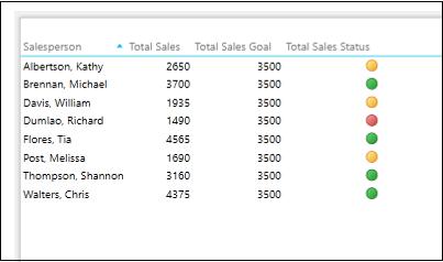
Defining KPIs in Power View
You can define a KPI from the Power View sheet itself. Suppose you do not have the calculated field Total Sales in the Data Model. You can create that from Power View itself.
Create a new Power View sheet.
Click the POWERPIVOT tab on the Ribbon.
Click Calculated Fields in the Calculations group on the Ribbon.
Select New Calculated Field from the dropdown list.

The Calculated Field dialog box appears.
Fill in the details for the calculated field as shown below and click OK.

The calculated field Total Sales appears in the Sales table in the Power View Fields list.
You can identify it as a calculated field as it appears with a calculator  icon.
icon.

Now, you can use this calculated field to define a KPI from Power View.
- Click the POWERPIVOT tab on the Ribbon.
- Click KPIs in the Calculations group on the Ribbon.
- Select New KPI from the dropdown list.

The Key Performance Indicator (KPI) dialog box appears.

Total Sales appears as a KPI depicted by the icon  with the three KPI parameters – Value, Goal and Status as fields under it.

Aesthetic Reports with KPIs in Power View
You can create an aesthetic report of Sales Performance with KPIs in Power View as follows −
Create a Table with the fields – Salesperson, Total Sales and Total Sales Status.
Click below the Table in Power View.
Create a Table with the fields – Salesperson, Total Sales and Total Sales Goal.
Switch visualization to 100% Stacked Bar Chart.
Click next to the Table in Power View.
Create a Table with the fields – Salesperson, Region, Total Sales and Total Sales Status.
Switch visualization to Card.
Drag the field Region to Tile By.
Type the Title – Sales Performance for the Power View Report.
Resize Table, 100% Stacked Bar Chart and Card for conspicuous visualization.

Observe that in Power View, you could portray the results as follows −
Table with icons for KPI status.
100% Stacked Bar Chart depicting the percentage achieved with respect to the Goal. You can also notice that it gives a clear comparison of the performance of all the Salespersons.
Card visualization depicting the KPI status of the Salespersons along with the Region, which they belong. You can interactively scroll through the Tiles to display results for different Regions that would give scope to assess performance regionwise also.
Excel Power View - Formatting a Report
Once your data visualization and data exploration is complete, you will be ready to produce reports for presentation. Power View provides a wide range of Themes, Chart Palettes, Fonts, Background Colors, etc. that can help you make your reports appealing. In this chapter, you will learn about the various formatting features of Power View.
You know that it is possible to have a combination of Power View visualizations on a single Power View report. Some of the formatting options enable you to apply the same feature for the entire view and some options can be set separately for each of the visualizations. Further, some options will get replicated to all the Power View sheets in your workbook, while some would not.
The formatting features in Power View enable you to do the following −
- Change the theme.
- Add background image.
- Choose background formatting.
- Change the text size.
- Change the font.
- Format numbers in Table, Matrix or Card.
Changing Theme
Consider the following Power View report −

Change the Theme as follows −
- Click the POWERVIEW tab on the Ribbon.
- Click Themes in the Themes group.
- Select Composite from the dropdown gallery.

The Theme of the Power View report changes to the selected one.

A theme has a unique set of colors and fonts for creating a look and feel for the entire report. You can choose the theme that best suits your data, context, the background of the presentation, etc.
Click in another Power View sheet in your workbook. You can observe that the new theme is applied to all the Power View sheets in the workbook.

Setting Background Image
You can add a background image in your Power View report, adjust its position, size and transparency.
Consider the following Power View report that is filtered to show the results only for the year 2000.

In 2000, Olympics were held in Sydney. You can add the respective emblem to your Power View report as follows −
Click the POWERVIEW tab on the Ribbon.
Click Set Image in the Background Image group.
Select Set Image from the dropdown list.

Browse for the image file and open it. The image appears as a background image in the Power View report.

You can resize the background image in several ways −
Stretch to occupy the entire Power View canvas. However, the aspect ratio might be lost and is not allowed for certain images.
Tile to cover the entire Power View Canvas with multiple copies of the image.
Center align the image.
Fit to display with the right aspect ratio and cover the Power View canvas. This is also the by default, Fit option.
The Center alignment option looks as shown below.

You can specify the transparency of the background image. By default, it is 50%. The higher the percentage, the more transparent (less visible) the image.

Select 80% from the dropdown list.

Change the Image Position to Tile.

You can observe that the background image is set only for this Power View sheet and is not replicated in other Power View sheets in your workbook.
You can remove the background image that you have set.
Click the POWERVIEW tab on the Ribbon.
Click Set Image in the Background Image group.
Select Remove Image from the dropdown list.

The background image will be removed.
Changing Background Colors
You can change the background colors in the Power View report.
Click the POWERVIEW tab on the Ribbon.
Click Background in the Themes group. You will find different backgrounds in the gallery, from solids to a variety of gradients. By default, it is white.

Click Light2 Center Gradient. The background color changes to the selected one.

The selected background color will be applied to all the Power View sheets in your workbook.
Changing Font in a Power View Report
You can change the Font in the Power View report.

Select Verdana from the dropdown list.

The font is changed in all the visualizations. You can have only one font for all the visualizations in your Power View report.
Note − The font has not changed in the other Power View sheets in your workbook.
Changing Text Size in a Power View Report
You can change the size of text to a percentage of the original text size in your Power View report.
- Click the Power View tab on the Ribbon.
- Click Text Size in the Themes group. By default, it is 100%. Select 125%.

The font size of the text in the entire Power View report will be enlarged.
Adjust the sizes of the visualizations and the title so that they will be conspicuous.

You can see that the text in the visualizations have become more readable.
Note − The text size would be the same in all the visualizations in the report and all the other Power View sheets in your workbook as well.
Formatting Numbers in a Power View Report
You can format numbers in Table, Matrix and Card visualizations.
- Create a Table with the fields – Country, Medal and Medal Count.
- Switch to Matrix visualization.

Click on a value in the Medal Count column in the Matrix.
Click the DESIGN tab on the Ribbon.
Select Number from the dropdown list in the Number group.

The entire column will be formatted to number.
Click Decrease Indent in the Number group twice.

The data will be displayed in Number format. You can format numbers in Table and Card visualizations also.

Changing Number Aggregates
In the Power View Fields list, some number fields will have a Sigma ∑ symbol next to them. They are aggregates, meaning that you can combine the values in that field to yield a numeric value such as sum, count, or average. You can aggregate a numeric or text (non-numeric) field. However, you cannot aggregate a calculated field.
Create a Table with the fields Country and Medal Position.

Suppose you want to switch visualization to Stacked Bar Chart. But, as you can observe, the Chart visualizations are grayed out and disabled. You can also observe that the field Medal Position has ∑ symbol next to it, meaning that it can be aggregated.

The field Medal Position displays a # symbol meaning it is count. In the Table, the column header changes to Count of Medal Position and the rows for each Country are displayed only once showing the count values.
On the Ribbon, Chart options will be enabled.

Now, you can switch visualization to Stacked Bar Chart. In a similar way, you can aggregate a text field also. This feature comes handy if you do not have numeric fields in your data.
Excel Power View - Sharing
Power View visualizations are interactive in nature with appealing look and feel. For any type of data and for large data sets you have suitable visualizations that will enable you to explore the data with presentable reports. So, you do not have an added step of preparing and /or previewing reports. Even formatting is interactive in nature and need not necessarily be the final step. Once you have explored and summarized your results, you would have to share with the concerned people. In this chapter, you will learn the different ways that you can share Power View reports.
Sharing Power View in Excel
You can share your Excel workbooks with Power View sheets on a SharePoint Server 2013 or SharePoint Online site. Your report readers can view and interact with the Power View sheets in the workbooks you have saved there.
Sharing Power View in SharePoint Reports
You can create and share Power View reports in SharePoint (RDLX files). The readers can view them, interact and /or edit if permissions are given on the server. Power View in Excel and Power View in SharePoint Server both provide an interactive data exploration, visualization and presentation experience for all skill levels.
You can also export an interactive version of your Power View in SharePoint report to PowerPoint. Each view in Power View becomes a separate PowerPoint slide. You can interact with the visualizations and filters in each view, but you can’t create visualizations or filters.
Printing Power View Reports
You can print a Power View sheet. However, it will be a static image on paper. It will not be an interactive report, which is innate strength of Power View. You design a Power View report, on screen, with the look and feel you have in mind, which cannot be reflected on paper. Your visualizations are meant to be dynamic and cannot be captured by static images on paper to the fullest extent.
Publishing to Power BI
You can also publish Excel workbooks with Power View sheets to Power BI. Power BI saves the Power View sheets in your workbook as a Power BI report.


 in the top right corner, or
 in the bottom right corner and pull the arrow that appears
 that appears on the top right corner of the visualization.


