Advanced Excel - Funnel Chart
Funnel chart is used to visualize the progressive reduction of data as it passes from one phase to another. Data in each of these phases is represented as different portions of 100% (the whole). Like the Pie chart, the Funnel chart does not use any axes either.
For example, in a sales pipeline, there will be stages as shown below.
Prospects → Qualified Prospects → Proposals → Negotiations → Final Sales.
Typically, the values decrease gradually. Many prospects are identified, but a part of them are validated and even lesser qualify for Proposals. A still lesser number come for negotiations and in the end, there is only a handful of deals that are won. This will make the bars resemble a funnel.
What is a Funnel Chart?
The Funnel chart shows a process that starts at the initial state and ends with a final state, where it is noticeable in what stages the fall out happens and by what magnitude. If the chart is also combined with research data, meaning quantified measurements of just how many items are lost at each step of the sales or order fulfillment process, then the Funnel chart illustrates where the biggest bottlenecks are in the process.
Unlike a real funnel, not everything that is poured in at the top flows through to the bottom. The name only refers to the shape of the chart, the purpose of which is illustrative.

Another variant of Funnel chart is where the data in each of these phases is represented as different portions of 100% (the whole), to show at what rate the changes occur along the Funnel.
Like the Pie chart, the Funnel chart does not use any axes either.
Advantages of Funnel Charts
Funnel chart can be used in various scenarios, including the following −
To allow executives to see how effective the sales team is in turning a sales lead into a closed deal.
A Funnel chart can be used to display Web site visitor trends. It can display visitor page hits to the home page at the top, and the other areas, for e.g. the web site downloads or the people interested in buying the product will be proportionally smaller.
Order fulfillment funnel chart with the initiated orders on top and down to the bottom the orders delivered to satisfied customers. It shows how many there are still in the process and the percentage cancelled and returned.
Another use of Funnel chart is to display sales by each salesperson.
Funnel chart can also be used to evaluate Recruitment process.
Funnel chart can also be used to analyze the order fulfillment process.
Preparation of Data
Place the data values in a table.

Step 1 − Insert a column in the table as shown below.

You will get the following data. You will use this table to create the Funnel chart.

Creating a Funnel Chart
Following are the steps to create the Funnel chart −
Step 1 − Select the data and insert a Stacked Bar chart.

Step 2 − Right click on the Shift Bars (blue color in the above chart) and change Fill color to No Fill.

The chart looks as shown below.

Step 3 − Design the chart as follows.
- Right click on the Vertical Axis.
- Select Format Axis from the dropdown list.
- Click AXIS OPTIONS in the Format Axis pane.
- Check the box – Categories in reverse order.

Step 4 − Fine tune the chart as follows.
- Deselect Legend in Chart Elements.
- Change the Chart Title.
- Right click on the orange Bars.
- Select Format Data Series.
- Change the Gap Width to 0% in the SERIES OPTIONS.

Step 5 − Select Data Labels in Chart Elements.

Your Sales Pipeline Funnel chart is ready.
Formatting a Funnel Chart
Step 6 − Make the chart more appealing as follows
- Click on the Chart Elements.
- Deselect Horizontal Axis.
- Deselect Gridlines.
- Right click on the Bars.
- Select Format Data Series from the dropdown list.
- Click on Fill & Line under SERIES OPTIONS in the Format Data Series pane.
- Click on Gradient fill under the Fill option.
- Set Gradient stops.

Step 7 − Click on Solid line under BORDER. Select Color as black.

Your formatted Funnel chart is ready.

Aesthetic Funnel Chart
Now that you understood the fundamentals of Funnel chart, you can proceed to create an aesthetic Funnel chart that actually looks like a Funnel as follows −
Step 1 − Start with the original table of data.

Step 2 − Select the data and insert a 3-D Stacked Column chart.

Step 3 − Design the chart as follows.
- Right click on the Columns.
- Select Format Data Series.
- Click on SERIES OPTIONS in the Format Data Series pane.
- Select Full Cone under Column shape.

Step 4 − Fine tune the chart as follows.
- Click the Design tab on the Ribbon.
- Click Switch Row / Column.
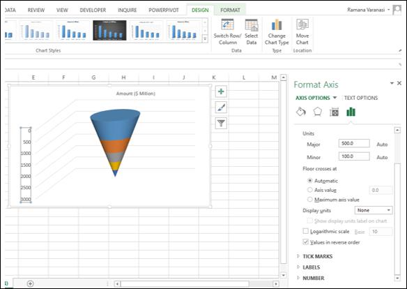
- Right click on the Vertical Axis and select Format Axis from the dropdown list.
- Click AXIS OPTIONS in the Format Axis pane.
- Check the box – Values in reverse order.

Step 5 − Deselect all the Chart Elements

Step 6 − Right click on the Bars and select Format Data Series from the dropdown list.
Step 7 − Click on SERIES OPTIONS in the Format Data Series pane and type 50% for Gap Depth under SERIES OPTIONS.

Step 8 − Format your chart with details as follows.
- Select Data Labels in Chart Elements.
- Place them and format them.
- You can choose Call Out option for the Data Label of the bottom part.
- Give a Chart Title.

Your Funnel chart is ready.


