Advanced Excel - Richer Data Labels
You can have aesthetic and meaningful Data Labels. You can
- include rich and refreshable text from data points or any other text in your data labels
- enhance them with formatting and additional freeform text
- display them in just about any shape
Data labels stay in place, even when you switch to a different type of chart.
You can also connect them to their data points with Leader Lines on all charts and not just pie charts, which was the case in earlier versions of Excel.
Formatting Data Labels
We use a Bubble Chart to see the formatting of Data Labels.
Step 1 − Select your data.
Step 2 − Click on the Insert Scatter or the Bubble Chart.

The options for the Scatter Charts and the 2-D and 3-D Bubble Charts appear.

Step 3 − Click on the 3-D Bubble Chart. The 3-D Bubble Chart will appear as shown in the image given below.

Step 4 − Click on the chart and then click on Chart Elements.
Step 5 − Select Data Labels from the options. Select the small symbol given on the right of Data Labels. Different options for the placement of the Data Labels appear.
Step 6 − If you select Center, the Data Labels will be placed at the center of the Bubbles.

Step 7 − Right-click on any one Data Label. A list of option appears as shown in the image given below.

Step 8 − Click on the Format Data Label. Alternatively, you can also click on More Options available in the Data Labels options to display the Format Data Label Task Pane.

The Format Data Label Task Pane appears.

There are many options available for formatting of the Data Label in the Format Data Labels Task Pane. Make sure that only one Data Label is selected while formatting.
Step 9 − In Label Options → Data Label Series, click on Clone Current Label.

This will enable you to apply your custom Data Label formatting quickly to the other data points in the series.
Look of the Data Labels
You can do many things to change the look of the Data Label, like changing the Fill color of the Data Label for emphasis.
Step 1 − Click on the Data Label, whose Fill color you want to change. Double click to change the Fill color for just one Data Label. The Format Data Label Task Pane appears.
Step 2 − Click Fill → Solid Fill. Choose the Color you want and then make the changes.
Step 3 − Click Effects and choose the required effects. For example, you can make the label pop by adding an effect. Just be careful not to go overboard adding effects.
Step 4 − In the Label Options → Data Label Series, click on Clone Current Label. All the other data labels will acquire the same effect.

Shape of a Data Label
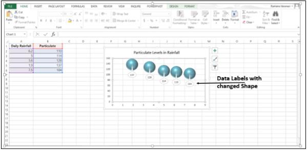
You can personalize your chart by changing the shapes of the Data Label.
Step 1 − Right-click the Data Label you want to change.
Step 2 − Click on Change Data Label Shapes.

Step 3 − Choose the shape you want.

Resize a Data Label
Step 1 − Click on the data label.
Step 2 − Drag it to the size you want. Alternatively, you can click on Size & Properties icon in the Format Data Labels task pane and then choose the size options.

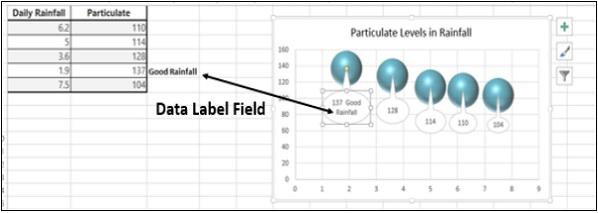
Add a Field to a Data Label
Excel 2013 has a powerful feature of adding a cell reference with explanatory text or a calculated value to a data label. Let us see how to add a field to the data label.
Step 1 − Place the Explanatory text in a cell.
Step 2 − Right-click on a data label. A list of options will appear.

Step 3 − Click on the option − Insert Data Label Field.

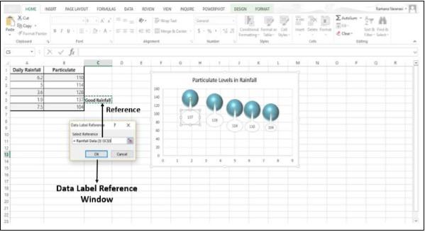
Step 4 − From the available options, Click on Choose Cell. A Data Label Reference window appears.

Step 5 − Select the Cell Reference where the Explanatory Text is written and then click OK. The explanatory text appears in the data label.
Step 6 − Resize the data label to view the entire text.
